Key Takeaways
- Google Calendar’s latest update allows users to disable illustrations for a more information-dense schedule view.
- Disabling event illustrations removes artwork for birthdays, reservations, and locations, but not monthly banners.
- The update makes the schedule view consistent with day, week, and month views for users not fond of Google’s artistic style.
For some, Google Calendar is a handy app that helps them keep tabs on what’s coming up next — for others, it’s simply another tool to use in the relentless pursuit of getting things done. Google’s latest update is clearly designed for people in the latter category.
Related
Change this setting if you share your primary Google Calendar
Gmail events won’t show up for everyone by default, and this is the fix
We had seen the feature in the works previously, and now, Google Calendar is widely rolling out a new setting that allows you to disable the illustrations that are automatically added to some events. The rollout was initially spotted by AssembleDebug, and it appears to be a server-side switch, as it’s live on version 2024.45.0-695135831-release of the Google Calendar app, despite the fact that there are several newer versions already in circulation on APKMirror and the Play Store.
How to suck the fun out of Google Calendar
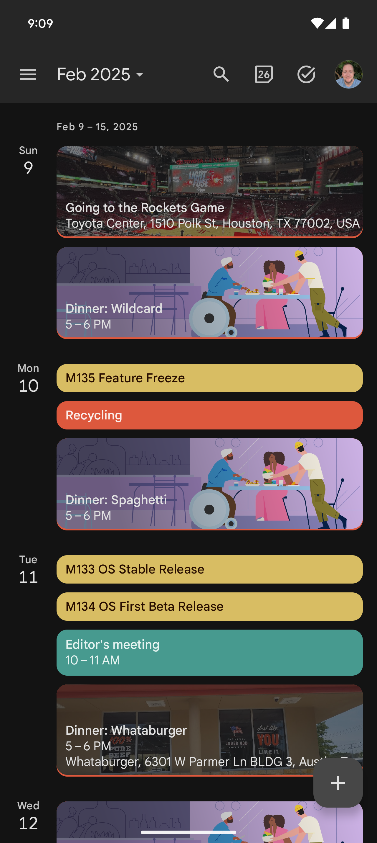
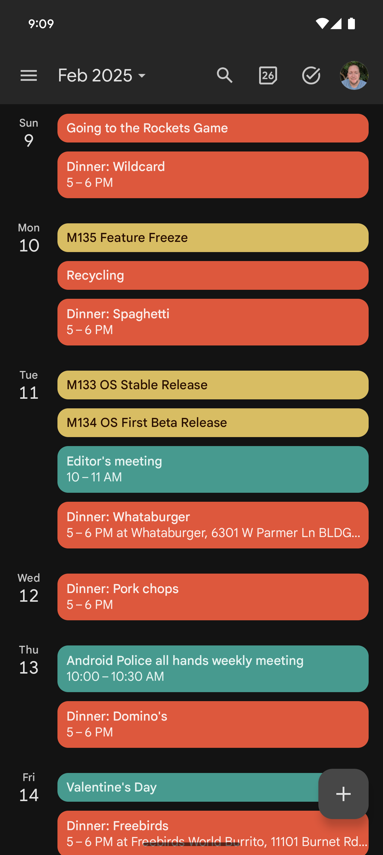
The setting primarily applies to Google Calendar’s schedule view, which excludes empty dates on your agenda and only shows upcoming events. If you’d prefer that this section be as information-dense as possible, you can disable the new toggle under Side menu → Settings → General → Show event illustrations.


Doing this will remove the automatically generated artwork for events like birthdays, dinner reservations, and things with a location attached, which would show Google Maps imagery. Note that you will still see the playful, illustrated banners that delineate each month, so there’s currently no way to suck every last bit of life out of the app, just the majority of it.
Ultimately, this does make Google Calendar’s schedule view a lot more like the day, week, and month views that simply show color blocks for each event. So, if you’re a fan of consistency who isn’t big on the Corporate Memphis art style that Google likes to cram everywhere, you should be happy to know that you can kill two birds with one stone here — or three if you count joy.
