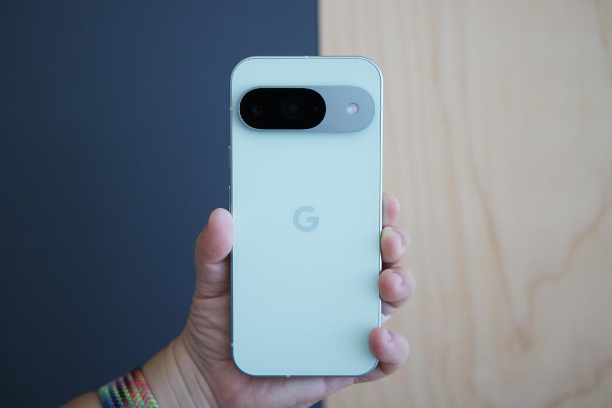
As Google’s Pixel line of phones has grown over the years, some fans have pointed out the increasing resemblance to the iPhone. The rounded edges, sleek design, and raised camera bump are all reminiscent of Apple’s iconic device — especially with the newest Google Pixel 9.
Now, it looks like even the incoming call screen of the Google Phone app will be taking on an iPhone-like appearance. This is according to an APK breakdown by Android Authority.
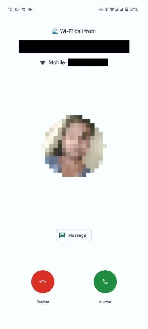
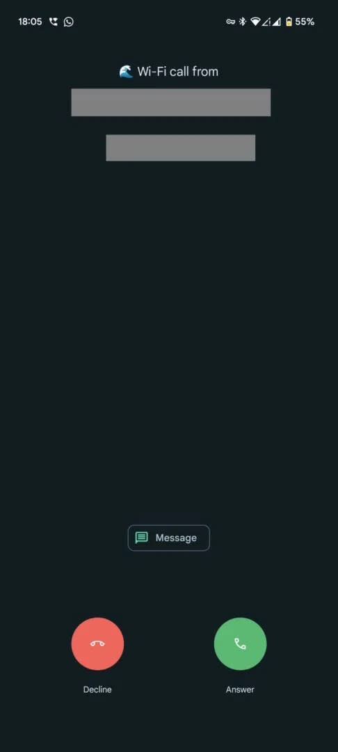
Based on Android Authority’s findings, it looks like Google is testing a new UI for incoming calls that could be released in update version 145.0.672690850. It’s a departure from Pixel’s current system. When a call comes in, you swipe up to answer or swipe down to reject the call. This new interface would do away with the swipe gesture in favor of one answer button and one reject button, just like you would see in an iPhone.
If the layout sounds similar to that of Samsung devices, you’re right — but there’s a significant difference. Samsung puts the decline button on the right and the accept button on the left, whereas iPhone swaps the position of the two.
Android Authority was unable to activate the UI during testing. Google has yet to officially announce the interface, indicating that this update is still a work in progress and that the end result might change based on feedback during testing.
Some fans might find the change odd, but it’s not a huge surprise. Google wants to attract iPhone users and convince them to switch. A familiar interface is an easy way to strengthen that proposition, especially with the Pixel offering lower-cost flagship devices than the iPhone.
However, this change could also indicate a promising, more homogenous future across all mobile devices. Sure, hardware and software will always vary, but there’s no reason basic functionality — like answering an incoming call — should be wildly different from phone to phone.


