Key Takeaways
- The Google app’s shortcut bar used to be crowded with five pill-shaped buttons and lots of text, but the new design has cleaned it up.
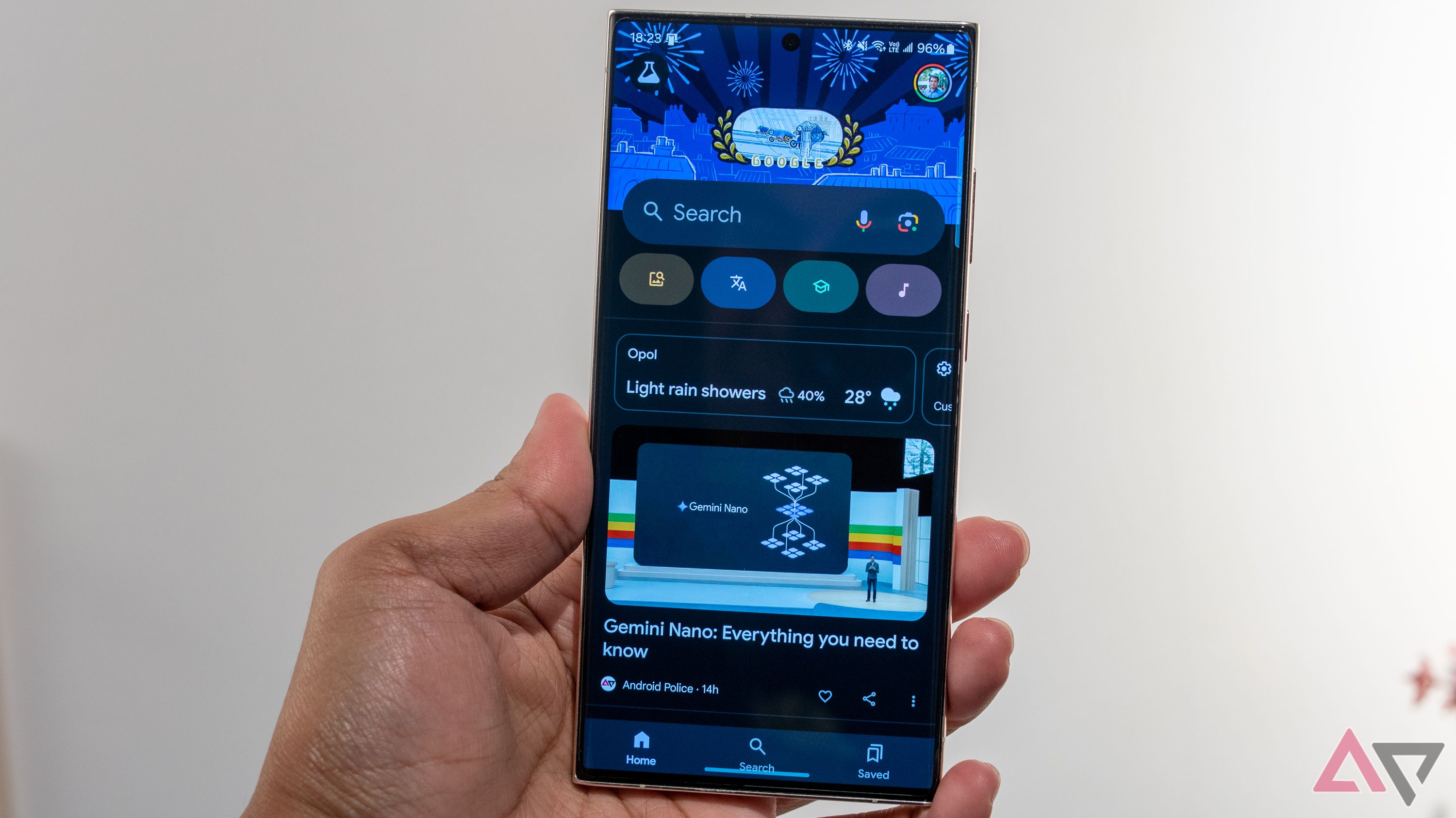
- Beta 15.34 introduces a sleek carousel that uses smaller, vibrant icons instead of text labels.
- The new layout fits all four icons at once, so scrolling is only needed for recent screenshots.
The Google app has been a bit too crowded with all its shortcuts crammed in. Right below the “Search” bar, you’d see five pill-shaped buttons, each with its name, icon, and a brief description. The double-lined text didn’t help with the cluttered look, but a new carousel redesign has made the shortcut bar much cleaner and more organized.
In the Google app beta 15.34 on Android, the shortcut carousel has received a fresh new look that’s both compact and stylish, as spotted by the folks at 9to5Google. The refreshed shortcuts ditched the text labels and shrunk the buttons, which frees up screen space and lets you fit more shortcuts in at once. It’s a nice little upgrade that makes the interface feel a lot cleaner.
Previously, the app used to pack a bunch of clunky buttons for things like searching your photo library, translating text with your camera, solving homework by snapping a picture, and identifying songs by listening, among others.
The updated design scraps the old text labels in favor of smaller, vibrant icons. This makeover makes the carousel look sleek and distinctive too. The icons for Google Lens and Sound Search are at the ends and are clear enough on their own, so no extra text is needed to get their point across.
The Google app’s refreshed shortcut bar is long overdue
A big perk of the revamped Google app carousel is that it shows all four icons at once, so you won’t need to scroll unless you’re analyzing a recent screenshot. It’s puzzling that Google didn’t optimize the carousel to fit all five shortcuts on-screen at once from the get-go. With only a few shortcuts, it seems like they could easily be displayed without the need for scrolling.
Anyway, the updated design is currently being tested in beta, but there’s no set date for when it will be officially released to the stable version of the app.

