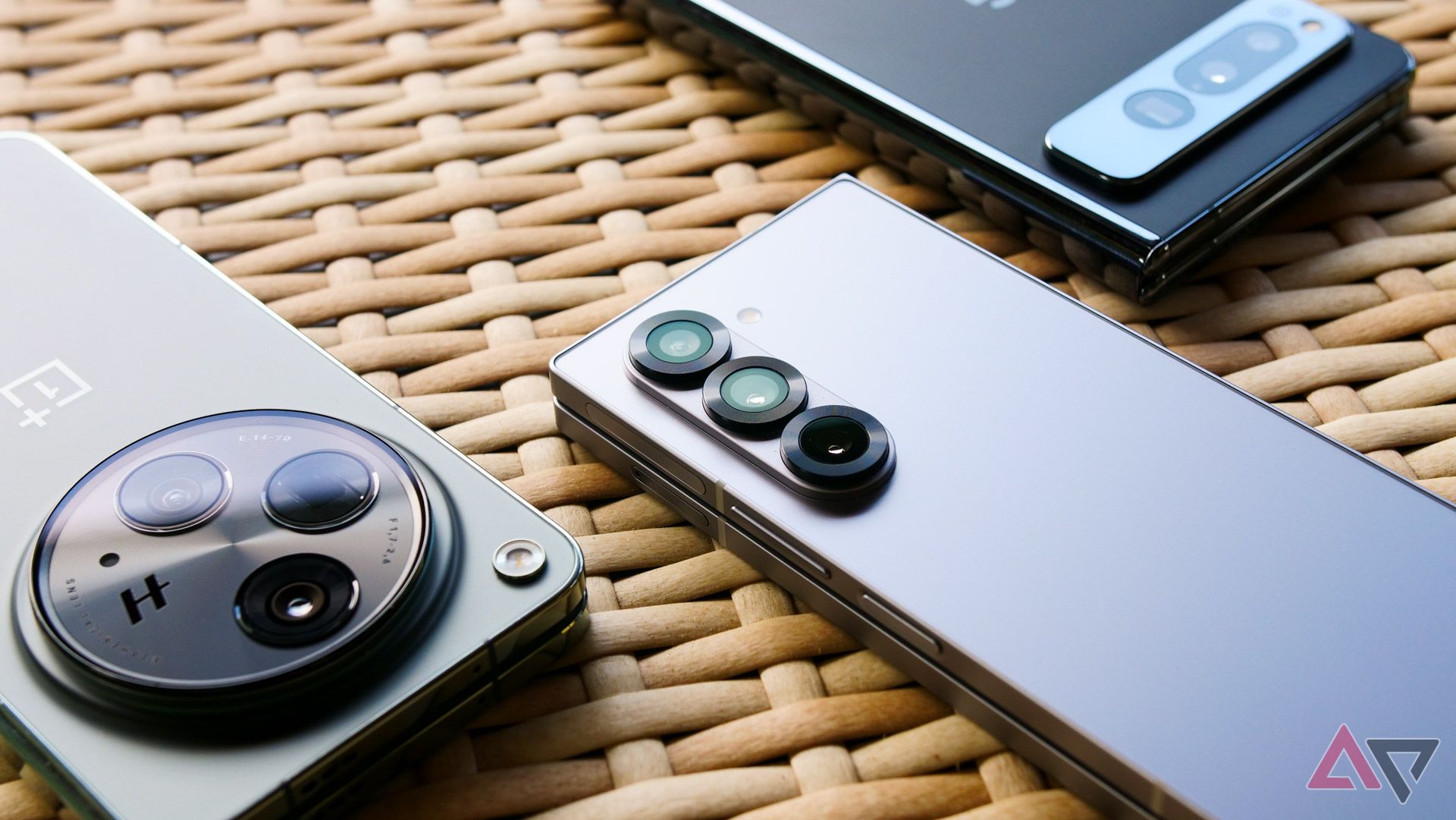
The Galaxy Z Fold 6 is here, and unlike its flippable sibling, Samsung’s brought some real changes to its design this year. It’s thinner, wider, and more premium than ever, utilizing Ultra-esque sharp corners and a matte finish to deliver an excellent experience for the price. It might be refinement, but this year’s Fold makes previous generations feel like beta hardware. But no matter how much Samsung has improved its game this year, there’s one big issue remaining with its flagship foldable: the camera bump.
This phone feels awfully wobbly when it’s on a desk
Maybe a little too much to actually be usable
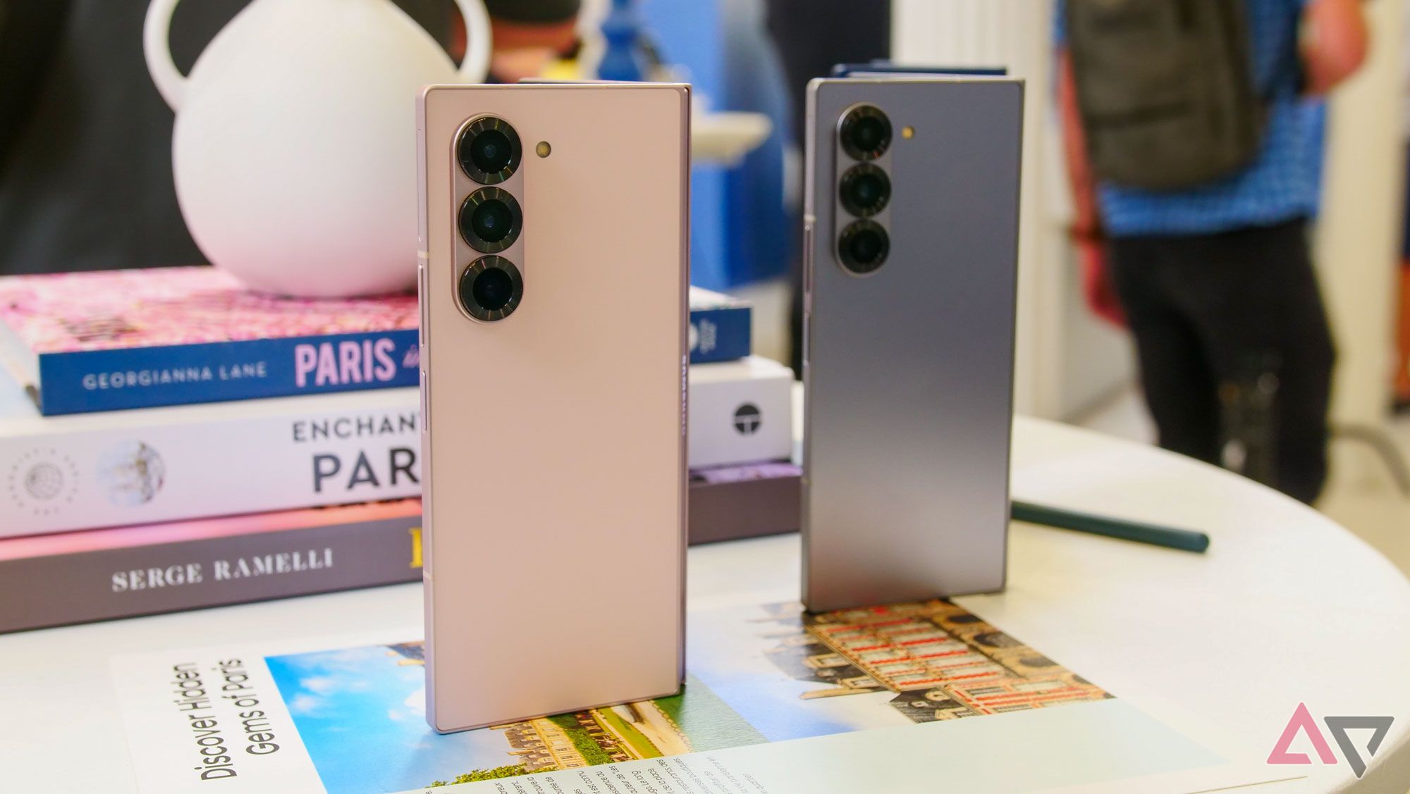
Anyone familiar with the company’s recent smartphone output will recognize the Z Fold 6’s camera module. From the S24 trio to the most recent A-series devices, Samsung has been using three lenses in a vertical arrangement for nearly all of its smartphones in recent years, creating a clean aesthetic that doubles as a unique identifier. The only phones you won’t find using this setup are devices where it’s simply unfeasible, like the Galaxy Z Flip 6 and its dual cover display lenses.
Related
Samsung’s Galaxy Z Fold 6 is another half-step forward for the original foldable maker
All while the competition picks up the pace
On practically all of Samsung’s phones, these protruding, left-aligned lenses cause a certain amount of wobble whenever you place the device on a flat surface. It’s never so bad as to make the device unusable when laying flat, and adding a simple case to your Galaxy S24 — as most buyers do — basically fixes the problem.
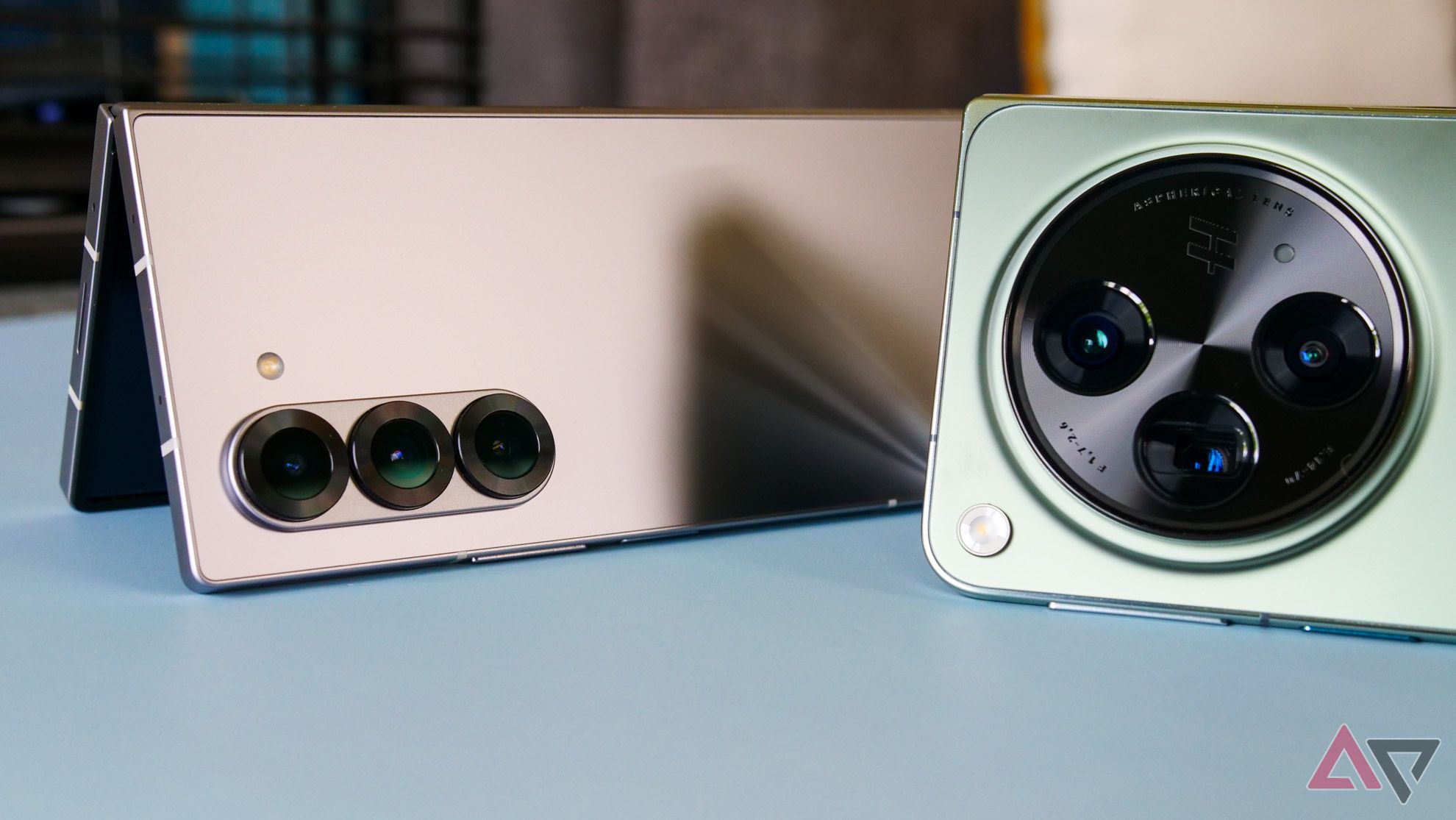
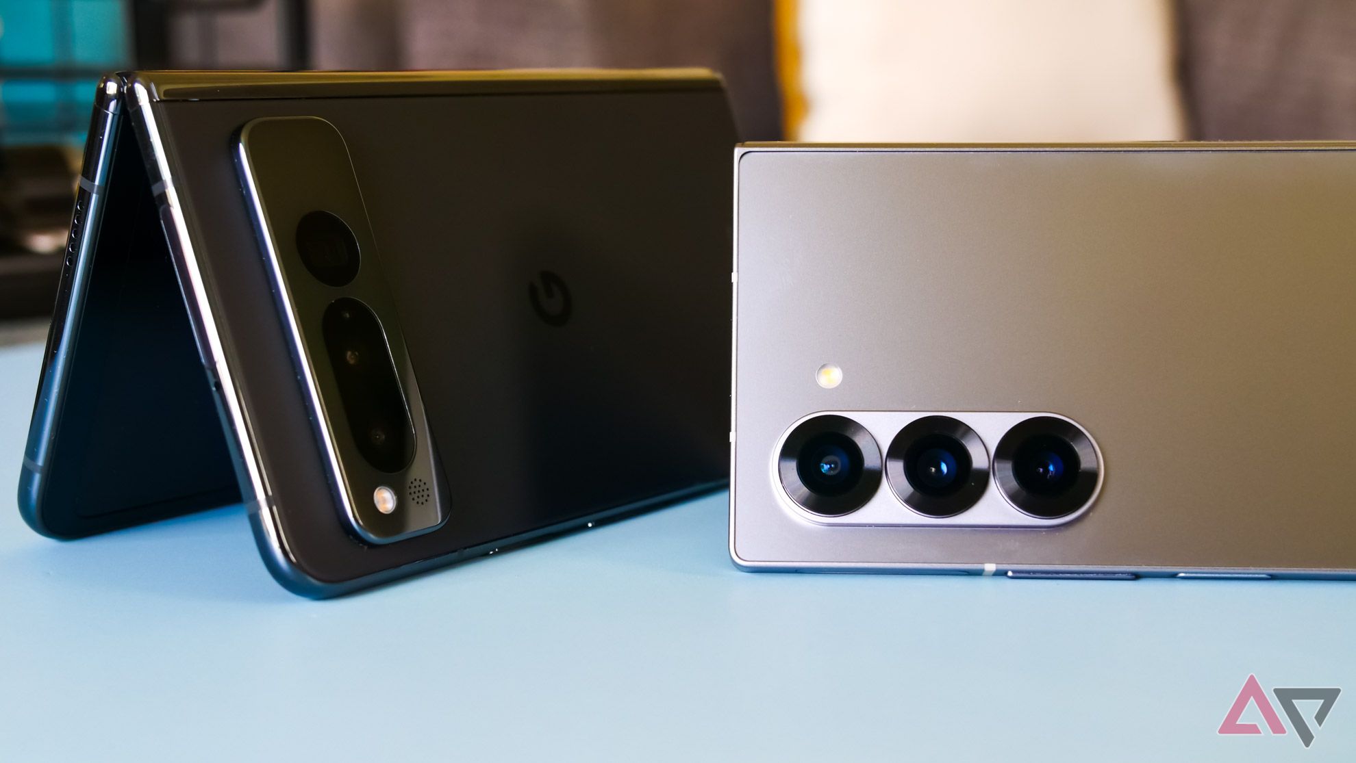
However, because of its thinner chassis, the Fold 6 is practically unusable on a table, particularly when interacting with its updated cover display. Samsung shaved about half a millimeter off of each section of this device compared to last year, and as a result, the camera module sticks out further than on previous generations.
Compare Samsung’s design to the OnePlus Open or Google Pixel Fold and you’ll immediately notice a difference. Both of those 2023 foldables sport centered camera designs (a camera bar on the Pixel Fold, a large circular module on the Open) that effectively lift the phone off whatever surface you place it on. The result is a much better outer display experience, even if all three designs struggle from table wobble whenever their main display is unfolded.
I understand the decision to match design language between phones — as we’ve seen with both the Pixel series and the iPhone, having unique camera designs can act as a brand identifier for your hardware. It’s clear that, no matter the price point, Samsung wants that triple-lens layout to be associated with Galaxy smartphones. But when you already have the Flip series unable to match that look, perhaps it’s worth considering a new approach with the Galaxy Z lineup in particular. Foldables have such a specific look to them anyway; you might as well lean into it with function over form.
It’s a change Samsung should make next year
Whether or not the competition stays its course
Of course, it’s possible the competition might be moving towards Samsung’s direction, no matter how little sense that makes. All of the Pixel Fold 2 — er, Pixel 9 Pro Fold — leaks suggest Google is dropping the camera bar design for something more in line with the pre-Tensor era of its smartphones, no matter how little sense that makes, aesthetically. It’s possible that a square camera bump creates the same issues I’m seeing with this phone, though our early glimpses seem to suggest it can at least lay flat enough on a table when folded open. Only time will tell.
But today, we’re focused on Samsung’s new foldables, not Google’s. Regardless of how future foldable rivals change their design, the Galaxy Z Fold 7 — and beyond — should lean into a new lens layout distinct from the company’s usual camera array. Even just turning its lenses 90 degrees to form a proto-camera bar would result in a device that feels a lot better to use when folded up. If protruding camera lenses will always result in some amount of wobble whenever the main display is in use, at least we can look for a more stable experience in their default state.
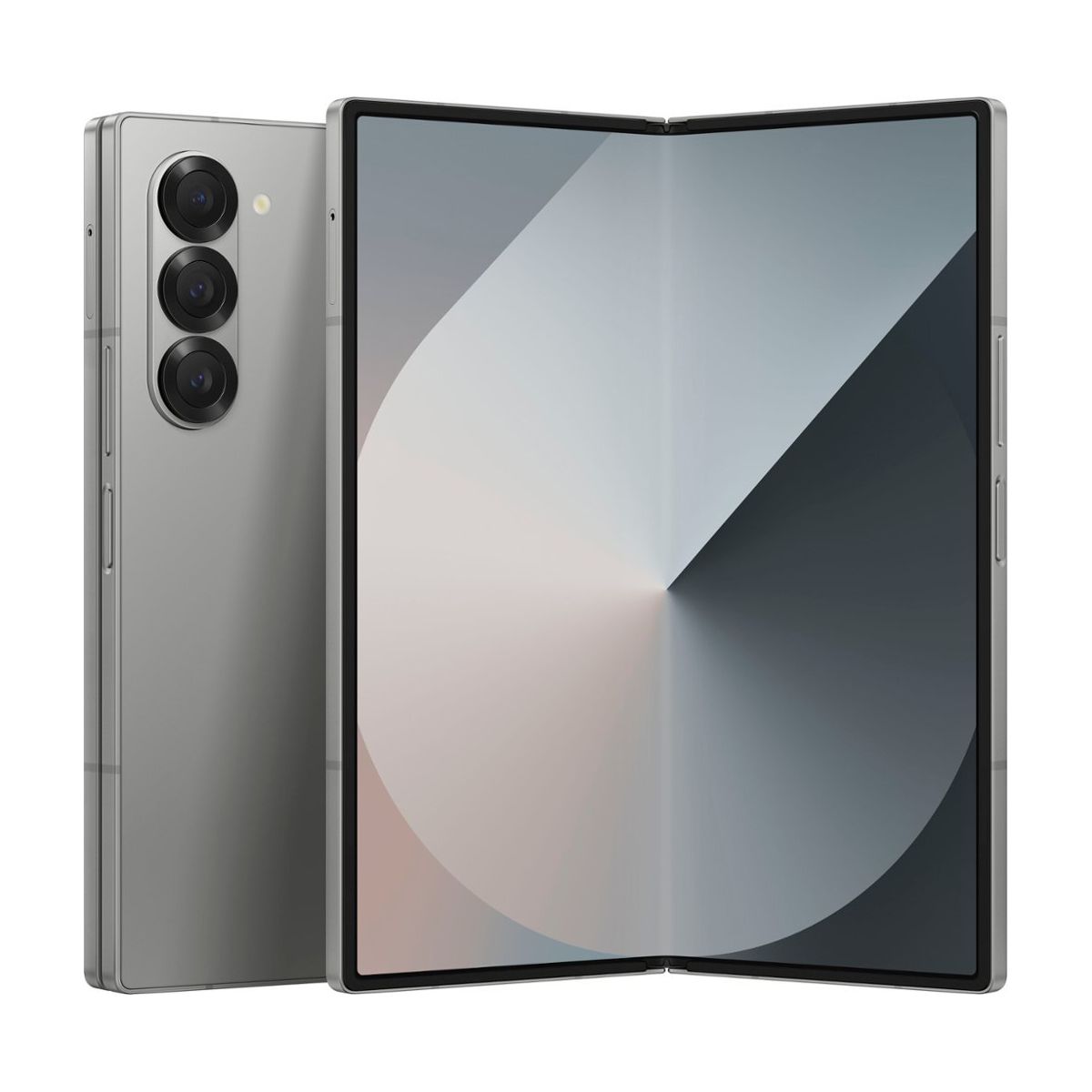
Samsung Galaxy Z Fold 6
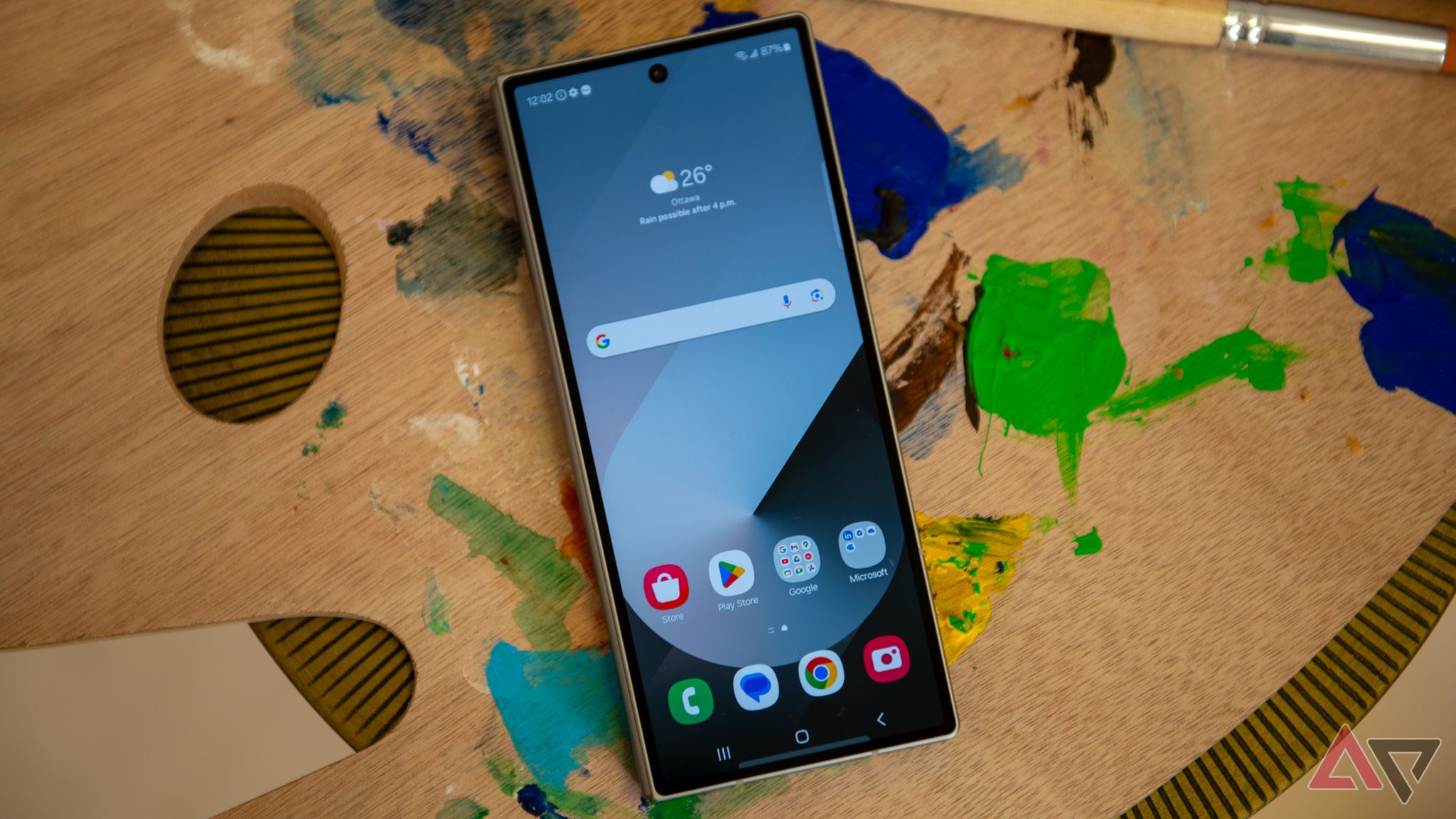
Samsung’s latest foldable takes some cues from the Galaxy S24 Ultra, with a boxier design and an all-matte finish. It features a slightly wider cover display for a more comfortable typing experience, as well as new Galaxy AI features and an upgraded ultra-wide camera.
Related
Here’s how the Galaxy Z Fold 6 got me through six hours of air travel delays
Samsung’s new foldable makes for good company

