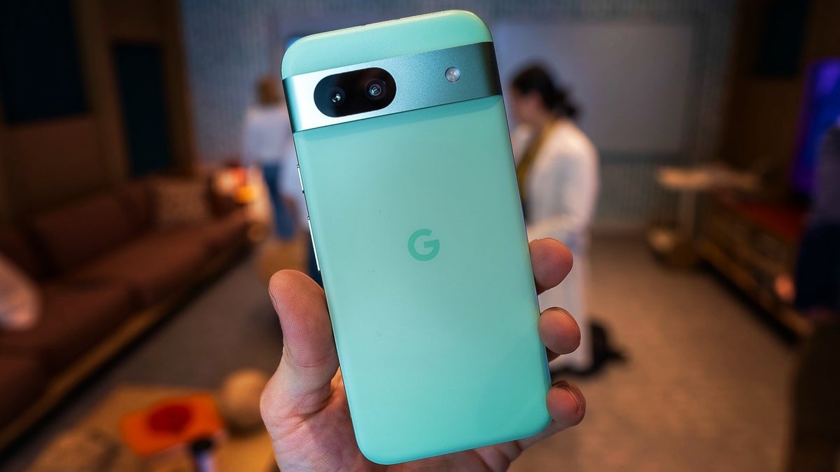
One particular aspect of smartphone design, which seems to unite most people, is display borders. The popular opinion on phone display borders is “the thinner – the better”. It’s as simple as that.
Then again, a less “popular opinion” is that symmetrical display borders should be an even bigger priority. However, not every phone-maker shares either one of those two views.
Take Samsung and Google, for example… Two of the most influential phone-makers in the world aren’t shy to turn back the clock, and make their new Galaxy A55 and Pixel 8a phones look older than their 2019-2021 counterparts – the Galaxy A51 and Pixel 5a.
And I know inflation is high, but I highly doubt it affects smartphone bezel real estate… Which is why I feel obligated to put Samsung and Google on the spot.
Pixel 8a vs Pixel 5a and Galaxy A55 vs Galaxy A51: Google and Samsung’s 2024 mid-range phones look older than their 2019-2021 counterparts
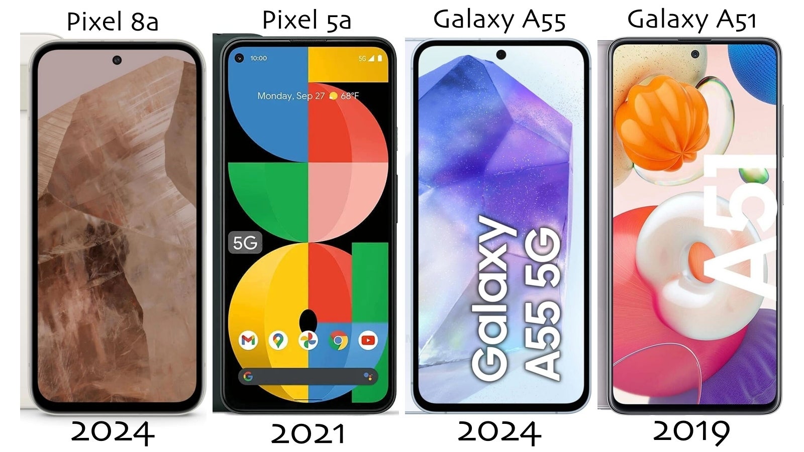
It seems like Samsung and Google continue to downgrade the design of their mid-range phones to make their flagships look better.
For one, this isn’t the first instance of Samsung and Google “rolling back the clock” on their phone designs on purpose. The same happened with last year’s Galaxy A54 and Pixel 7a.
The surprising bit is that, this year, the Galaxy A55’s design remains unchanged, and the Pixel 8a has even thicker display borders than its predecessor, or at least that’s what it looks like due to the new, curvy design of the 8a.
If I was once suspicious of it, I am now pretty much convinced Samsung and Google give their phones thick borders to make them look older, and less premium (than their flagships).
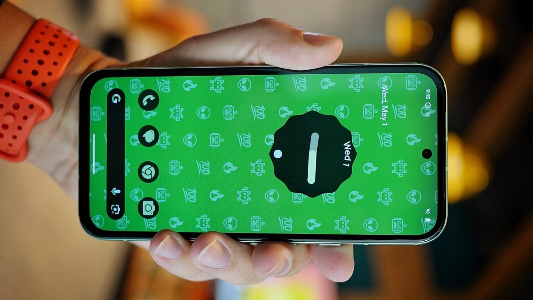

The worst combo? The Pixel 8a’s display borders are both thick and asymmetrical.
If we accept that Samsung and Google simply couldn’t make the bottom bezel as thin as the side and top borders, they surely had the choice to make all four borders the same size – even if they had to make them as thick as the (thicker) bottom bezel.
It might be just me, but I happen to find asymmetrical borders to be far less appealing than generally thicker borders. In fact, we (humans) are wired to look for symmetry in things/other people, so that’s no shock.
Take phones like the 2019 iPhone 11 and the 2022 Nothing Phone 1. Both have relatively thick display borders but both Apple and Nothing have made it a point to give their phones symmetrical borders. In fact, that’s the case with the very first iPhone and Nothing Phone ever to the latest models we have now.
Unlike Apple and Nothing, it seems like Samsung and Google aren’t too familiar with the word “consistency”. Or at least it’s not all that important to them.
Thick display borders make Samsung and Google phones look older but they are not a reason to avoid buying a Pixel 8a; still, it’s not a good look!
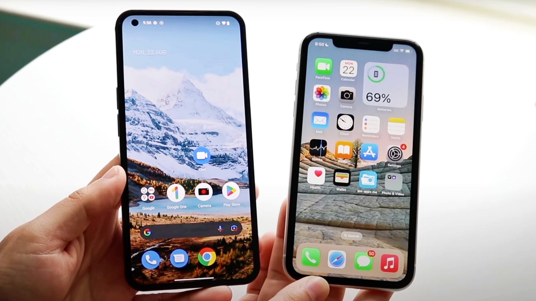

Nothing Phone 1 (left), iPhone 11 (right). Symmetrical display borders make a bigger difference than thin display borders.
In the end, thick display borders might make Samsung and Google phones look older but are they a reason to avoid buying a Pixel 8a? No! Not at all…
I’d still recommend the Pixel 8a to almost everyone looking for a great value phone that literally does everything Google’s $1,000 flagship can do but at half the price.
Sure, the Pixel 8a has the thickest display borders on a $500 phone in years (even $200 Xiaomi phones look far more modern). However, the Pixel 8a offers so much value that I’m able to look past the bezels.
That being said, what “bugs” me is the fact that big players like Google and (especially) Samsung are willing to make their 2024 mid-range phones look less modern than 4-5 year-old phones only so their flagships stand out (and sell more).
I get it – It’s the golden rule of upselling. But it’s not a good look – literally and figuratively.
In fact, I recently argued the new Sony Xperia 1 VI flagship looks just as good or better than other modern phones, and this one has old-school top and bottom borders. However, they are symmetrical and give you a totally uninterrupted display, which feels refreshing in 2024.
Perhaps our protest should start with buying a Sony phone, folks! I mean… I’m not doing it… But you totally should!

