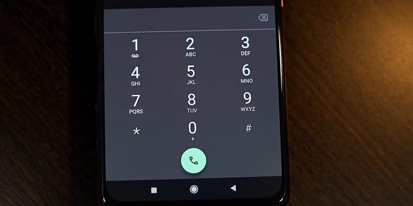
Google is testing a new interface for the Google Phone app that is inspired by the iPhone’s call screen design.
Here’s What We Know
The updated interface will feature separate buttons for accepting and rejecting calls, making it easier for Android users to manage calls. The new layout is still in the testing phase and may not be available for all users at once. Variants of the call screens in the old and new format can be seen below.
Right now in the Google Phone app, you have to swipe up on the phone icon to answer a call and down to reject it. This is different from the interface on iPhones and Samsung devices, where the incoming call screen displays two buttons – to answer and reject the call.
It’s not yet known when exactly the update will become available to the general public, but testing is ongoing. This redesign is part of Google’s efforts to improve its apps and provide users with a more intuitive and user-friendly interface.
Source: Android Authority

