Ryan Haines / Android Authority
I might not be old enough to remember my parents pulling out a paper map in the car when we got lost, but I’m old enough to remember when Apple Maps was the punchline of the navigational world. I remember it sending tourists to the middle of Australia in search of a national park and putting a trench in the middle of the Brooklyn Bridge, and thinking that it must be the worst map ever created. That was several years ago, though, and I’ve heard plenty of good things about Apple’s updates since then, so I figured I’d give it another chance.
With one eye on a family vacation and another on a wedding, I let Apple take the wheel to see how it stacks up against Google Maps. I decided I would use it to guide me to a campsite I’ve been to every year since I can remember (a trip where I’d know if I was being steered wrong) and then follow it up with a less familiar drive across Pennsylvania, where I’d have to trust Apple’s choices. Let’s see how it went.
A map for this, a map for that

Ryan Haines / Android Authority
When you open Apple and Google Maps, you can tell they feel as different as iOS and Android. Apple’s platform only exists within its own ecosystem, so, of course, it feels tailor-made for use on an iPhone. It follows many of the same design cues as Safari, putting the search bar across the bottom edge and listing your favorite locations and recent searches for easy access. Above that, the default map shows the neighborhoods around you, a few well-rated restaurants, and convenient things like points of interest and grocery stores. Tap on one of those locations, and you’ll get a menu of Yelp reviews, pictures (also from Yelp), and a Good to Know section that lets you know if there’s takeout available, whether or not a place is good for kids, and more.
Interestingly, Apple Maps prefers neighborhood names to street names, showing me places like Fells Point, Butcher’s Hill, and Little Italy rather than the roads I’d have to walk to get there. You can also tap on the folded map icon in the corner to open up alternative views like Driving, Transit, and Satellite, but I mostly left mine on the Explore menu as it felt slightly less cluttered.
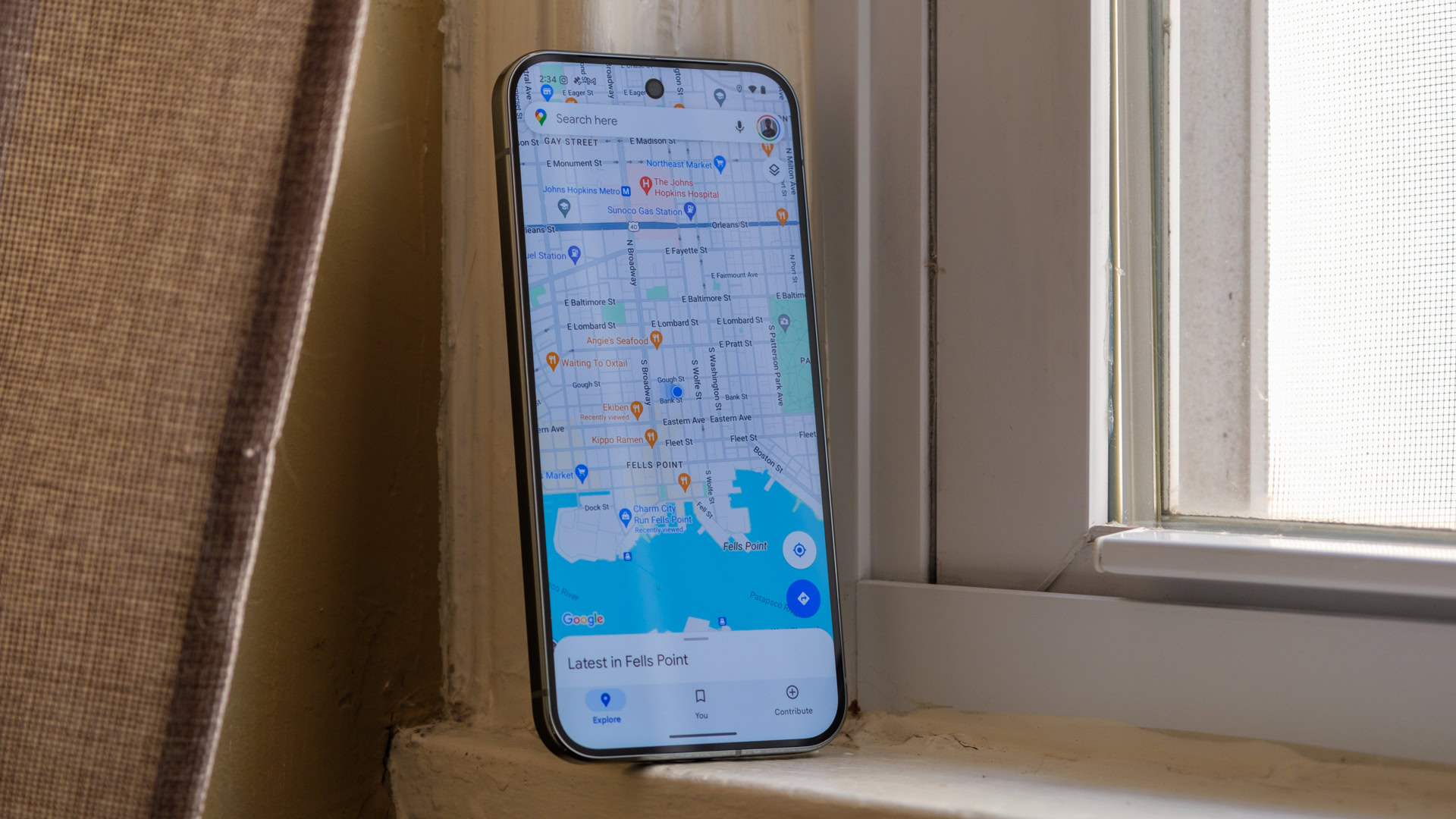
On the other hand, Google Maps feels more like a navigation app that can run on just about any device short of a Google TV — because it can. That’s why it’s been my go-to for years — I know it’ll function on whatever phone I’m reviewing at a given moment. With that, though, Google Maps feels much more like a Google product (hopefully one it won’t kill), featuring a few local points of interest and mixing in locations that have paid for advertising. You can quickly tell the difference, too, as they show up with square icons rather than pins, and they have small highlight blurbs where most locations have nothing.
Google Maps is also far less interested in neighborhood names. On my side of Baltimore, it only highlights Fells Point, Canton, and Highlandtown while skipping the smaller sections I mentioned above. However, it lists more street names, making it easier to pick where to turn if you’re not actively navigating. I’ll also give Google a slight edge for its map detailing options, as you can fine-tune your view for car traffic and cycling lanes and even check on a color-coded air quality map. You can stack your Google Maps details, too, whereas Apple will only show you road traffic or transit options — not both.
Which navigation app do you use most?
756 votes
The search for, well, anything

Ryan Haines / Android Authority
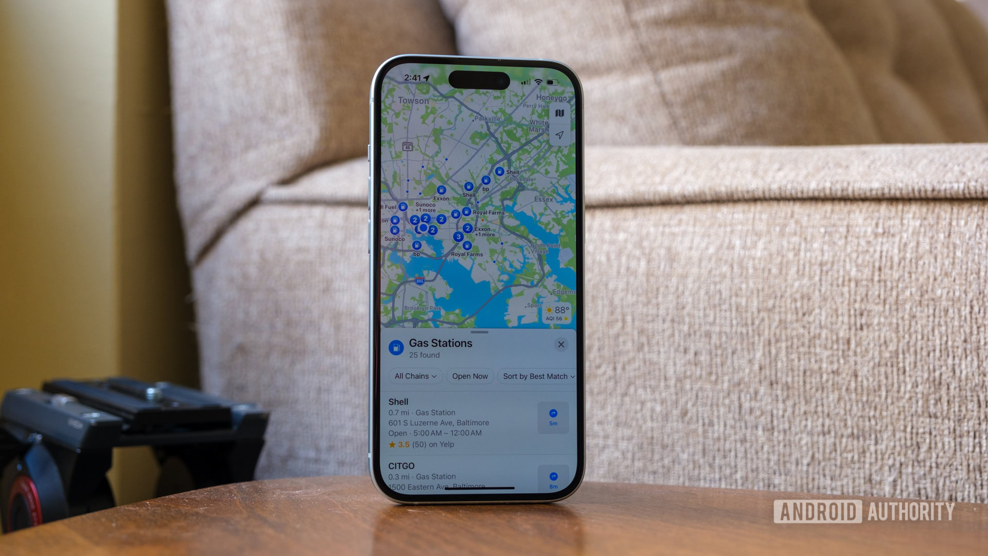
Apple Maps and Google Maps remain opposites once you decide to look for a specific location, too. Google Maps sets a few frequent addresses across the top, like Home and Work, but primarily relies on your recent locations or waits for you to type out a place before it gives a suggestion. For example, I knew I’d have to get gas before setting off for my family camping trip, so I opened Google Maps and had to open the search bar to type “gas near me” before I got a result. Granted, the results aren’t bad — they also listed out the price of a gallon of regular gas — but it takes an extra second to input your search.
Apple will help you find gas, Google will tell you what it costs.
On the other hand, it seems that Apple Maps would rather search for you. Sure, when you open the app, it’ll show frequent locations and recent searches across the bottom — much like Google Maps — but when you go to search for something, Apple gives you a set of quick Find Nearby buttons for lunch, gas, coffee shops, and even parking without having to type a single letter. The interface reminds me a lot of my recent outing with Safari, which means there are probably a few things Google could borrow if it wanted to. If you’re looking for gas, though, Apple Maps doesn’t currently offer updated prices.
I’m also somewhat disappointed by Apple’s set of City Guides, which pops up below the Find Nearby menu. It seems like Apple only spent time on major cities, offering guides to Washington DC, Philadelphia, and New York City near me while skipping smaller cities like Baltimore or Richmond, Virginia. On the one hand, I get that more people are likely to head to a major city, but I’d also point out that there are tons of guides to those locations, while it can be harder to find guidance to a smaller (but in my opinion, better) city — a city like, say, Pittsburgh, where I was headed to celebrate the wedding of friends from college.
I’ve been to Pittsburgh once or twice, but certainly not enough times to be familiar with the Steel City’s offerings. So, I typed in the address for my hotel and then swiped around a little bit to find out what might be nearby. Unfortunately for Google, Apple Maps was far more helpful at finding me a hot bite. Although Google might excel at showing the different buildings throughout Pittsburgh’s Strip District, Apple’s platform showed me more of what was in those buildings, skipping things like apartment rental companies and focusing more on local restaurants and bars. Google Maps showed me one restaurant in The Terminal, a building that stretches from 16th Street to 21st, while Apple Maps gave me four restaurants, a brewery, and two golf simulators in the same structure. By the way, if you actually want to see the streets around you, both apps offer ways to look around.
All roads lead to somewhere

Ryan Haines / Android Authority
And yet, as different as Apple Maps and Google Maps are when you’re looking around, they’re just about identical once you need directions. I typed in the state park where I was headed to meet my family, and both Apple Maps and Google Maps came back with the same suggested route — at least within a mile or two of each other and about a minute apart on my estimated arrival time. The only difference between the two was that Google let me choose my destination within the park while Apple Maps defaulted to the park office (which makes sense as I immediately had to register my car upon arrival).
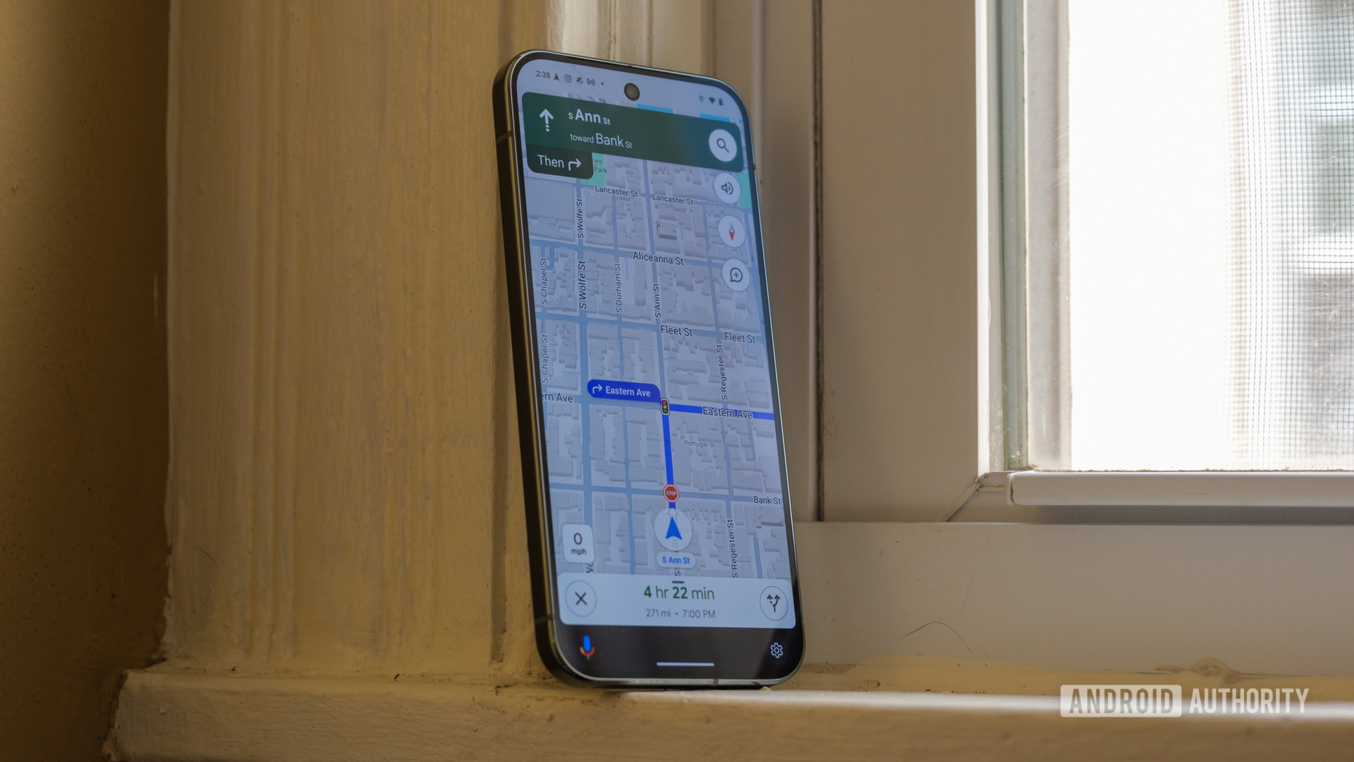
So, with my route pretty much planned out, I hopped in the car and pressed start. Unsurprisingly, Apple Maps and Google Maps behave just about the same once you get on the road. Both list your upcoming turn prominently at the top, with the finer points like your arrival time, remaining mileage, and remaining time across the bottom. Google’s approach is a bit more colorful, though, with your remaining time shown in green, orange, or red, depending on whether or not it’s delayed from the original estimate.
Google Maps also makes it much easier to control your music — even if it eats into the map just a bit. When playing something over Spotify, it appears in a small bar above your arrival time and remaining miles, offering quick controls to pause your song or skip to the next track. On the other hand, Apple restricts its playback to the Dynamic Island, meaning that you have to tap on a much smaller button when you want to change your music — not exactly safe while driving on a multi-lane highway.
Outside of music controls, though, I might prefer Apple’s interface for one crucial reason — it’s far more helpful when switching lanes and finding exits. Yes, Google Maps will tell you which lane to be in and how many lanes are part of the exit, but Apple Maps shows you a three-dimensional version of the roads and exits in front of you so you can match the directions with your eyes rather than quickly trying to count lanes at the last second. It wasn’t the most useful when taking an exit in a small town in upstate New York, but the visualization made navigating Pittsburgh’s confusing set of bridges, tunnels, and one-way streets much more manageable.
Google will tell you where to get off the highway, but Apple will show you what the exit looks like.
And somehow, that’s about it regarding the significant differences between Apple Maps and Google Maps — at least when it comes to a long trip in the car. Otherwise, both will let you know when there’s a speed trap coming, both will let you know if there’s a slowdown ahead, and both will happily tell you to continue straight for more than 100 miles when needed — which is enough to bring a tear to anyone’s eye.
So, I guess I owe Apple Maps a bit of an apology. It’s come a long way in the last few years and hasn’t tried to kill me with an invisible cliff or a misplaced park once. And yet, it won’t replace Google Maps in my life since I review Android phones for a living, and Apple doesn’t seem interested in navigating outside of its walled garden.
