A recent report shows that the newest beta version of the Google Messages app has introduced a new Magic Compose button. Powered by Google’s generative AI, Magic Compose helps you craft responses based on the context of your messages, offering suggestions for how to kick off a conversation, reply, or even rework a draft in different tones.
In the current setup, Magic Compose sits in the bottom row, nestled between the gallery and text field. As you type, it slides out of view behind a chevron.
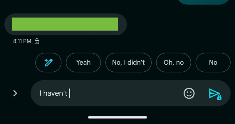
What’s new in the beta version, though, is that Magic Compose shows up in the row of smart replies, even when there aren’t any suggestions. It appears as a pill-shaped message bubble with a sparkle icon located either first or at the far right.
Magic Compose shows up in the row of smart replies when you start typing. | Image credit – 9to5Google
The icon matches the Dynamic Color theme, just like the Send button. Once you start typing in the compose field, the icon switches to Magic Rewrite (a pencil with a sparkle). No big visual changes to the feature itself, though.The old layout, with three buttons squished into one row, felt cramped and often shrank the text box, especially on smaller devices. So, I think Google making this small change to how the Magic Compose feature appears makes it way more accessible and easy to use.
In other Google Messages news, three new changes are on the way to level up your texting experience. Plus, the Gemini Extensions feature for the Messages app has started its gradual roll-out.


