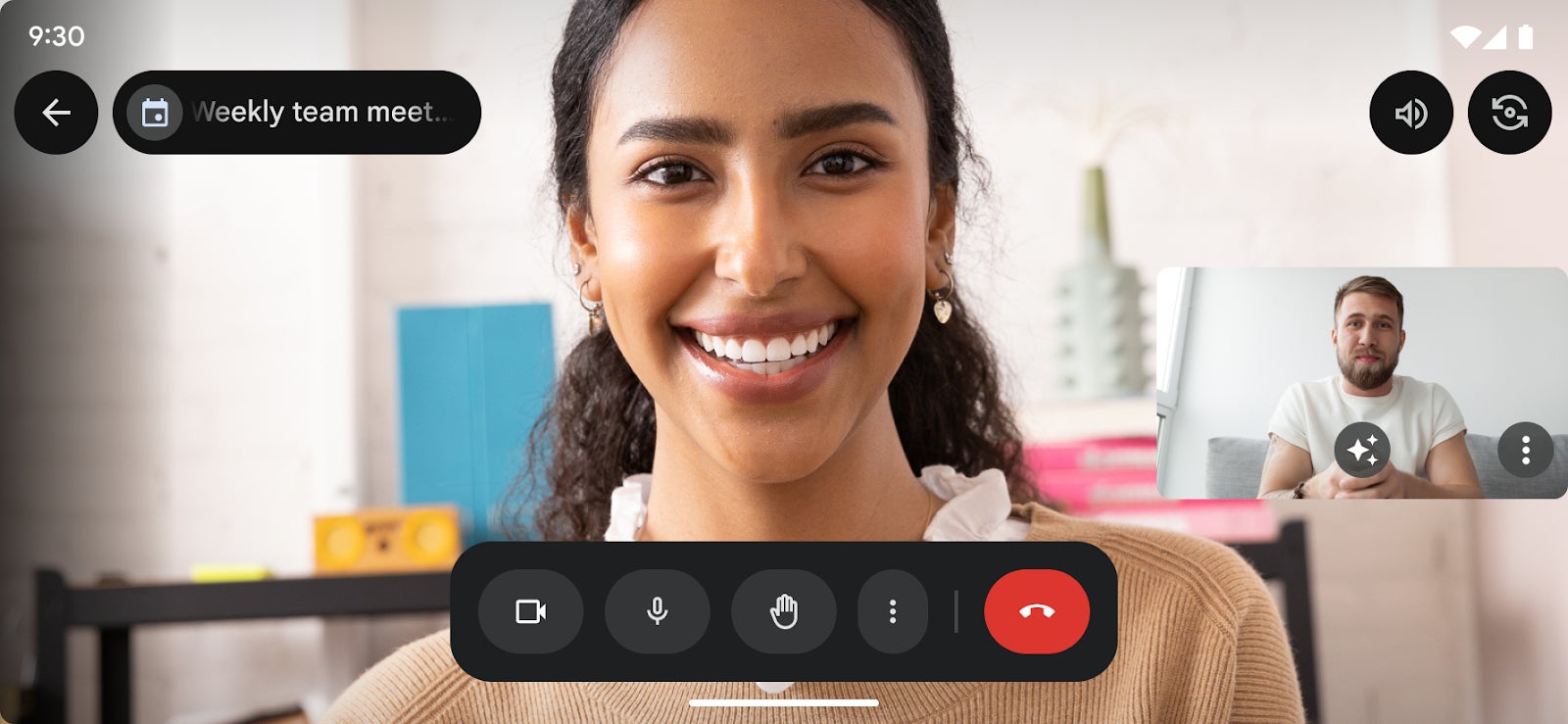
Besides that, Google is now rolling out a sleeker user interface for meeting controls, as well as clearer indicators for information such as the meeting title.
As seen in the screenshots released by Google, all the meeting controls are placed in a box along with other functions like video on/off, mic toggle, overflow menu, wave, and end button.

Google Meet’s new user experience | Screenshot credit: Google
Google will probably continue to fine-tune the improved user experience in the coming months, but the more recent update does indeed provide a better calling experience for those using Android devices.
As far as availability is concerned, Google confirmed that the improved users experience for Meet users on Android devices has already been rolled out to everyone.


Google Meet’s new user experience | Screenshot credit: Google

