Key Takeaways
- Google Meet’s updated Android app brings Material Design 3 elements for an enhanced user experience.
- The ‘New’ call page has been renamed to ‘Start a call,’ featuring a revamped layout and a new ‘Suggestions’ row showing recent contacts.
- This design has existed on the enterprise version of Google Meet since last year but is now expanding to all Meet users.
Google Meet is one of the most popular video chat apps today and with good reason. On top of providing excellent enterprise-related features through its mobile and web apps, Meet also offers a refined video call interface for non-paying customers on the Android app, as we saw recently with the call screen redesign. The Google Meet team is back with another redesign, but this time for the new call page, which is now named “Start a call.”
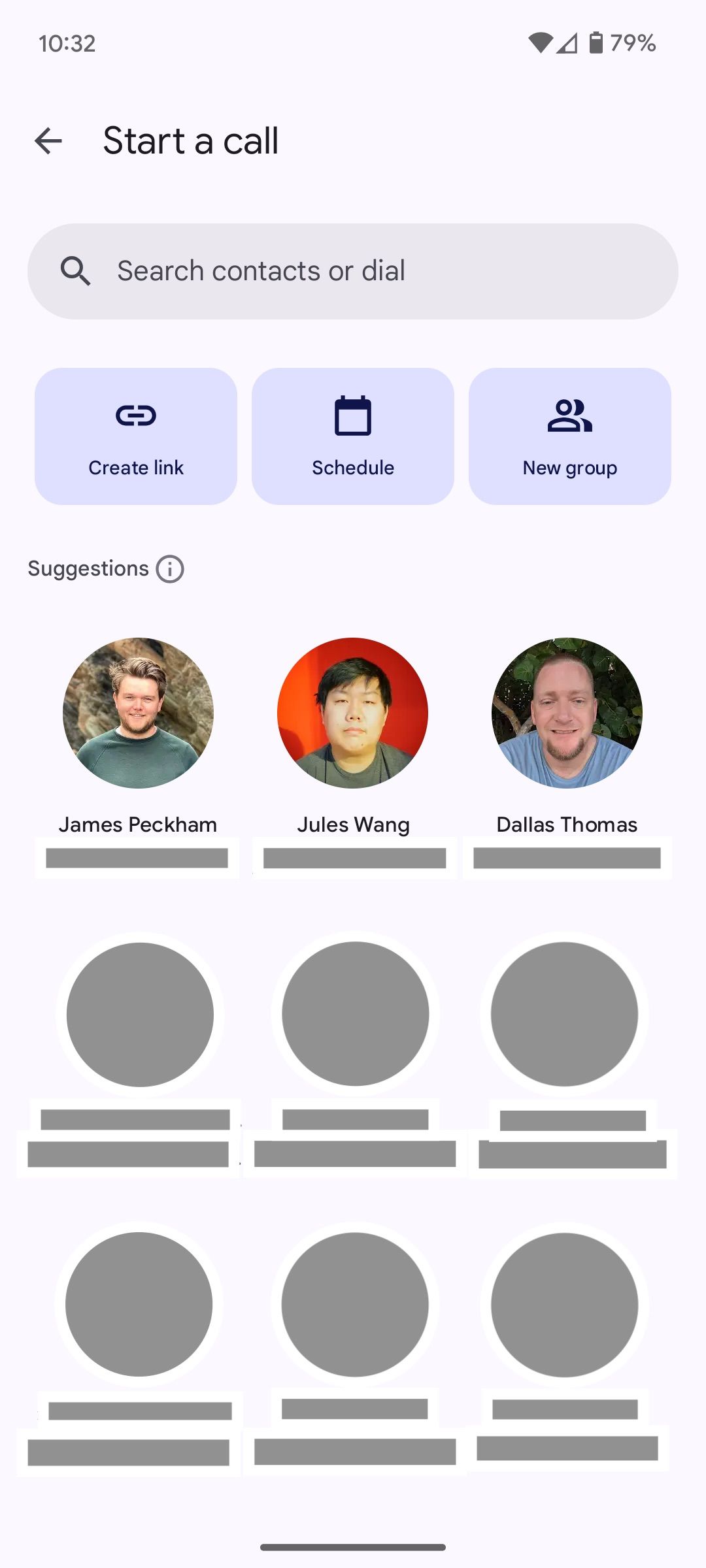
On Google Meet for Android, tapping the New FAB (floating action button) in the bottom right of the home screen opens the page where you select which contact(s) to call, previously known simply as New. However, with this new redesign, tapping the FAB opens a revamped Start a call page with apparent Material Design 3 elements, including a pill-shaped search bar (Search contacts or dial), and horizontally placed large buttons named Create link, Schedule, and New group right below (via 9to5Google).
In its previous form, these options were placed one below the other, with more descriptive wording, such as “Create a new meeting” and “Schedule in Google Calendar.” These options are more concise now following this redesign of the Google Meet app for Android. Users with a custom domain email on Meet will notice that the updated Start a call page lacks the New group option, with only Create link and Schedule appearing.
A handy new Suggestions row

Old new call page vs the redesigned Start a call page
The other significant change here is the addition of a Suggestions row with large contact options, complete with a circular profile image/avatar, name, and email or phone number. This section takes up more space than the older, vertical layout. However, it’s definitely better as it recommends recent contacts first, whereas the older version only offered a basic list of all contacts in alphabetical order.
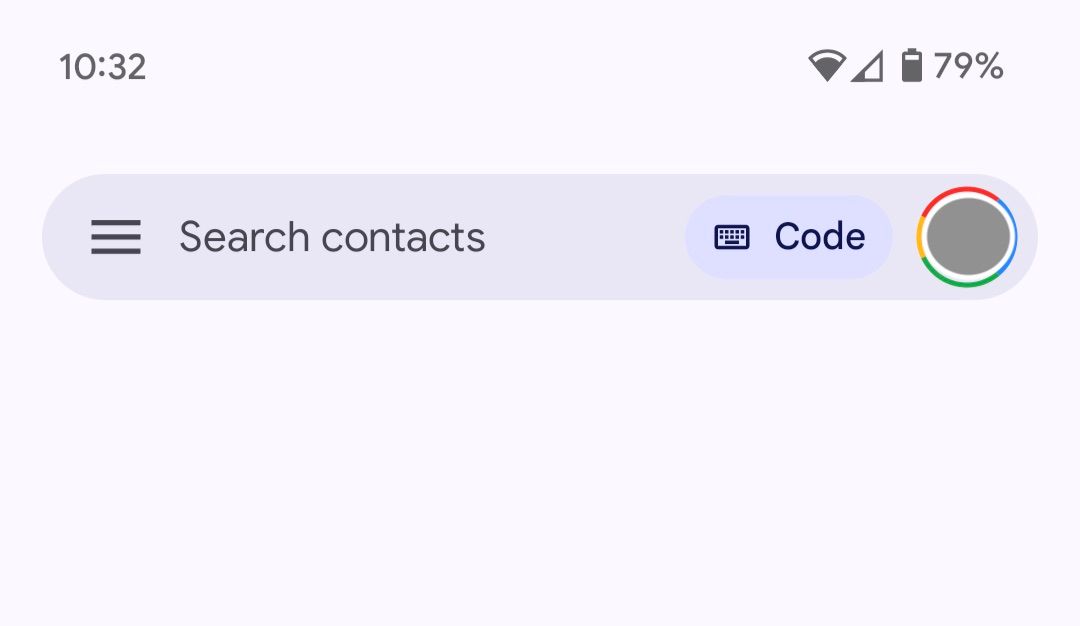
Lastly, Google is also incorporating a Code shortcut within the Meet app’s search bar. This option allows users to join meetings conveniently using either a code or a nickname. These changes have already been part of the Google Meet enterprise experience since late last year, as 9to5 notes, but they’re now available to all Google Meet users, regardless of their subscription tier.


