Google Maps and Waze are the world’s most popular navigation apps, and they are often considered each other’s alternative. Users who want to give up on Google Maps typically end up installing Waze, while users who are disappointed with Waze adopt Google Maps.
Google Maps has become an all-in-one mapping platform that offers much more than navigation. If you want offline maps, satellite maps, and overall cleaner UI, Google Maps is the right choice. Waze is still focused on traffic navigation, allowing users to send traffic reports and generate warnings for everybody else. Waze requires an Internet connection, doesn’t have offline maps or an offline mode, and sports a cartoonish and colorful UI that looks and feels cluttered.
People have been comparing Google Maps and Waze since forever, and while it’s obvious they come with different features but a similar goal, choosing the right app doesn’t always come down to the feature lineup. If you just want to get from where you are to where you want to be without caring about traffic reports, offline modes, and other extras, you’re mainly interested in an app that just works.
That’s the purpose of this article. I won’t compare Google Maps and Waze from a feature perspective. I’ve done that already, and everybody is already familiar with what each app can do. Instead, I will detail the user experience after many years of using both, and I invite you, my readers, to join the conversation using the comment box below. Considering this article is based on my user experience, I could be subjective occasionally, so it’s important to hear from you on this one.
To better detail the user experience with Google Maps and Waze, I divided this article into five sections.
Chapter 1: The user interface
One of the most important parts of a software application is how it looks. Every app needs a straightforward and clean UI that makes it easier to use. Nobody likes cluttered interfaces, and most certainly, nobody likes to be forced to learn using an app.
All these points are twice as important for navigation apps. The interface must be clean and easily readable, as the driver shouldn’t need more than a glance at the screen to get the information they are interested in.
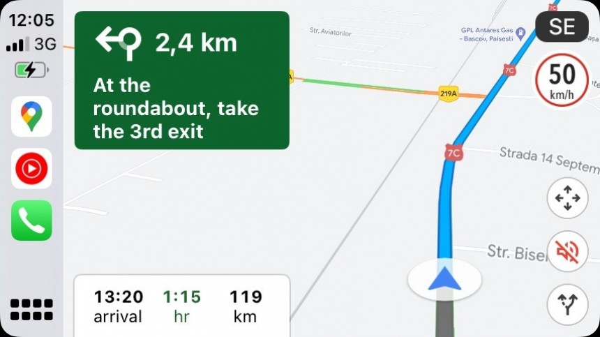
Google Maps wins here. While the latest redesign, which included new colors and updated colors in the daytime and night modes, wasn’t everybody’s cup of tea, Google Maps is overall easier to use. It allows you to easily see the map, the route, and the next turn, and the UI makes even more sense on a larger screen, such as on Android Auto and CarPlay.
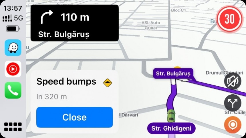
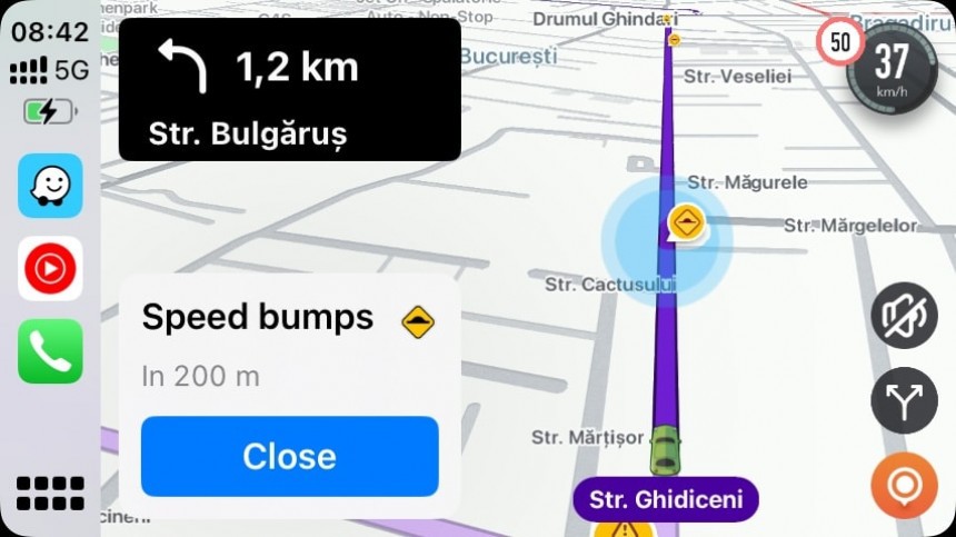
Waze sticks with an approach that I still find childish. The cartoonish and colorful UI made sense many years ago, but the new and modern design languages propose cleaner and more modern visual styles. Waze keeps spamming users with non-critical information, such as other users’ moods, so I found myself tweaking the UI just to get a simplified and cleaner experience.
Chapter 2: How navigation feels
I regularly use Google Maps and Waze, and the most obvious thing anyone can observe is that navigation feels more straightforward and convenient in Google Maps.
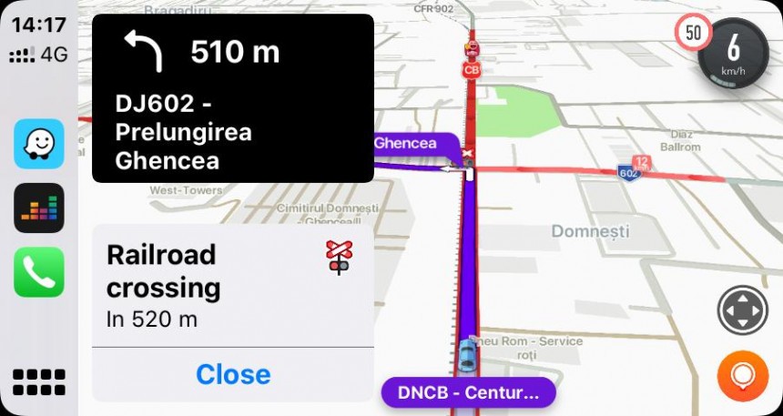
Waze throws more data at the user, and while I agree that this is its top selling point, the navigation experience should be substantially simplified. When navigation is enabled, users are mainly interested in which way they need to go, and while reports help make the road more predictable and safer, they could also increase distraction if drivers keep looking at the screen.
This is why audio alerts should always be enabled, though it’s not a secret that infotainment software like Android Auto and CarPlay makes people take their eyes off the road more frequently, even for less than a second.
Due to the traffic reports, which I agree are what makes Waze special and significantly contribute to a safer driving experience, the overall navigation experience feels more intrusive. To deal with this, I disabled audio alerts when I drive with Waze on the screen so I can focus on the road without notifications “forcing” me to take my eyes off the road.
Chapter 3: The glitchy navigation
Nobody wants their navigation app to stop working in the middle of the drive, leaving them without guidance to follow the suggested route.
Unfortunately, a flawless navigation experience is something many of us still dream about. Both Google Maps and Waze glitch in the most awful moments, even when running on Android (people assume that a Google app is more stable on a Google operating system, but this is not the case).
However, many of these issues are caused by GPS connection problems or the device itself. While I agree that Google sometimes ships botched updates, they have become rarer in recent years.
The most concerning part of the story happens on Android Auto, where the experience with Google Maps and Waze is terrible. The apps often malfunction, and the culprit is often impossible to determine.
Google never seems to be in a rush to ship fixes, and this approach causes more frustration in its community. Google Maps and Waze users often jump from one app to another, looking to avoid bugs and sometimes struggling with other issues.
Chapter 4: The lack of features
I promised that I wouldn’t talk about what one app does better than the other, but I still must mention that both products lack essential functionality that users would otherwise expect in such advanced software.
Google Maps doesn’t have a speedometer for all users. As I explained not long ago, Google has quietly started enabling the speedometer for more users, but it’s still unclear why the feature is not broadly available.
Before you ask, it’s not a legal issue. Google Maps doesn’t have a speedometer where I live, while Waze offers this feature. We have two Google products, one offering and one lacking an essential feature, so nobody can tell why the search giant doesn’t enable it for everybody running Google Maps.
Waze doesn’t have an offline mode, and while the parent company’s reasoning makes sense, users driving in regions with a spotty cellular signal still expect more. Waze needs an Internet connection to download and upload traffic reports, and once it’s no longer online, the app can only follow the enabled route without updated data. Once you miss a turn or go on a different route, Waze can’t reroute until it returns online.
Chapter 5: Update frequency
Many people don’t care about update frequency if their apps are stable and reliable, but this is exactly why Google Maps and Waze need patches to be delivered to devices faster and more efficiently.
As I said earlier, Google Maps and Waze are sometimes glitchy, and Android Auto users know this best. However, patches land at a painfully slow pace.
Google Maps typically gets updates faster, including on iPhone. The application received five updates in May and four new releases in June. Waze receives rarer updates, sometimes without even addressing widespread issues. Waze has been updated once in May and twice in June.
Unfortunately, the dev team working on Waze is painfully slow at fixing even the most pressing problems. Last year, a glitch that wreaked havoc on CarPlay, causing Waze to take over the audio control on the platform even when the app was not in focus, was only fixed a few months after it became widespread. Waze typically ships updates once a month, and the company doesn’t seem interested in accelerating the release cadence when emergency patches are needed.
Google Maps feels more stable and gets updates faster on Android and iOS.


