Key Takeaways
- The Gemini app for Android is getting a new design that makes it look cleaner and less cluttered.
- The new design removes the carousel of suggested prompts and the recent chats section, adding a chat icon instead.
- The most significant change is the bottom input bar, which is now more compact and efficient.
Gemini has seen several upgrades this year, including rebranding from Bard to Gemini and the release of updates like Gemini 1.5. While backend improvements have been continuous, the service’s app and web user interface have largely stayed the same since its debut. However, after making minor tweaks to the web UI, it seems a sleek, modern design for the Gemini app on Android is finally on the way.
It’s been a few days since the Gemini app on Android received the Gems integrations, but now the reliable leaker AssembleDebug has spotted potential design changes (via X/Twitter) coming to the app. The screenshots suggest that the Gemini app could adopt elements similar to the web redesign, resulting in a cleaner, less cluttered look. The new UI may feature a more compact bottom bar, among other changes.
A sleeker, modern Gemini app redesign for Android could be on the way
Source: AssembleDebug/X
The screenshot of the new Gemini app UI reveals some significant changes. Most notably, the carousel of suggested prompts at the top of the screen, which is present in the current version, is absent. The carousel was recently removed from the web version in September 2024, and although it can be hidden in the current app, it seems the Android version will soon adopt this change.
Additionally, the recent chats section, which appears below the suggested prompts in the current design, is also missing in the new UI. However, this could be because AssembleDebug had history disabled or cleared for the screenshot. Nonetheless, it appears that Google will add a new chat icon in the top left corner to provide access to the list of recent chats.
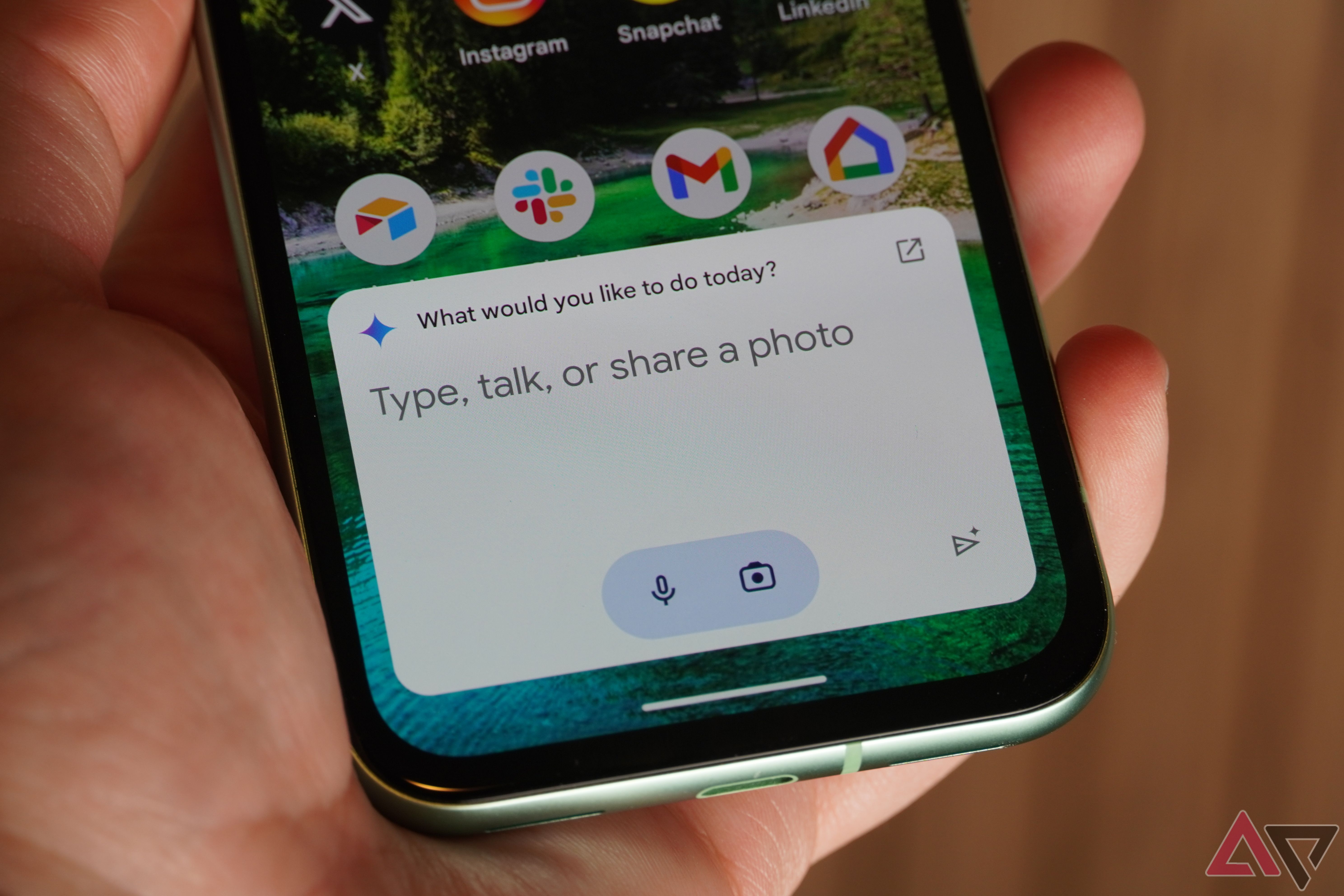
The most significant change in the Gemini app redesign appears to be the bottom input bar. The current version features a large bar that inefficiently uses space, making the interface feel cluttered. In contrast, it appears that the redesign will bring a fresher, more compact look with the attach button, text input, microphone button, and camera button neatly next to each other in the input field. The Gemini Live button would sit right beside the input field.
It seems Google is also adjusting the wording in the Gemini app. Currently, the app prompts users with “Type, talk or share a photo to Gemini,” but the upcoming redesign might simplify this to “How can I help you?” — similar to the recent changes on the web version. While the new UI design for the Gemini app isn’t widely available yet, 9to5Google reports that some users have already started to see these updates, which means Google could be rolling it out gradually as a server-side update.

