Key Takeaways
- A new beta UI makeover shrinks the Gemini floating panel into a sleek bottom-aligned text box.
- The tweak hides the redundant keyboard button and relocates suggestions within pills on the left.
- The tech giant is also working on revamping the Gemini extensions page on Android with a category carousel.
Earlier this year, when Google’s Gemini Assistant for Android was still in its infancy, it received a solid quality of life upgrade that made it functional as an overlay. Previously, when you’d call on the assistant on your mobile device, it would appear as a floating panel, but then transition to the full window app when asked to complete a task or answer a query.
In August, however, Google updated the app to maintain its floating window while answering queries, allowing users to interact with the assistant without having to leave the app they were on. Around the same time, the floating overlay also received a subtle glow around its edges.
‘Ask about this video/screen’ also made their way to the assistant back in August, followed by a Dark Mode UI tweak in October. Since then, the app hasn’t really received a major UI tweak, but it looks like Google does have a significant change on the way.
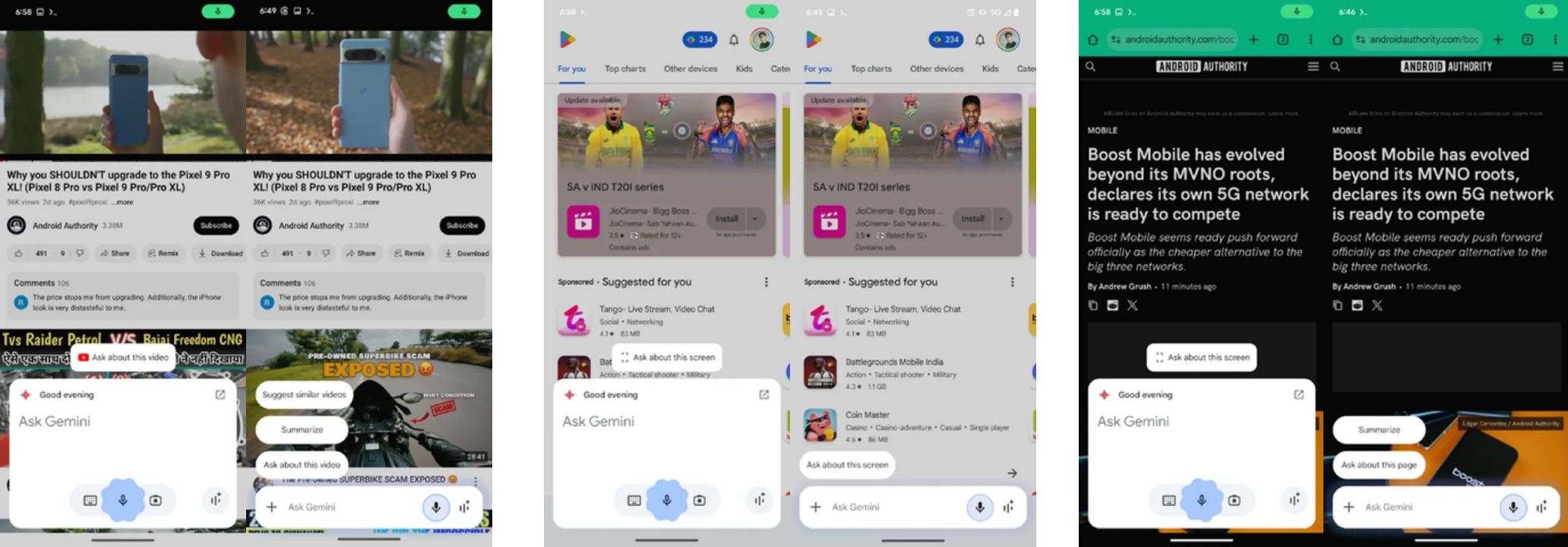
As spotted by credible code sleuth Assemble Debug in a report for Android Authority, Google is working on a makeover that shrinks the floating panel into a sleek-looking bottom-aligned text box. The change was spotted in the Google app (version 15.45.33/34.ve.arm64 beta).
The extensions page is getting a makeover too
Source: Android Authority
As seen in the screenshots above, the change essentially makes the panel look like a minimized version of itself, complete with add-ons like ‘Ask about this video,’ ‘Ask about this screen,’ ‘summarize,’ and other suggestions now aligned as pills on the left. The new UI hides the keyboard button, which was essentially redundant considering that it’s only role was to bring up the pop-up keyboard — something that can already be done by simply tapping the text box once. The tweak also hides the camera button, which likely now sits within a new ‘+’ menu on the left of the minimized text box. Lastly, the Gemini Live button is still accessible on the right.
Elsewhere, while not as major as the overlay redesign, Google is also reportedly revamping the Gemini extensions page on Android. The page, which currently lists extensions in alphabetical order, will feature a carousel with extension categories in a future update, making it easier to find extensions based on your “Productivity,” “Communication,” “Device Control,” “Travel,” “Media,” or “Learning” needs.
This comes on the heels of Google potentially releasing a standalone Gemini app for iOS with support for Gemini Live.

Related
Google Gemini could soon get a dedicated iPhone app
Google is testing the app in one country


