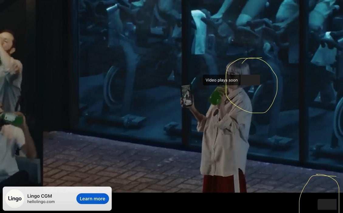
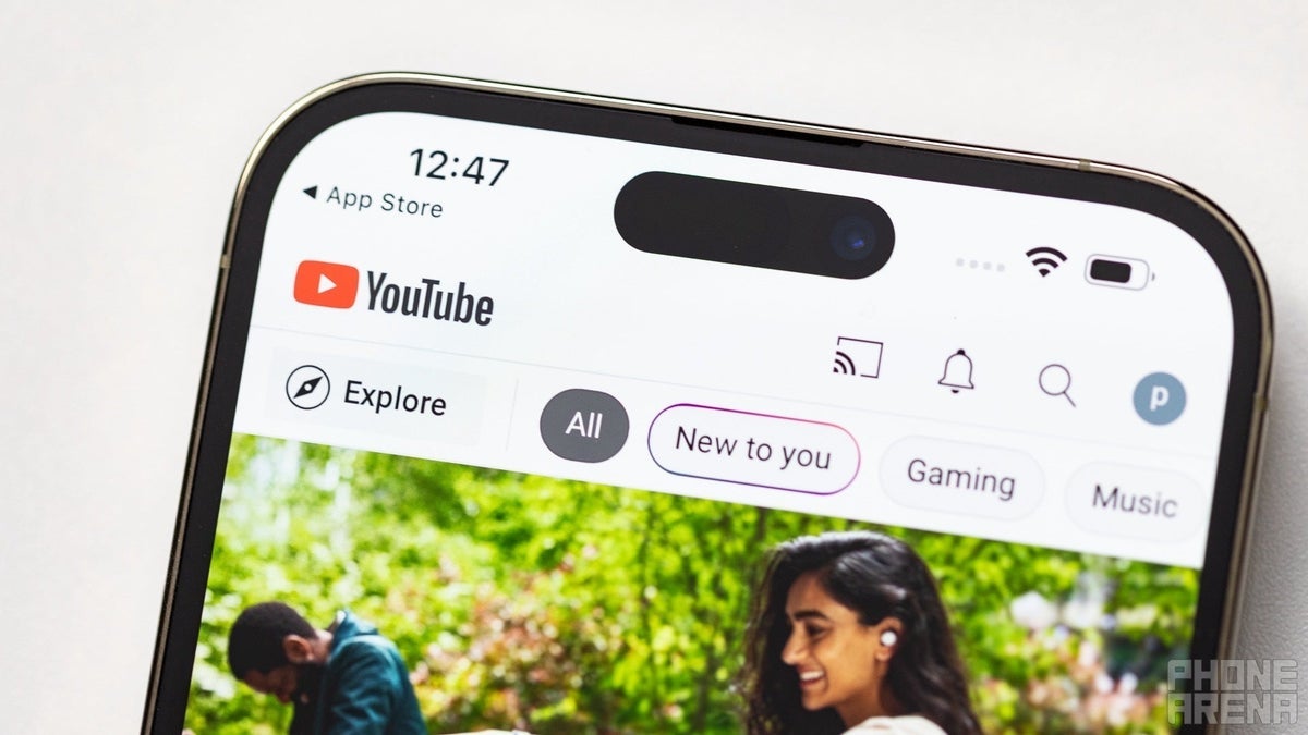
If you watch YouTube often, whether on mobile or desktop, you might have noticed a change to the Skip button that users press when they can halt an ad and move on to the content that they selected to view. On mobile, the usual countdown to the Skip button has gone missing on both iOS and Android. So instead of the countdown timer, you see the full ad until the Skip button pops up. On the desktop, some report seeing dark rectangles where the timer would normally be found.

The countdown timer leading into the Skip button is now missing on mobile and desktop YouTube. | Image credit-PhoneArena
The YouTube spokesperson said that the Skip button isn’t going away even if the seconds leading up to its appearance have changed. Falodun noted that YouTube is “reducing elements on the ads player” so that “viewers can engage more deeply with the ad through a cleaner experience.” Instead of a rectangle covering a small part of the ad (which, to be fair, could be distracting), a progress bar on the bottom of the screen could replace the countdown timer on both desktop and mobile.


On the desktop, the countdown timer was replaced by dark rectangles. | Image credit-Reddit
The concern that some have is that removing the countdown timer is a precursor to a future decision by Google to remove the Skip button altogether which would force YouTube users to wait for an ad to completely finish before they could watch the video they selected to view.

