Key Takeaways
- Google Discover may undergo a redesign with individual cards for each item and no line dividers for topics.
- The redesign also includes taller images, a new card type for suggested topics, and some inconsistencies, like the two overflow menus.
- These changes are part of the latest Google app beta and are not widely available as of now.
Google Discover is available on most Android phones on the market today. It’s a useful tool to help you get up to speed on the top news stories of the day or other topics of interest. This customizable experience is available via the Google app as well as the Android home screen. Discover is not one of those Google products that sees a lot of updates or changes, with the last significant change we encountered being the under-development Updates from searches function, which hasn’t widely rolled out yet. Google is now experimenting with some Material You design modifications for topics that appear on Discover.
The current appearance of the Discover feed has remained largely unchanged for a while now. But with this Material You redesign first spotted by 9to5Google, each item has its own card, which means that the horizontal line separating the content has also vanished.
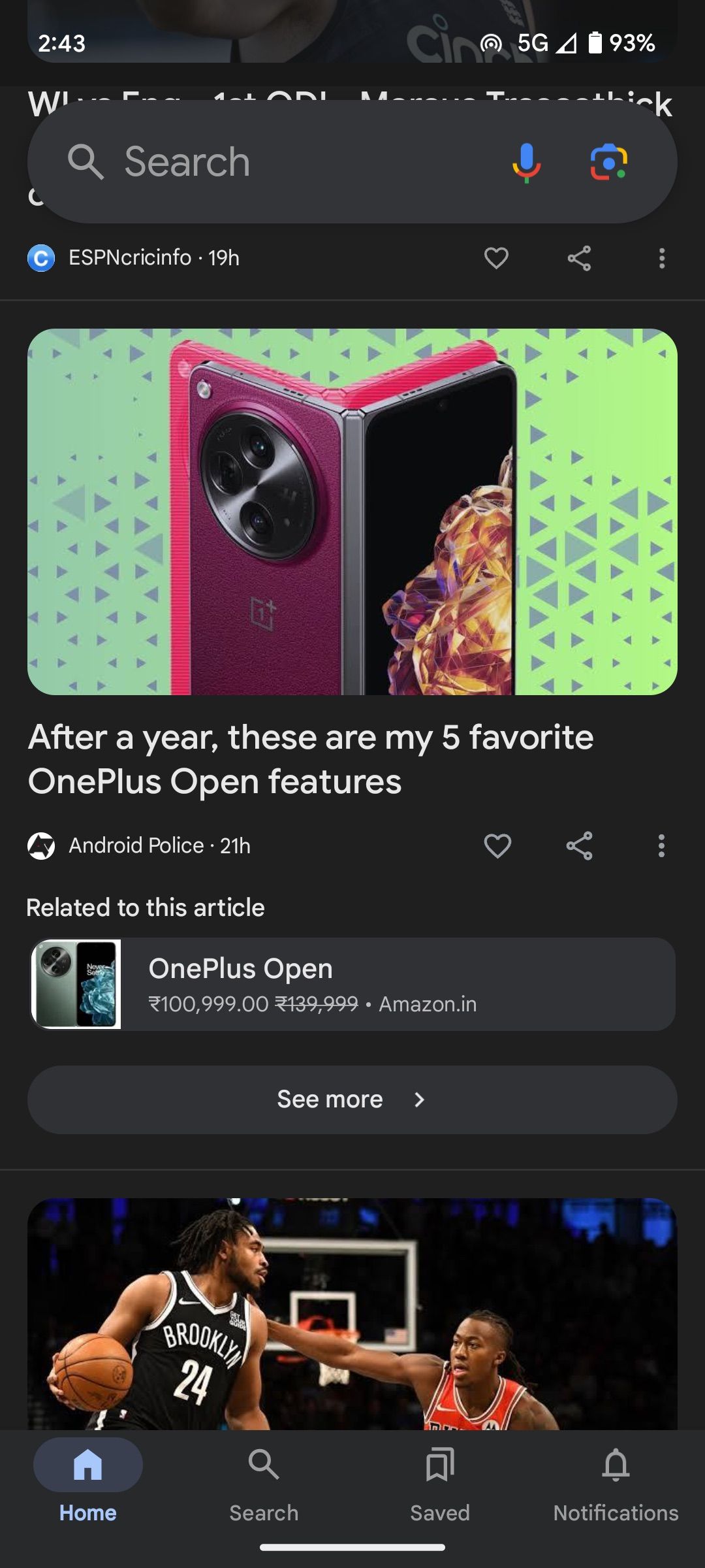
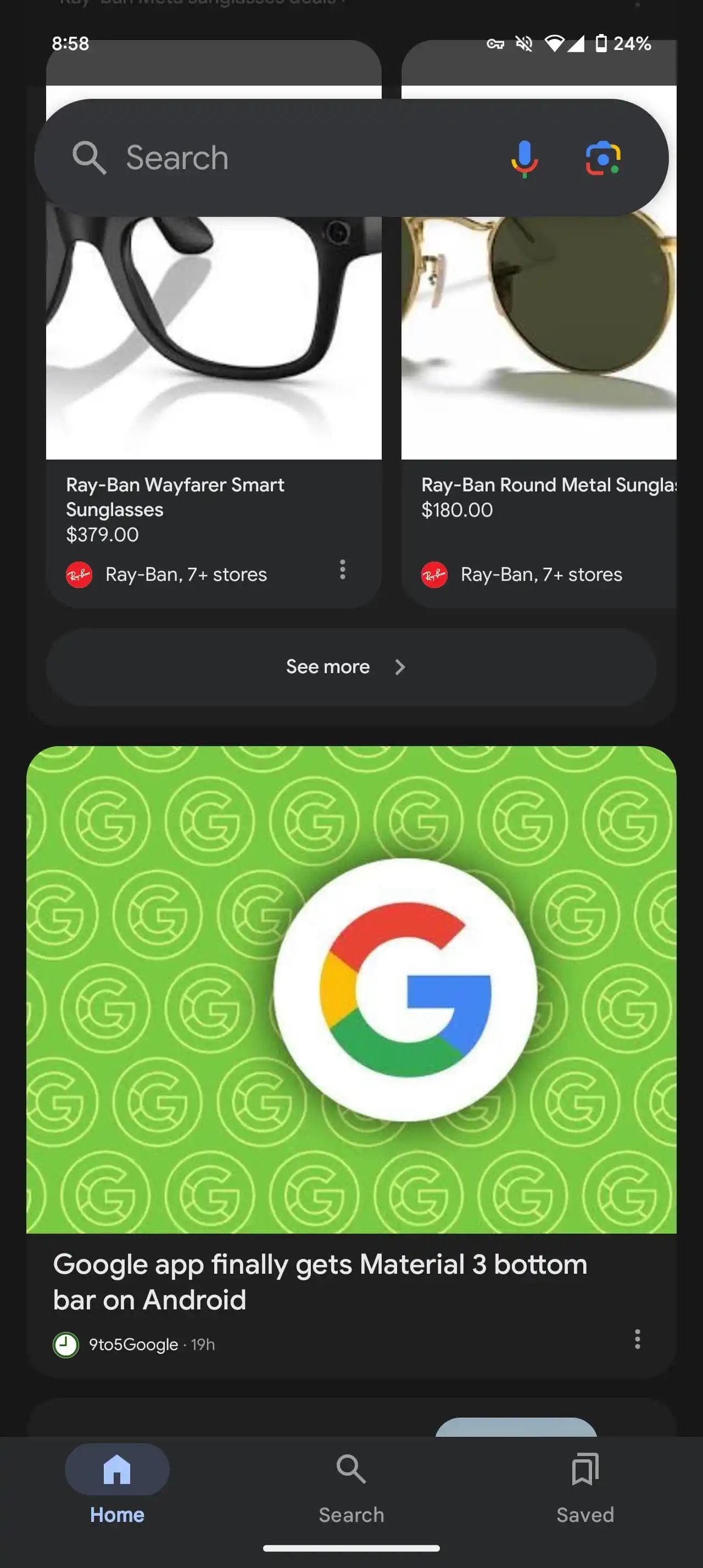
Current v upcoming
Images accompanying each Discover item are also visibly taller, while the dedicated share and save buttons are no longer available on the card. Instead, they now sit inside the solitary overflow menu button. It’s evident that Google is going for a cleaner design here, though it’s not quite perfect everywhere.
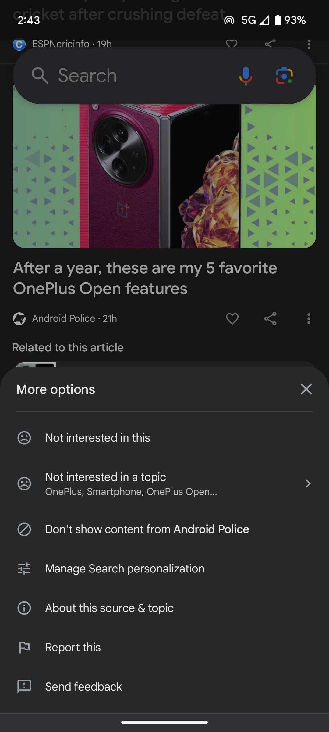
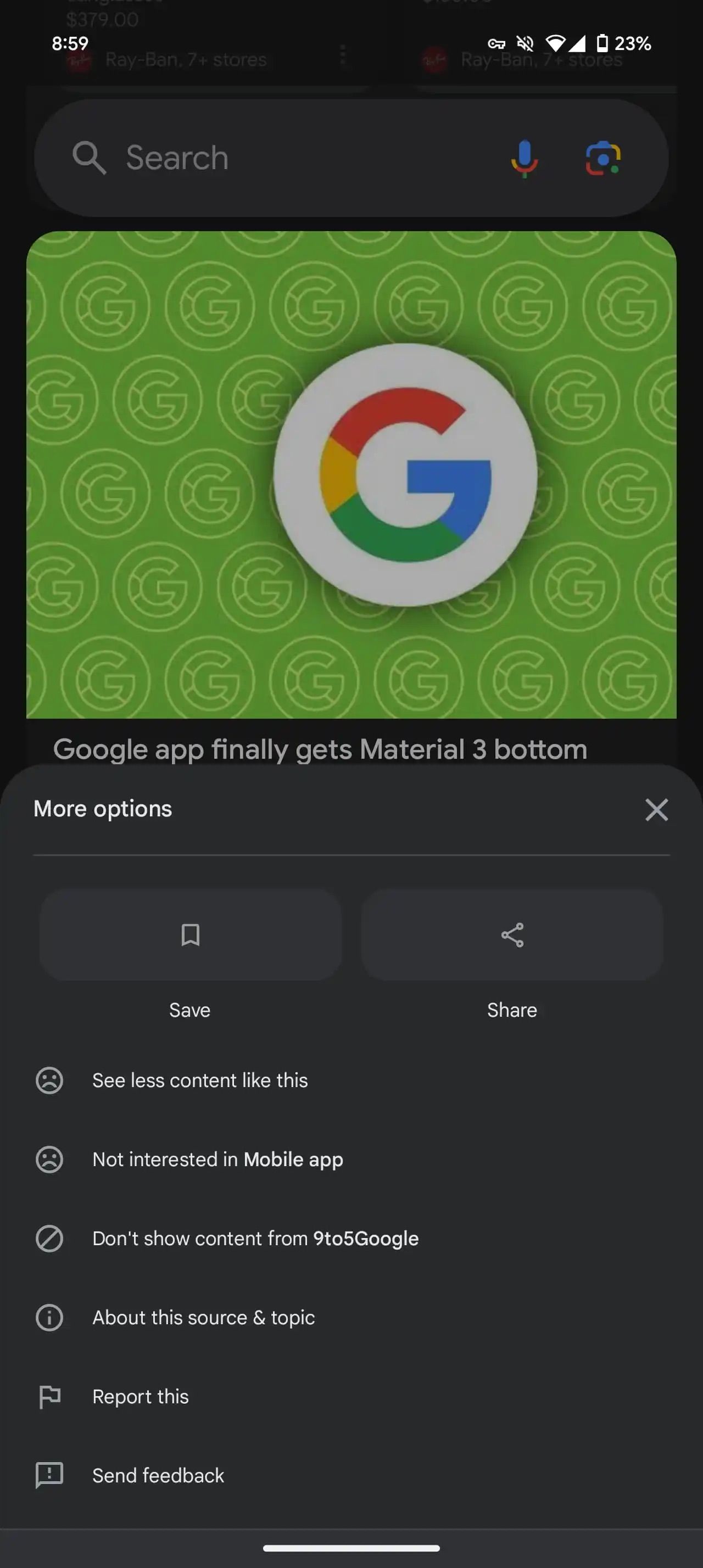
Current v upcoming
On top of these design adjustments for Discover items, a new card type is also in the works that will suggest a relevant topic and offer a conveniently located plus button to add it. What’s strange about this card, however, is that it has two overflow menu buttons (pictured below). It’s unclear if both menus serve the same purpose, although Google will likely remove one of them in a future update.
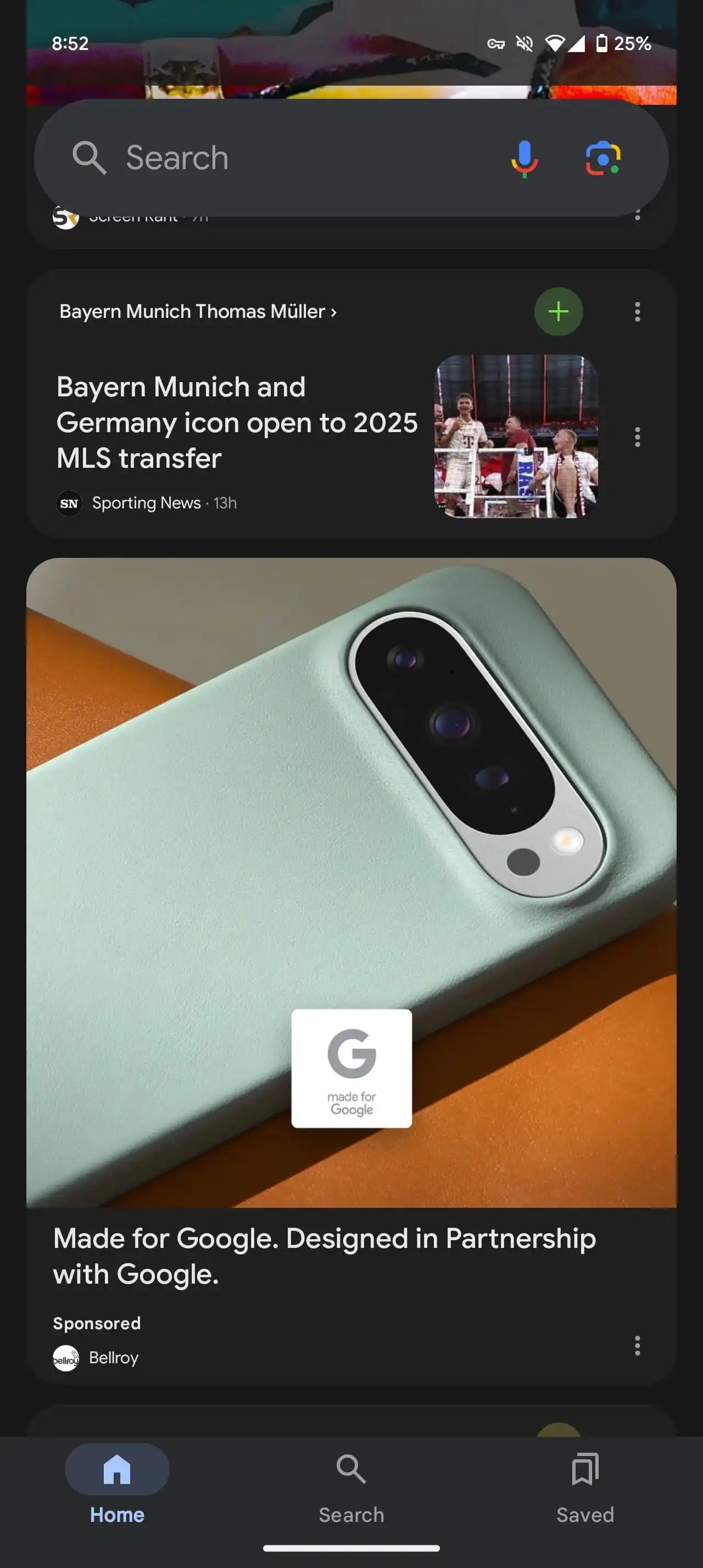
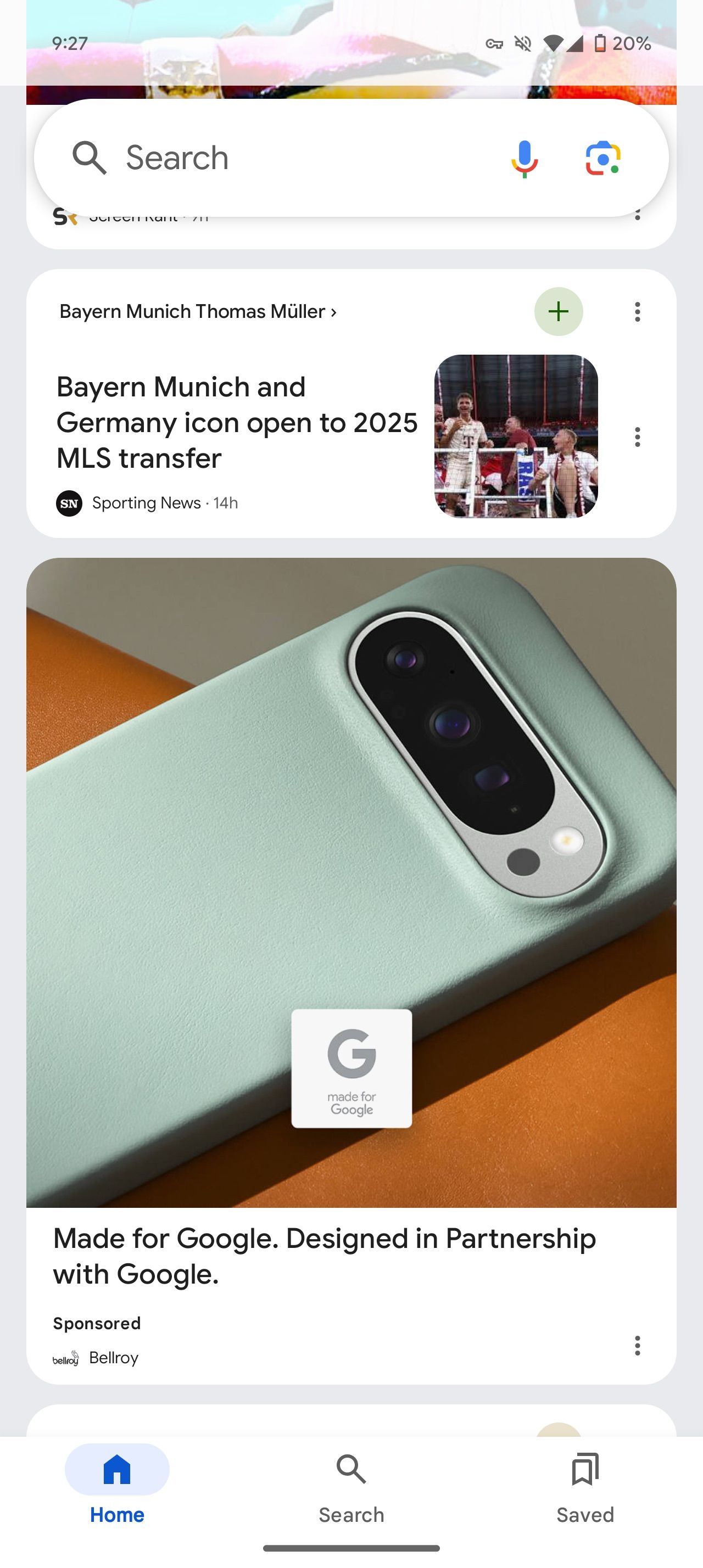
What’s also new in these screenshots is the presence of just three bottom bar tabs — Home, Search, and Saved, with the Notifications tab from the existing version disappearing. These changes are reportedly making their way to Discover with the Google app beta v15.43, though it’s only available to a small batch of users now.
It’s worth remembering that Google routinely experiments with design modifications, though not all make it to the stable version. This also means we don’t have a timeline for when these changes will appear on the stable version of the Google app.
