Summary
- Android’s QR code scanner is getting a redesign for easier one-handed use and improved accessibility.
- The new interface includes rearranged options at the bottom of the screen and a new animation for the onscreen viewfinder.
- These changes are only available on a beta version of Google Play services, though its wider rollout should be imminent.
QR codes are everywhere today, and modern-day smartphones provide a quick and convenient way to scan them using the onboard camera. Android phones come with a dedicated QR code scanning functionality built into the system, complete with its own UI. Barring some minor but significant additions like auto-zoom last year, it doesn’t generally see a lot of changes. But new evidence unearthed within the newest Google Play services beta suggests that a redesign is on the cards.
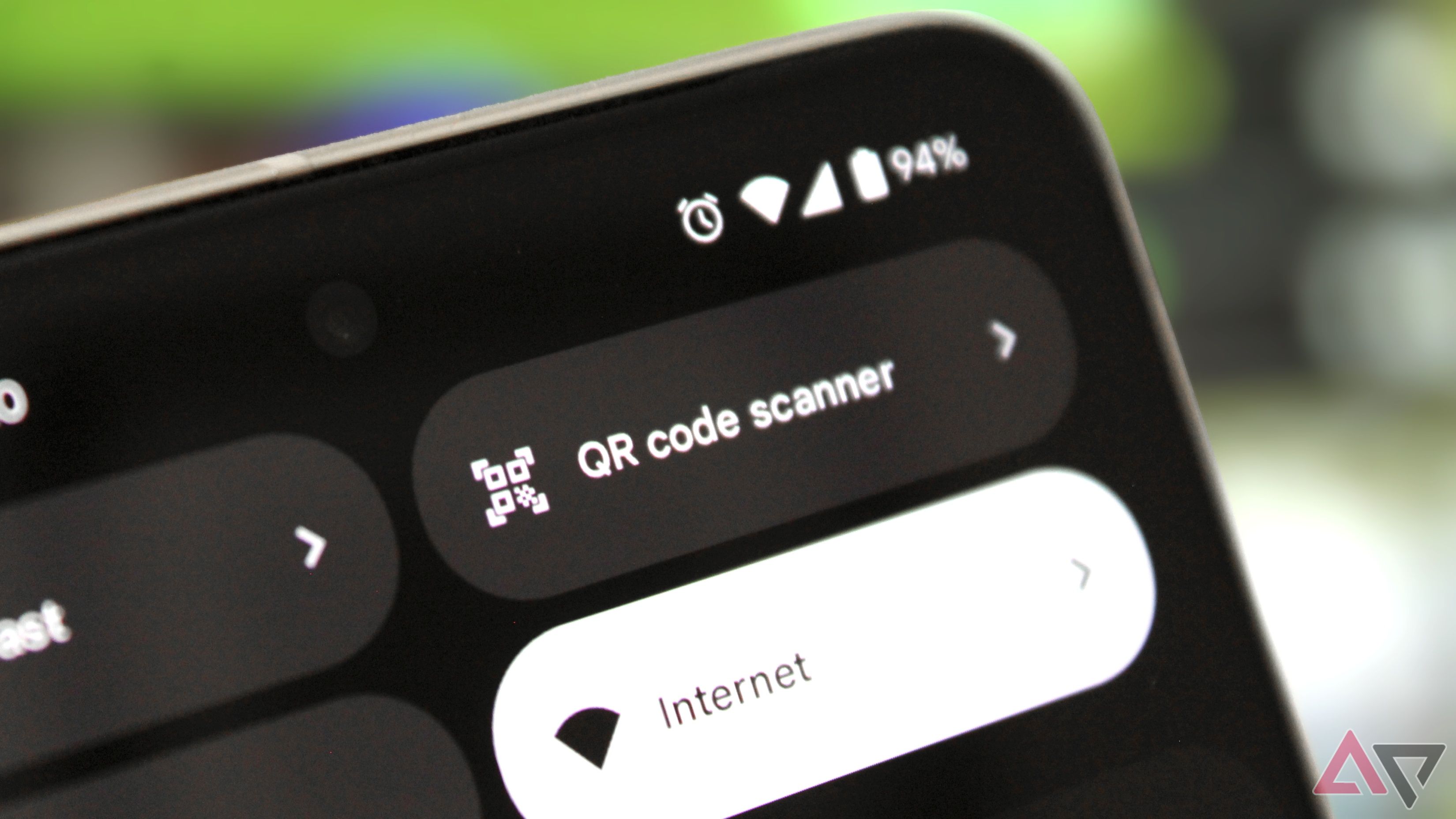
Digging into v24.28.30 beta of Google Play services, the folks at Android Authority found a redesigned interface for Android’s QR code scanner. Users can access this functionality from their Android phone’s Quick Settings tile or by searching within the app drawer (on Pixel phones). While Android’s stock Camera app can also scan codes, the Quick Settings solution makes it a touch easier.
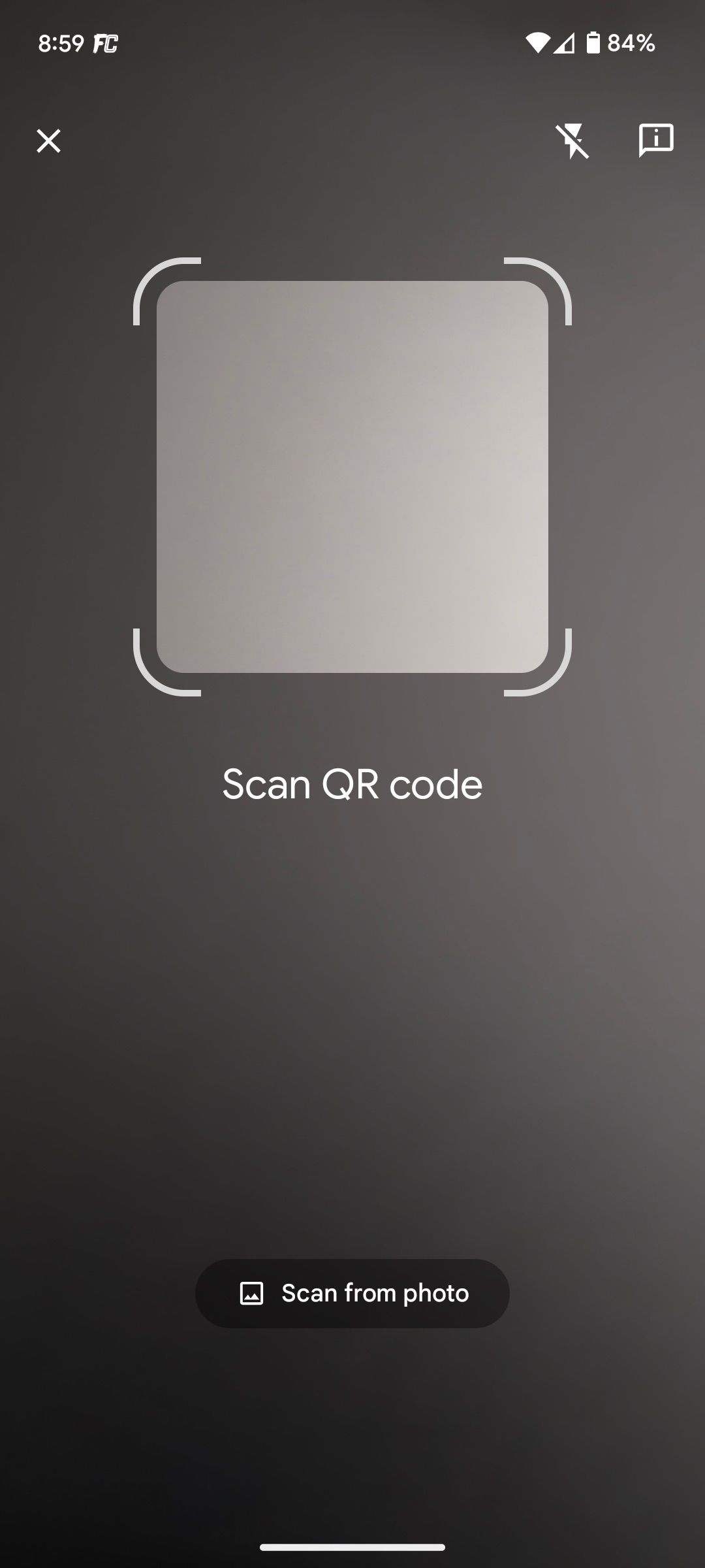
In its current form, activating the built-in QR code scanner opens up a large enough viewfinder, accompanied by two buttons at the top right of the screen — a flashlight toggle/switch and a feedback button. Meanwhile, the bottom of the screen has the Scan from photo option paired with a gallery icon, which directs users to scan a code from one of their saved images.


Current vs upcoming design
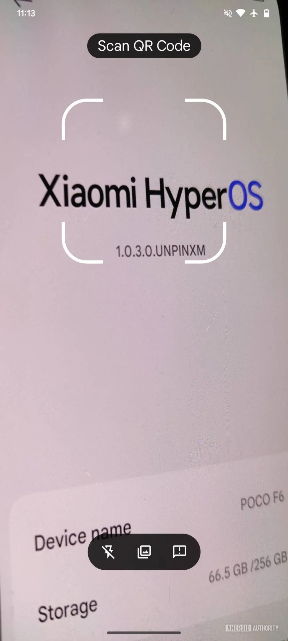
But with the new redesign, all three options (flashlight, Scan from photo, feedback) are placed next to each other at the bottom of the screen inside a pill-shaped box. As Android Authority notes, this rearrangement makes it easier to access the QR code scanner while using the phone with one hand.
Additionally, the onscreen text that reads “Scan QR code” has now moved into a pill-shaped box just above the viewfinder, while it was previously placed just below it, as you can see above. The close button (x) on the top left has also vanished with the updated UI.
The QR code scanner is also getting a new animation

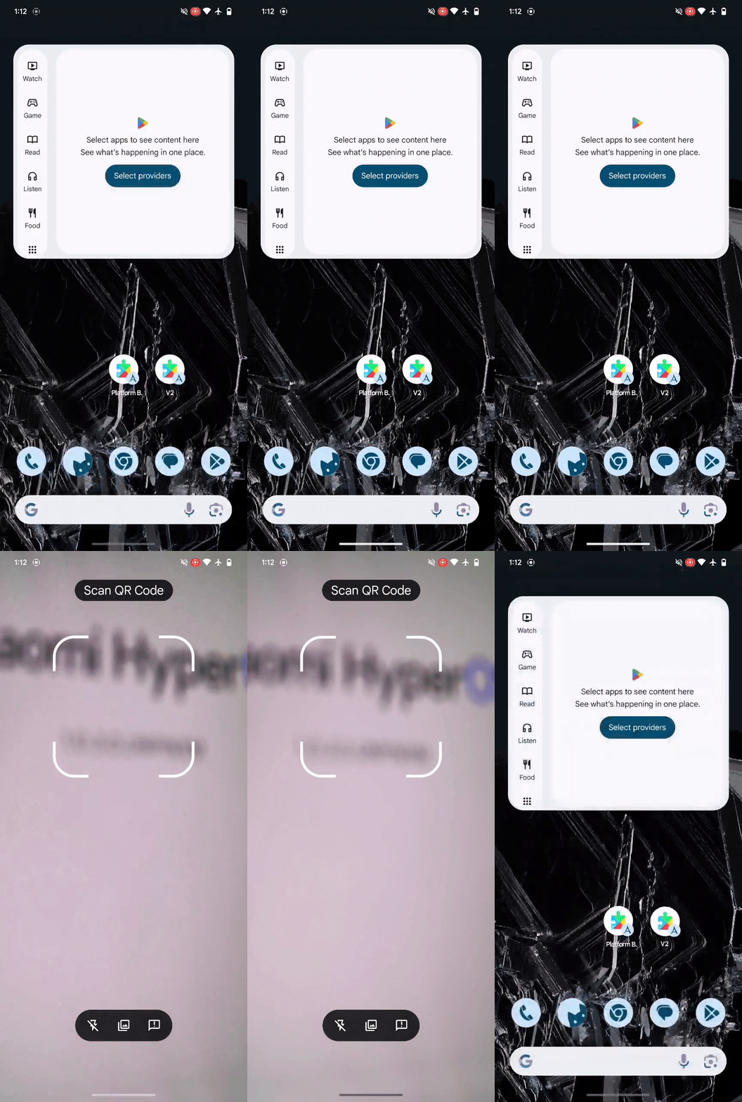
In addition to repositioning some of the onscreen options, the QR code scanner is also working on a brand-new animation, which appears just after it is triggered. It’s not a major change by any means, with only the onscreen viewfinder slightly expanding and falling back into place, but it’s definitely new.
It’s unclear when these new additions will be widely available to Android users. But since they’ve already been spotted in the Google Play services beta, we hope their broader rollout isn’t far away.

