Kaitlyn Cimino / Android Authority
I am still riding the high of Google’s successful Pixel Watch 3 launch this year. Not only do the company’s latest smartwatches pack in a ton of updates and features, but they also boast much more display space, especially the all-new 45mm option. Making the most of this added real estate starts with a top-tier watch face. To help users nail down the right look, I’ve curated a list of some of my favorite Pixel Watch 3 watch faces from the Google Play Store.
Monospace by Luka Kilic Watch Faces
Kaitlyn Cimino / Android Authority
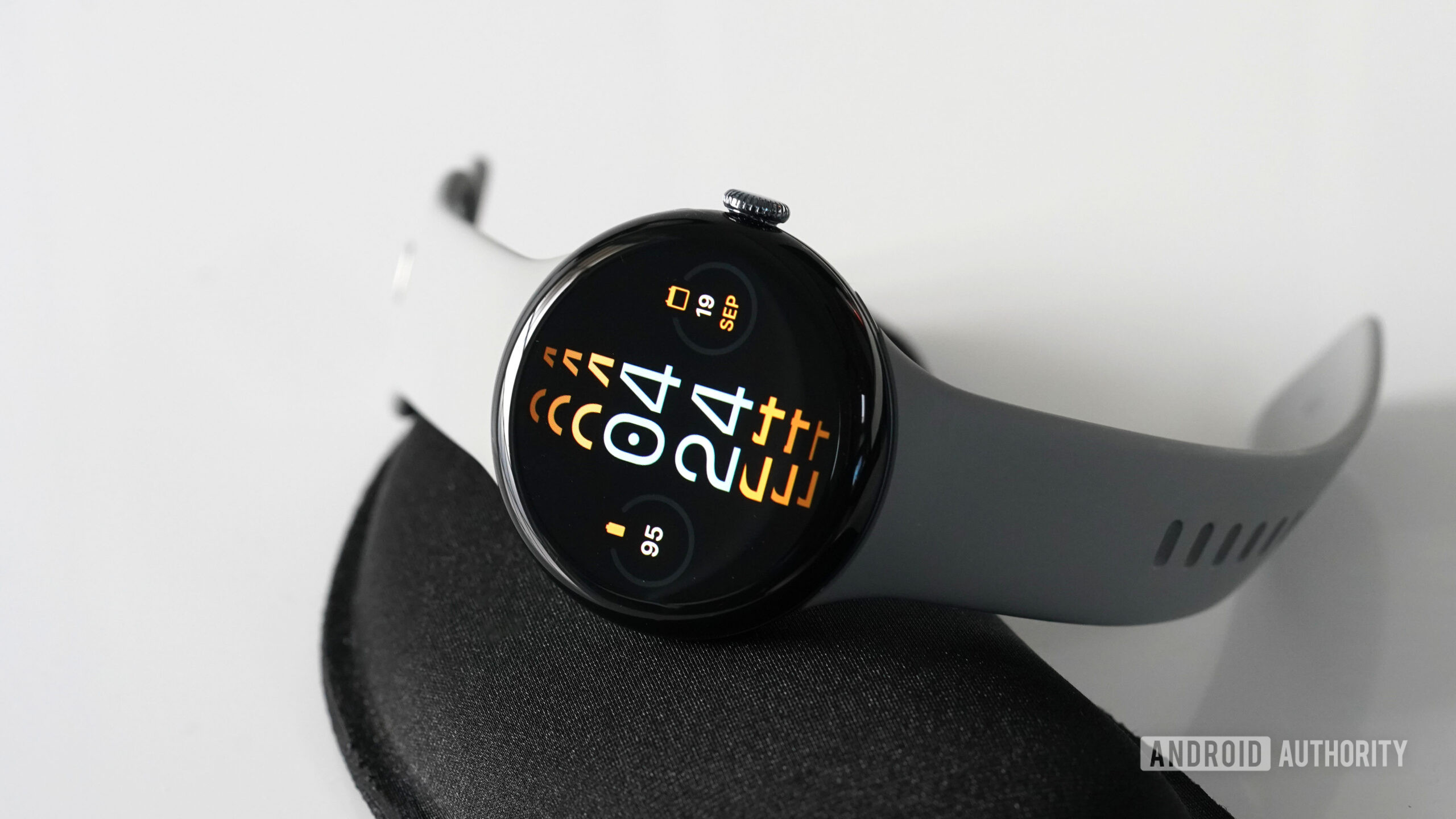
A colorful, somewhat mind-bending design, Monospace by Luka Kilic Watch Faces is my favorite overtly simple watch face, with a unique focal point. First, the design stacks the current time digitally and allows you to choose a font and color for the written numbers. Then, by layering the hour and minute atop itself, the watch face creates a visual stripe down its center, which stretches out in a second color of your choosing. I kept it simple with an orange and off-white tone, but there are hundreds of combinations available.
On either side of the central element, the watch supports a circular complication. Given the simplicity of the face, I stuck with general information: battery life and the date. You can also add a third complication to the top of the watch face. If you do so, that complication will mirror the color you choose for the “echoing” time text (for example, in the image above, it would have been orange). You can also add a second hand to the design in the form of a tiny dot that will circle the watch face, but I prefer the design without it.
Blue Lagoon by Natasa Petek
Kaitlyn Cimino / Android Authority
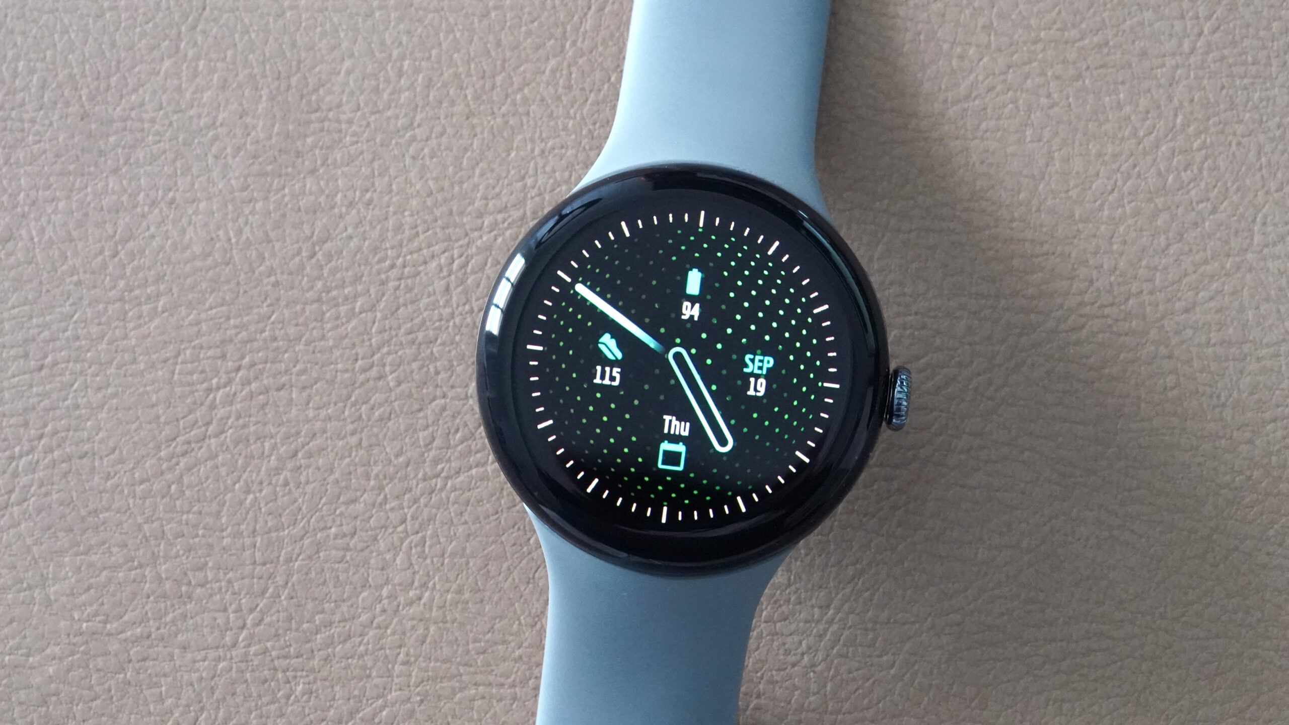
Though a video would do this watch face far better justice than an image, Blue Lagoon by Natasa Petek is another beautiful pick from the Google Play Store. Live, the dotted background of this design rotates in a mesmerizing swirl that is nothing short of captivating. It’s also completely customizable in terms of colorways, complications, and even indexes. I tested a variety of bright and colorful combinations and loved them all. To me, the overall impression is that of an elevated, adult LiteBrite. I also love the monochrome or completely black-and-white option that is still animated, just simplified in saturation.
As mentioned, each of the four complications is customizable and placed as shown above. I opted for simple details, including battery, date, day, and step count. To be honest, though, I like the watch face best with all the complications disabled, so the movement of the dots is completely unimpeded. Blue Lagoon offers an elegant version of an analog watch face.
Dual Tone by Amoledwatchfaces
Kaitlyn Cimino / Android Authority
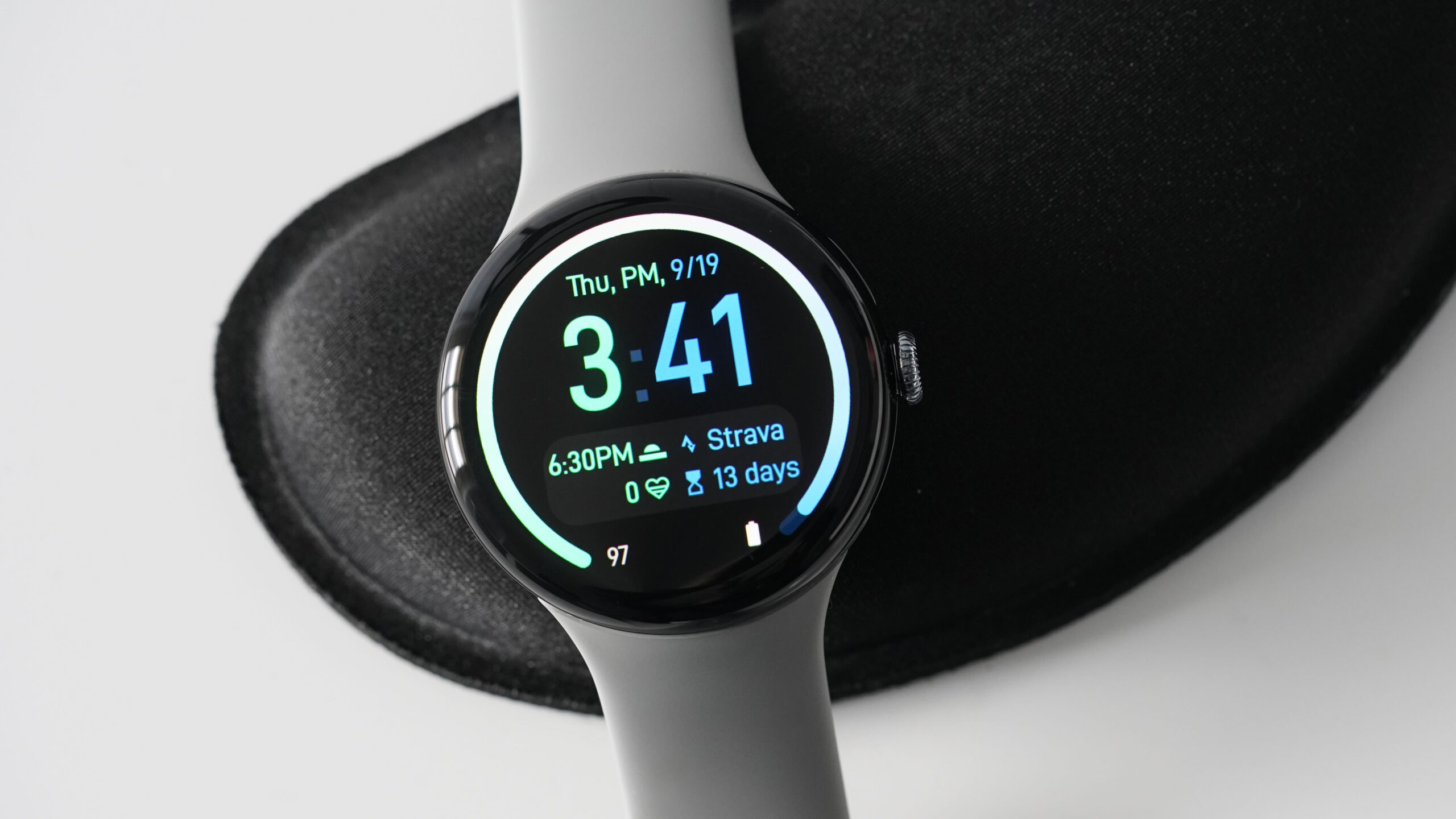
Another hue-centric watch face, Dual Tone by Amoledwatchfaces offers the opportunity to feature your favorite color pairing. With more than 50 themes to choose from, the face’s split-screen design divides your display directly in half so you can set each portion to a unique color. These can be contrasting or complementary, depending on your style. The result is a graphic look that’s fun to match to your watch band or outfit.
In addition to looking good, Dual Tone also packs room for seven customizable complications, including two spaces with progress arcs bordering the screen. These arcs can be dotted or solid and melded together at the top, as shown above. You can also adjust the design’s AOD settings to show as much or as little of the design as you’d like when the full watch face is not in use.
Tidal Glow by Time Flies Watch Faces
Kaitlyn Cimino / Android Authority
Time Flies Watch Faces is no stranger to our round-ups of attractive watch face designs to share with readers. After recently featuring Complicationist by Time Flies in my list of best Galaxy Watch 7 faces, I revisited the developer’s selection for the Pixel Watch 3 and genuinely had a hard time narrowing my pick down to one winner.
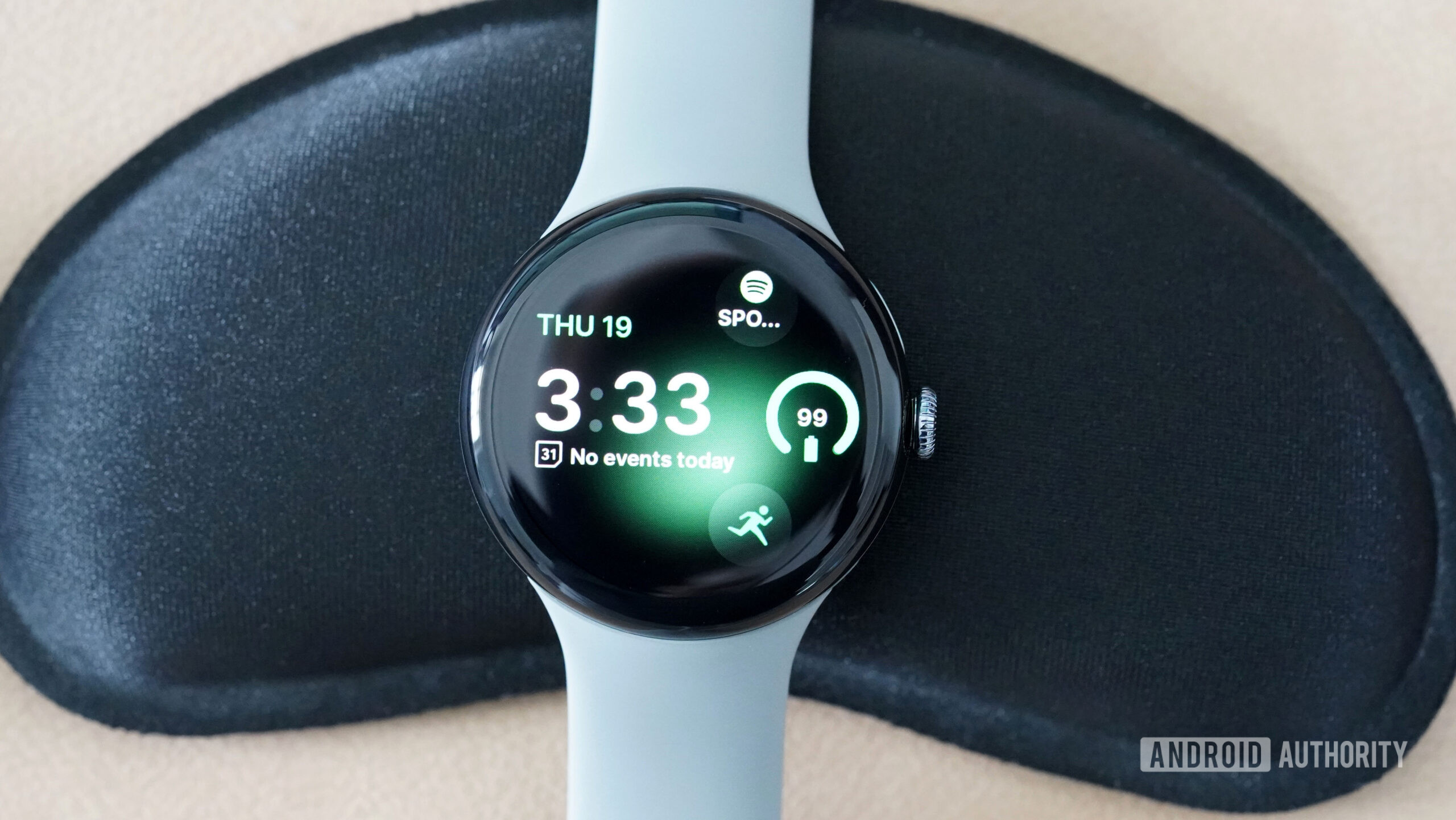
In the end, I landed on Tidal Glow, a clean, modern look that echoes the minimalist aesthetic of the Pixel watch line. I love that the date and time are clearly displayed but off-center to afford visual interest and space for complications. I also really enjoy the subtle background “glow” with customizable color options that make the watch face interesting and yet quite subdued. The face has room for one line-style complication, which I utilize for upcoming calendar events, and three icon-style complications, which I set to display my battery life and provide shortcuts to my top two apps: workouts and Spotify. Overall, the design is simple, effective, and a great complement to the existing aesthetic of the smartwatch.
Minimal Digital Sport RE55 by Recreative Watch Faces
Kaitlyn Cimino / Android Authority
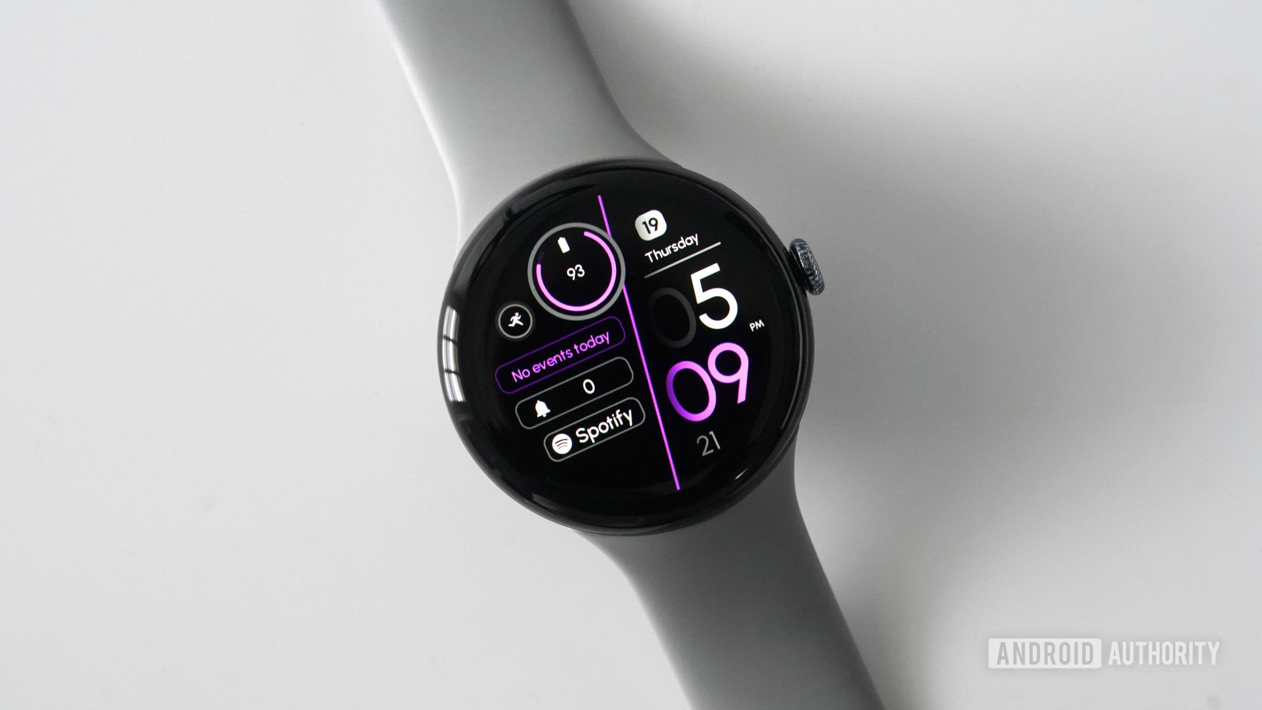
Leaning into a little more on-screen data access, Minimal Digital Sport RE55 by Recreative Watch Faces is a well-balanced digital watch face with plenty of space set aside for complications and details. To start, I love the bisecting line that separates time and date information from my chosen complications. It’s easy for me to check the time at a glance without being bogged down by irrelevant data points. I even appreciate that seconds are included for quick countdowns.
I love how the larger circular complication (battery above) overlaps the central line (the purple line, in my case) for an organic feel rather than a strictly graphic look. The watch face supports customizable complications, three of which are displayed line-style and one small circular shortcut, which I set to the Fitbit Exercise app. As someone who doesn’t do well with clutter, I appreciate how neat and contained this half of the watch face feels despite offering considerable information.
Glyph Watch Face by SOC Creations
Kaitlyn Cimino / Android Authority
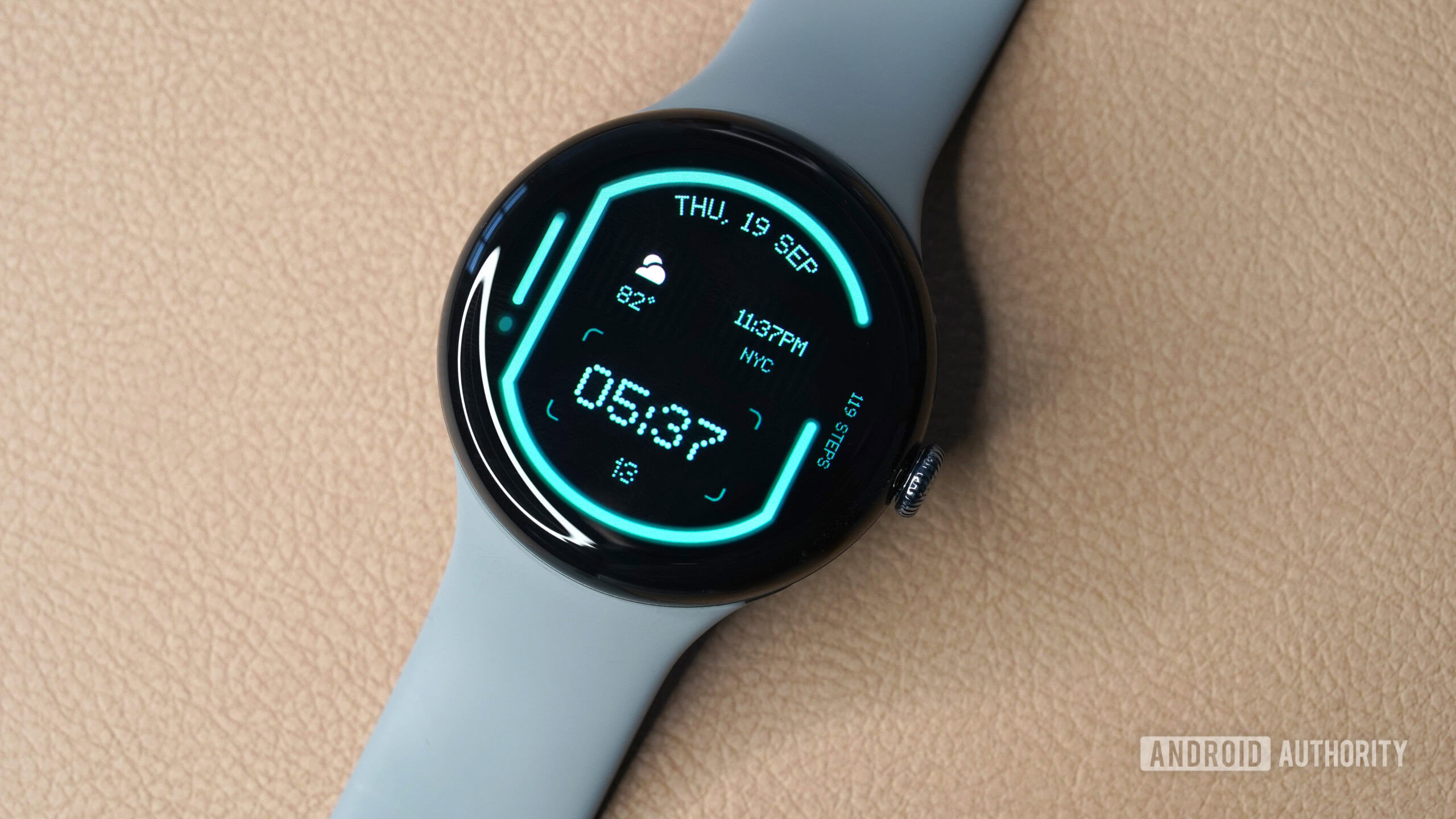
It’s genuinely hard for me to put my finger on why I enjoy Glyph Watch Face by SOC Creations so much, but I absolutely love it. In some ways, it reminds me of a travel board with transportation details listed, like at a train station or airport. I love the old-school dotted font, the subtle striping behind the weather and world clock complications, and the asymmetrical framing around the central parts of the face’s design. I also like the subtle battery level indicator on the left side of the watch.
After downloading this watch face, I hardly changed the customizable options beyond the design’s primary color. Notably, however, all five data points are customizable, and even the time can be swapped out for alternative information if you don’t want to use your watch as, well, a watch. I know that everyone has their own unique priorities, but I feel the developer really nailed the presets and how they align with the face’s overall vibe.
MD309 by Matteo Dini MD
Kaitlyn Cimino / Android Authority
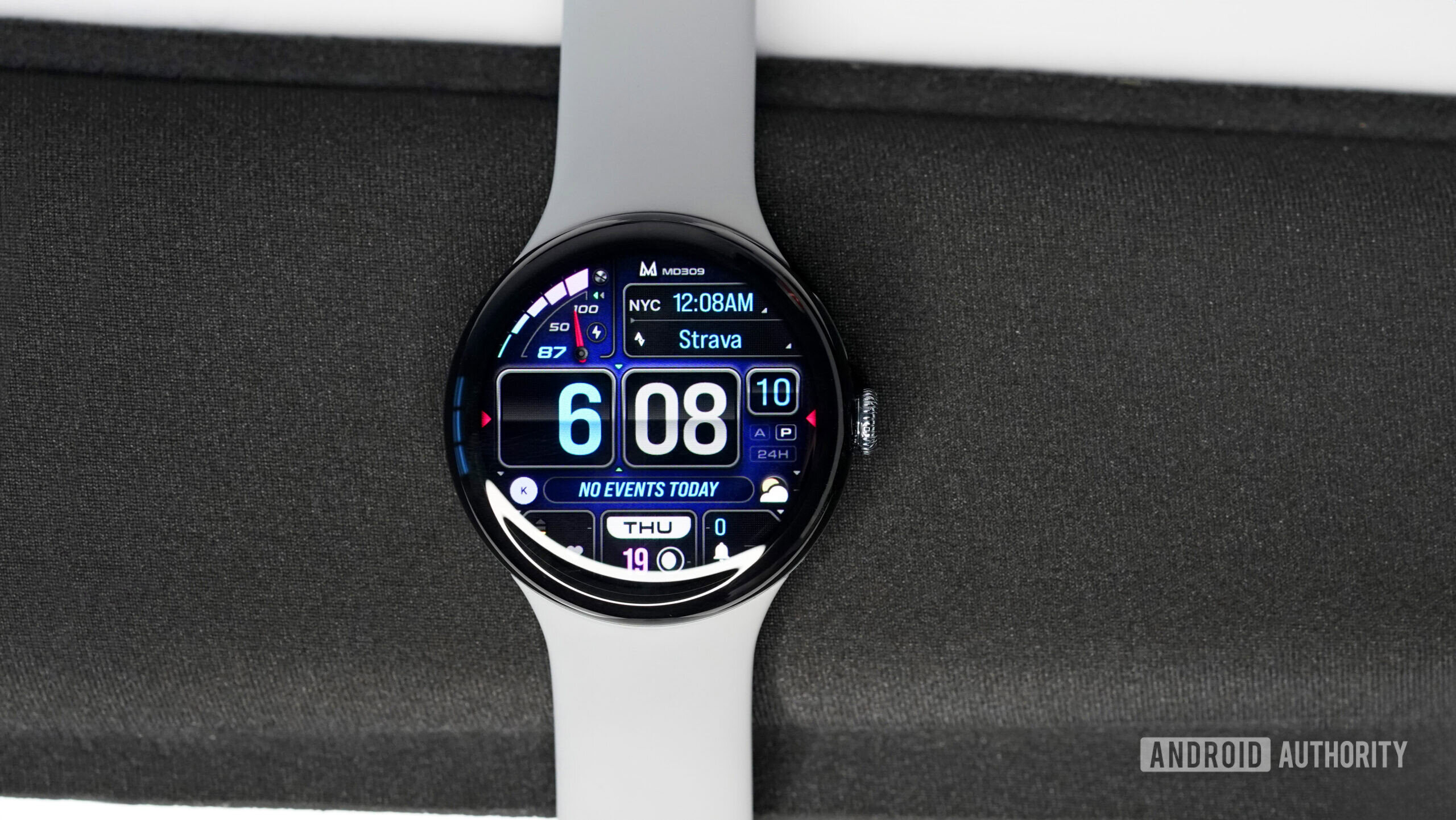
Finally, my pick for a dense, hardworking watch face that brings key information to the forefront is MD309 by Matteo Dini MD. If simplicity is your style, Matteo Dini MD probably isn’t the developer for you. However, I do like this data-packed watch face that loads my display with details without it feeling busy or overwhelming.
MD309 features three preset app shortcuts and two customizable shortcuts. It also has space for four customizable complications. The time is displayed nice and large, and the colors of the hour and minutes can be altered independently. Likewise, you can adjust the overall color scheme, background, and the look of the battery indicator.
