To many, the Pixel Watch 3 will be about a (finally) bigger size – now 45mm instead of the previous 41mm size. But to those into sports and fitness, it’s actually much more than just size: It’s the biggest change to the sports and fitness realm of Fitbit since…well…ever. The company has poured in tons of new features focused on training and training load, but especially running-related features. Sure, other sports benefit, but running sees the most new features.
To that end, I’ve been putting it through its paces over the last three weeks, pushing the watch into all sorts of athletically uncomfortable situations, to try and see how it handles from a performance standpoint, and a training load recommendations perspective. This includes the updated optical heart rate algorithms, which, to spoil some of this review, went from pretty good to industry-leading. This might be some of the best optical HR sensor plots I’ve ever put in a single review. But, not everything on the watch is perfect, as you’ll see.
Still, with this 3rd edition, Google is making the transition from ‘newcomer’ to ‘regular’ in the fitness watch world, and so I’m going to focus on all these bits here. This is a fitness/sports/etc focused review, rather than a general smartwatch review. Still, I’ll touch on most of the new smartwatch bits throughout this review, including the increased battery life claims.
With that, let’s dive into it.
What’s New & Different:
![]()
Dividing things up, let’s look at what’s new in hardware and in software. Starting with the hardware bits, here’s what’s new:
– Adds 45mm size case (41mm display is 32.2mm across & 408px, 45mm display is 36.2mm across & 456px, previous 41mm was 30.48mm & 384px)
– Changed from AMOLED to AMOLED-LTPO, which adds/enables dynamic refresh rates
– Adds variable refresh rate from 1hz to 60hz
– Increased max brightness from 1,000 nits to 2,000 nits, decreased min brightness to 1 nit
– Increased battery life up to 36hrs in new battery saver mode (24hrs in always-on display mode)
– Increased/faster charging times by 20%, or 15 mins faster than before
– Made improvements/changes to dual-chipset architecture (one core for ambient compute, one for performance compute)
– 35% bigger battery in 45mm than the 41mm (but screen burns more, obviously, so times are essentially a wash between units)
But the real interesting changes are largely on the software side, so quickly looking into that before I get into the details down below:
– Upgraded to Wear OS 5 (the operating system/platform)
– Improved heart rate accuracy via algorithm, especially for running
– Added new automatic bedtime mode to detect if you fell asleep and lower power/battery burn
– Added new workout builder on both watch and revamped Fitbit app
– Added structured workout support on watch (including realtime guidance during run)
– Added media controls inside of the workout itself
– Added running efficiency metrics, including ground contact time, vertical oscillation, form analysis, cadence, and stride length
– Added support for all those efficiency metrics within Fitbit app on phone
– Added new running-focused dashboard in Fitbit Mobile app (tons of new analytics, very runner-focused, more down below)
– Added PR tracking (e.g., fastest 5KM/10KM/etc…)
– Added offline Google Maps support to watch
– Added new Cardio Load and Target load features (training load concepts see below, this is a huge line item)
– Revamped Daily Readiness Score concepts (more explained below)
– Daily Readiness Score is now available for all users, not just Fitbit Premium
– Added Morning Brief report on watch upon wakeup (akin to Morning Report/etc on other watches)
– Adding no-pulse emergency alerts and notifications (if it detects your pulse has stopped)
– Minor improvements in heart rate broadcasting compatibility (to 3rd party apps/devices)
– Added Google Nest Camera live view, including responding via Mic
– Added Google TV Remote (using watch as TV remote control)
– Added Pixel UWB phone unlock, and car unlock (from watch)
– Added ability to pick up and hold calls from watch (Pixel Phones)
– Added Find My Phone from watch (Pixel Phones)
– Added Pixel Recorder App (audio recorder) for phone
– Revamped Pixel Phone camera controls from watch
Now, there are some new Fitbit Premium items in here, though it’s notable that *EVERYTHING* listed above is totally free on the Pixel Watch. Instead, Fitbit is slowly shifting Fitbit Premium as before more of the advanced recommendations side of things, rather than in the past where it was restricting looking at basic historical data. I’ll dive more into this in the review, but based on my first look pieces, at Google, the additive pieces here are really more about suggested future things you could do, rather than restricting seeing your own data. In any event, a few new things on Fitbit Premium:
– Shifting to Google AI Gen9 models underneath
– Will now create daily run recommendations, including an LLM-generated description of the run
– Will use your Readiness Score and Training load metrics to drive those run recommendations
– Will leverage long-run preferences (specified in the watch) to schedule workouts
– Will determine your optimal target heart rates for each workout
Got all that? Good, let’s get into the box.
In the Box:
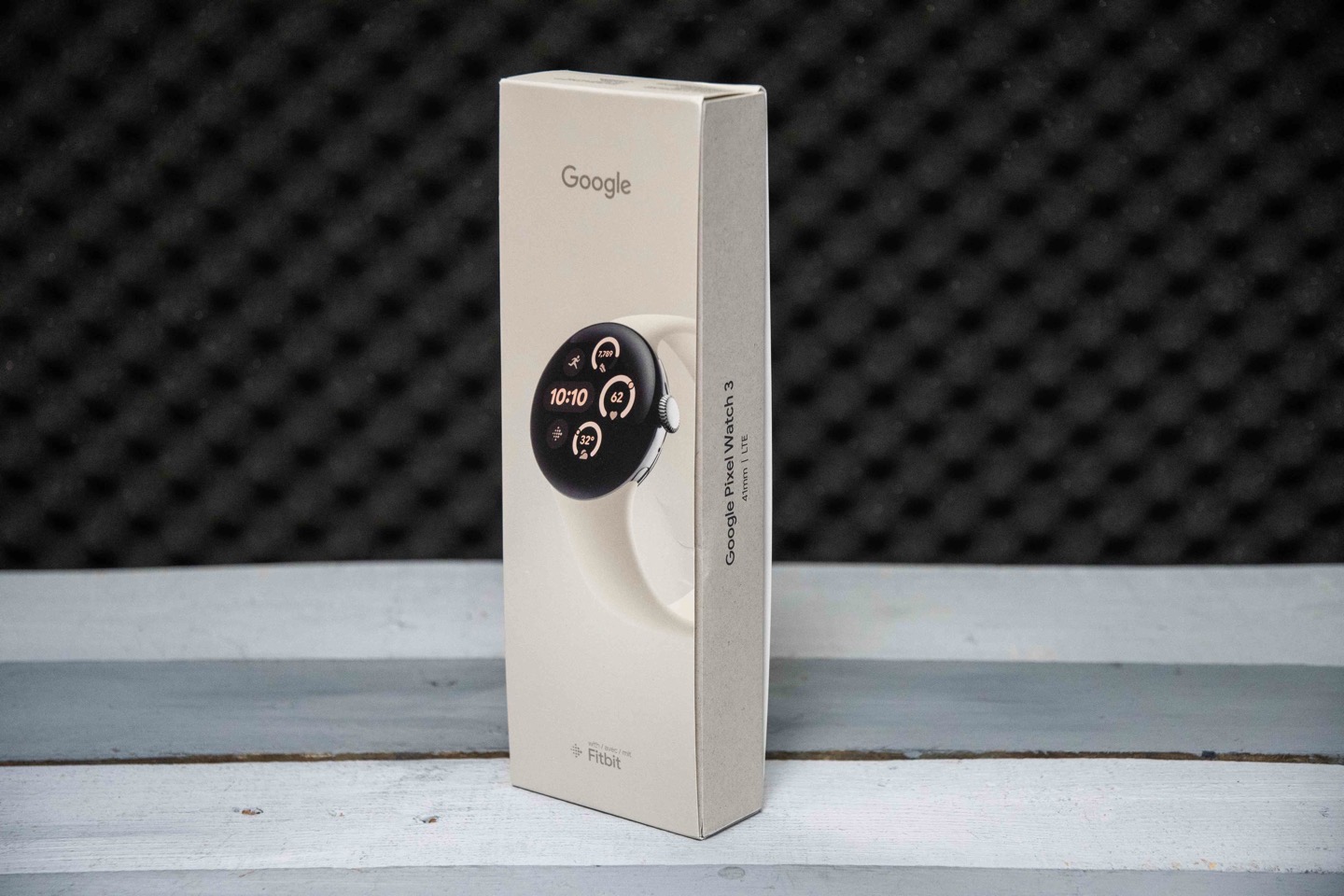
Both the 41mm and 45mm versions have the same box contents, thus, I’ll just unbox one, to keep life simple (mainly, my life). The box design is pretty well done, though honestly, like all watch companies, kinda overkill in terms of protection. But I suppose they all want to ensure it arrives to you looking perfect.
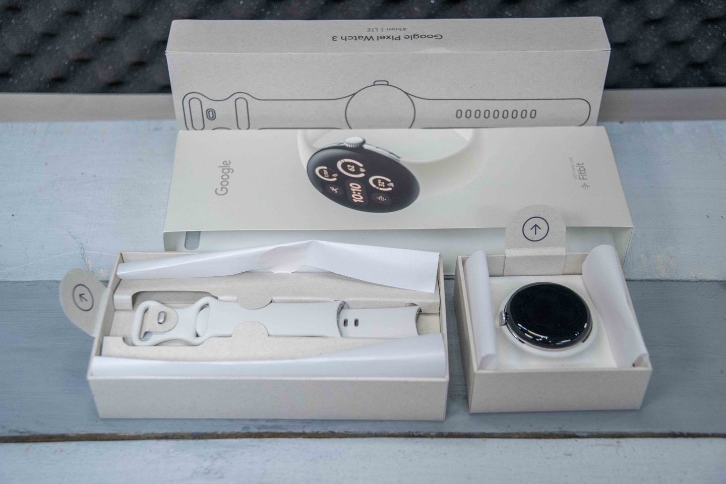
Inside you’ll find two different strap lengths for the band, as well as the main Pixel watch pod, and the charging cable. Oh, and some paper junk you won’t read.
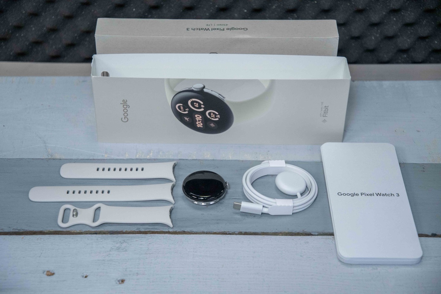
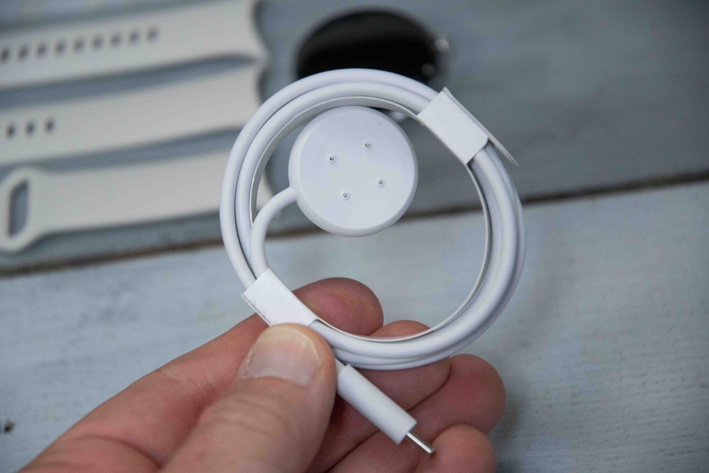
This is the same charging puck as the Pixel Watch 2 (but, they did change it from the Pixel Watch 1). This charging cable matches some of Fitbit’s other recent watches. Thus in a way, it’s vaguely a Fitbit/Google standard for watches.
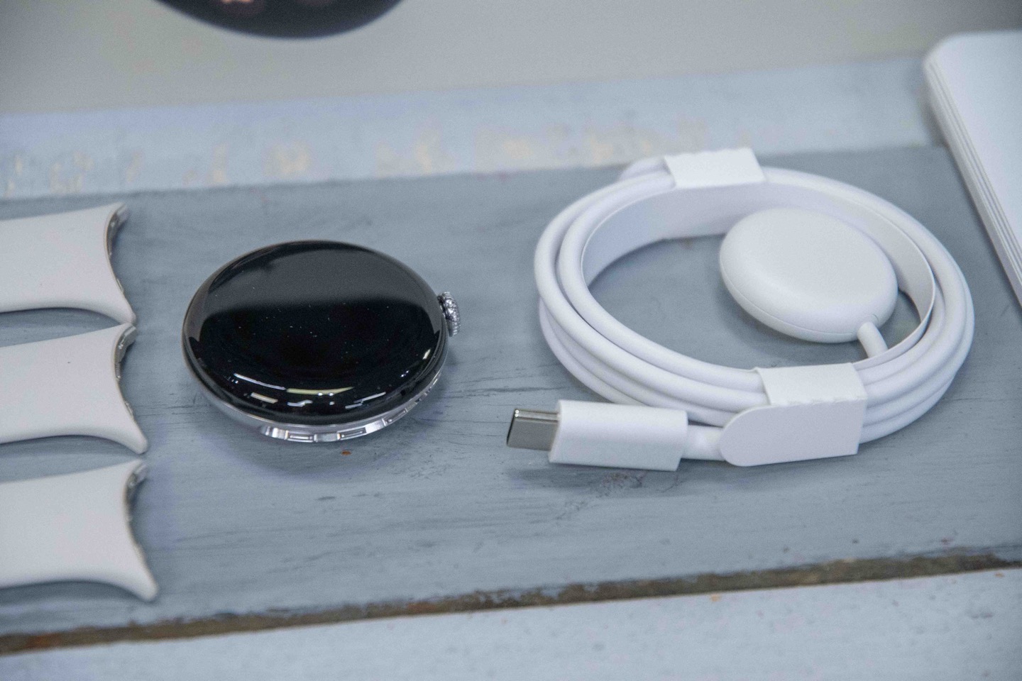
It’s not a wireless charger, but rather has four little contact points that charge it. I don’t mind, as it’s nice and snug, and says on the charger well. Charging time is fast enough where it hasn’t been a concern for me. I dig into the real-world battery bits at the end of the accuracy section (for both daily and GPS usage).
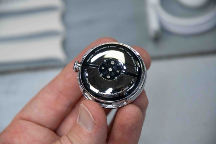
Here’s the back of the Pixel Watch 3 pod, showing the optical HR sensor as well as charging pins. This is the 41mm, but the 45mm shown throughout the rest of the review is identical.
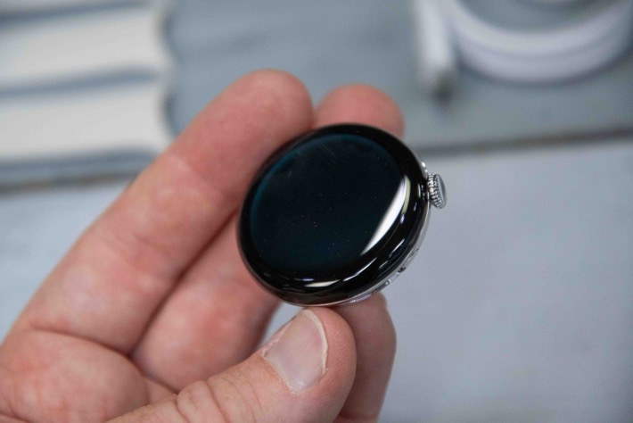
With that, let’s get to using it.
The Daily Basics:
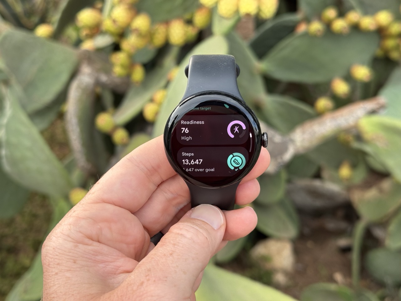
First up, is that the Pixel Watch 3 requires an Android phone, though, does not require a Google Pixel phone. There are a handful of minor features that do require a Pixel phone, mainly due to Pixel-phone-specific features, including the ability to pick up and hold calls from watch, and Find my Phone from the watch. But otherwise, everything else is totally equal. That’s notable because if we look at Samsung’s watch offerings, many of the health features (like ECG or other higher-end heart features) are tied to only Samsung phones, not all Android phones.
In any case, I used the Pixel Watch 3 with a blend of both current and previous-gen Pixel phones. One minor notable fun tidbit was how impressed I was that I could switch between phones mid-trip and not lose any data on the watch. In my rush to pack for a transatlantic trip, I had grabbed then wrong Pixel phone off the table in my early morning haze. Astoundingly, I was able to transfer everything from one phone to the next phone, without any issues or loss of my day’s data to the point. While that might seem normal for legacy endurance watches, that’s a hard-no for most smartwatch brands (Apple/Samsung/etc…). Anyway, I was impressed.
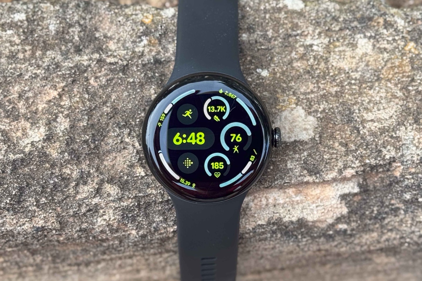
Moving onto more mundane things, here’s the default watch face, which includes a slate of complications (data bits) you can customize. In my case, I went for having Steps up top, the Readiness score at the right, the Cardio Load on the bottom, and then around the edge a pile of other relatively straightforward metrics (distance at lower left, floors at lower right, calories upper right, and Zone Minutes upper left):
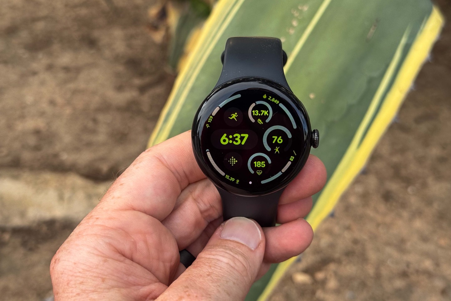
There’s also the runner icon, which jumps straight to starting a workout, as well as the Fitbit icon, which opens up the Fitbit dashboard.
When it comes to interacting with the watch, there’s 2.5 buttons on the right side. Meaning, there’s an upper right button, and a digital crown that both scrolls and acts as a button. Additionally, there’s the touch screen itself.
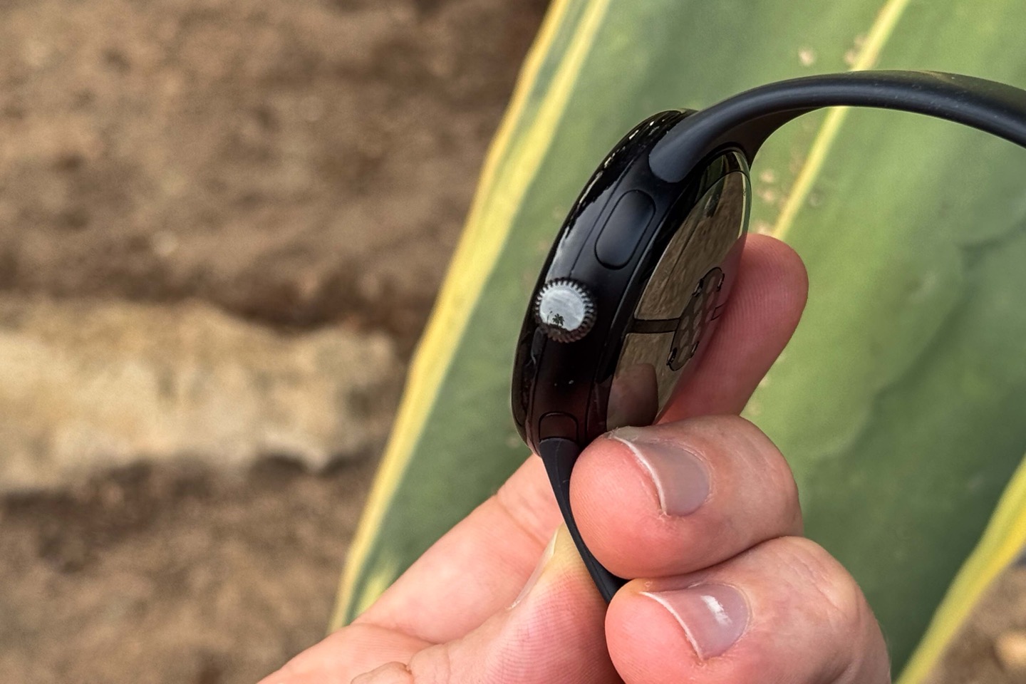
I’ve found the buttons work well, respond well, and all is well there. The touchscreen is great when it’s dry, but very much not great when it’s wet (namely, sweaty). Certainly, many touch displays struggle in wetness, but this definitely struggles more than Garmin’s touch screen displays when they are wet (those work largely just fine, or at worst require an occasional re-confirmation).
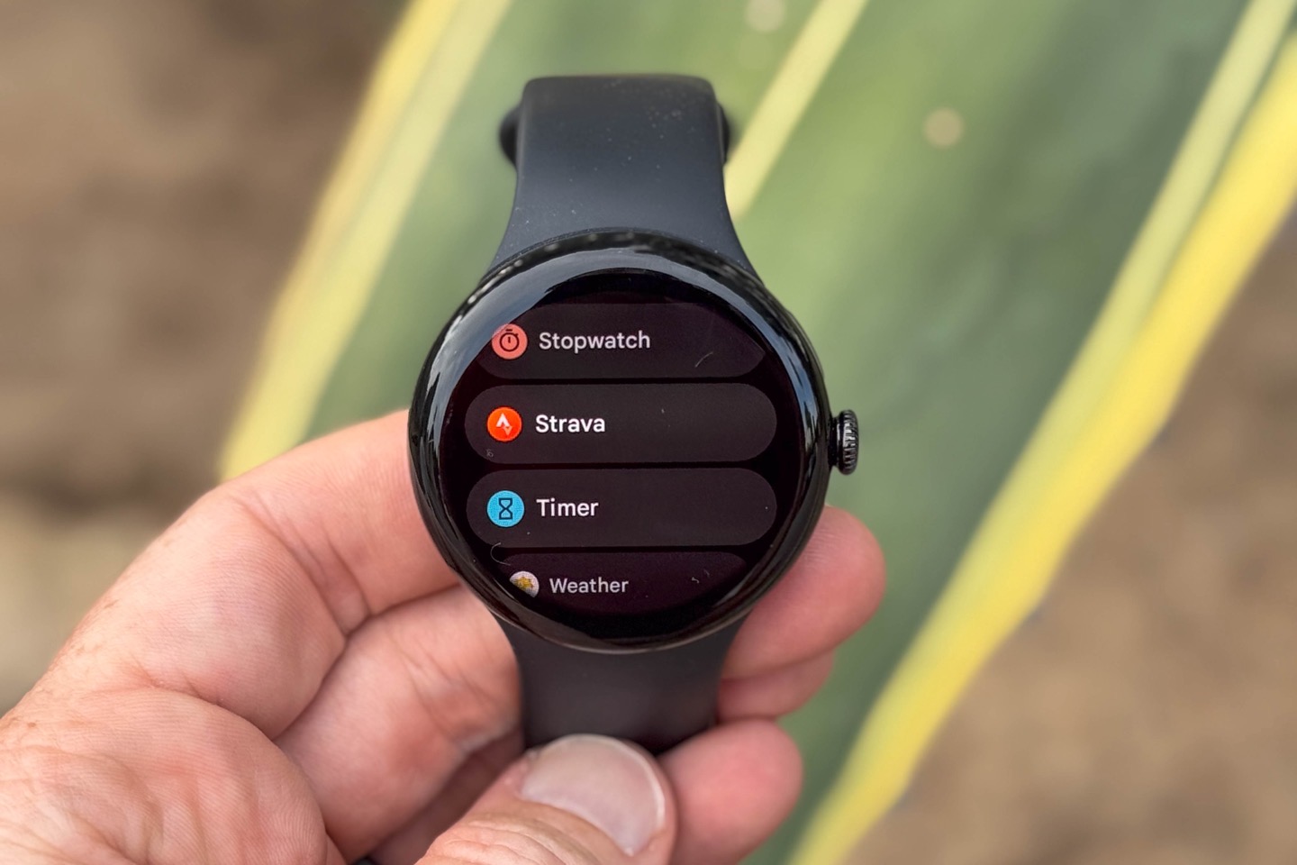
In any event, back in more dry scenarios, if you were to press the Digital Crown button, you’d see a list of all your apps, including any 3rd party WearOS apps (like Strava or Komoot):
If you swipe down, you’ll see the settings-related options, including quick toggles for things like sleep mode.
Whereas if you were to swipe to the right, you’ll go through a list of tiles with mostly fitness/health or daily information (by default, you can add other tiles too). This includes things like steps, heart rate, and the workout quick start menu.
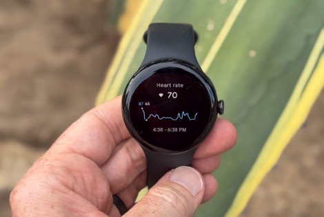
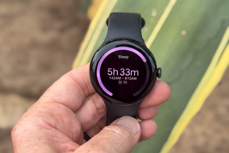
However, there’s also the Fitbit dashboard, which isn’t really a tile per se, but is found from a variety of places. This shows all of your daily stats in one handy place. This includes both sleep stats as well as activity stats, including trending.
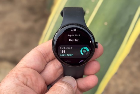
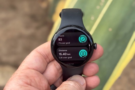
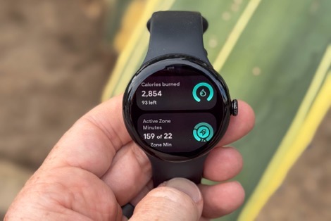
One such stat is the Readiness Score, which used to be the Fitbit Daily Readiness score. They’ve dropped the ‘Daily’ part from the name, as well as tweaked what components are within it. The removal of the components are less about removing them, and more about moving them into a different bucket. Also, notably, the new Readiness is now free for everyone, with no subscription required for anyone anymore (including all existing Pixel Watch users, and Fitbit users got in an update last week).
As for the Readiness Score, the new score now uses HRV, the past two weeks of sleep (with a weighted average built around a sleep reservoir concept), and your resting heart rate. It no longer takes into account previous day ‘activity’, whereas resting HR wasn’t previously part of it. The reason for the changes is they want the updated Readiness Score to be more about how you’re feeling generally, rather than athletically. That’s because the athletic side is now counted for in Cardio/Target load. Your Readiness Score is still on a 1-100 scale (with 100 being most ready).
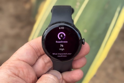
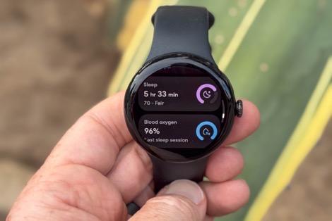
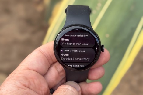
The score seems pretty good to me, and has trended reasonably enough based on my perceptions of how ready I was upon that day. There’s been a few days where it seems like it gives me a bit more credit for poor sleep than I’d prefer, but I suspect that might be slightly skewed because my baseline period (or the last three weeks in general) has been so low on sleep due to all sorts of work travel, that it’s probably decided/assumed this was the norm.
Speaking of that sleep, the sleep metrics have been solid in terms of wake-up/fall-asleep times, within a few mins of my actual times (no more than 5-7 minutes out). This includes periods where I would be in bed on my phone/TV, and it didn’t accidentally trigger that as sleep time. So kudos there. The watch/app of course also shows sleep stage/phase information:
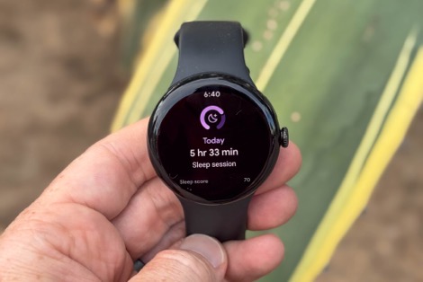
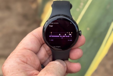
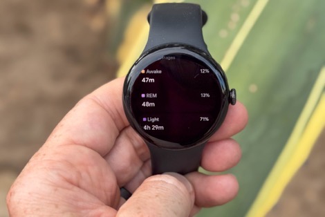
But as I note in every review, comparing the data is basically like throwing spaghetti at a wall. Even the “most accurate” methods to compare sleep phases/stages is only in the mid-80% accuracy range, which, we’d never accept for comparing heart rate data to be wrong 20% of the time as our ‘gold standard’. Thus, I don’t do comparisons of sleep phases/stages, as catchy/fun as the might be.
In terms of notifications, you can swipe up to see those, as well as respond to them directly from the watch. There are countless other reviews though that cover some of those more general smartwatch features that haven’t changed any in years.
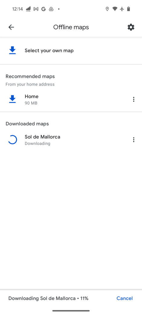
Lastly, I do want to briefly mention the you can download offline maps to the Pixel Watch 3. You’ll use the Google Maps app on your phone to highlight the area you want to download offline maps to your phone. Then, concurrently, that option will also be available for the watch (the same area).
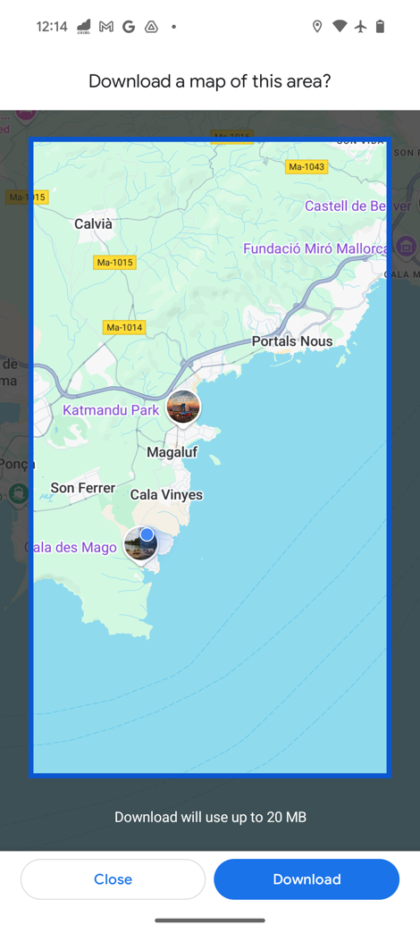
On the watch, you’ll choose the Google Maps app, and then within that you’ll see the options available to download. These will download once on a charger and within range of WiFi:
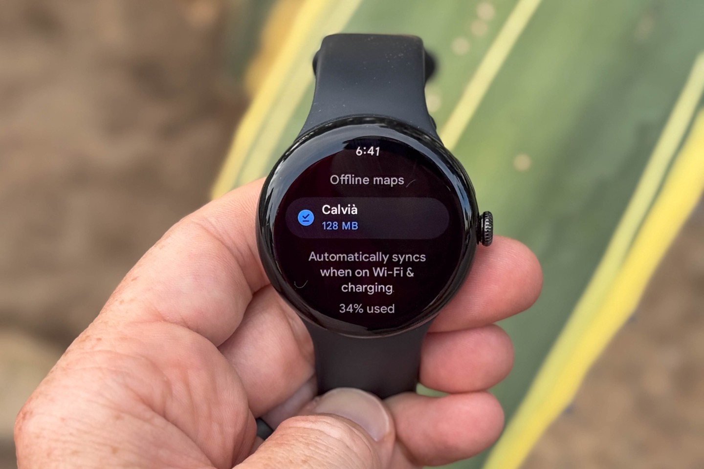
Note however, that there isn’t any integrated navigation from a workout standpoint. Like Apple, it’s a separate app entirely. This is a good example of where there’s a distinct difference between the endurance-focused companies, and the Apple/Google’s of the world. They see those as totally separate apps that you can switch back and forth between, whereas the endurance sports companies know the it’s one cohesive experience. Obviously, I side with the companies that have been doing this for a long time, and I suspect eventually we’ll see Apple/Google join them.
Thus, let’s dig deeper into sports.
Workout & Sports:
![]()
Outside of the size increase, the biggest changes within the Pixel Watch 3 are to the sports features, and specifically a heavy focus on running. That said, all sports benefit from the new Cardio Load & Target Load features. So I’m going to briefly touch on basics like starting a workout/etc, but spend a bit more time on the newer bits around structured workouts, running efficiency metrics, and then transition into the next section for Cardio Load components.
First up, to start a workout you’ve got a couple different ways to access the sports menu, but I tend to just swipe to the right a few times till I get to this sports screen, which let’s me choose the sport type I want. Or, you can tap then ‘More’ button to get the full listing of sports.
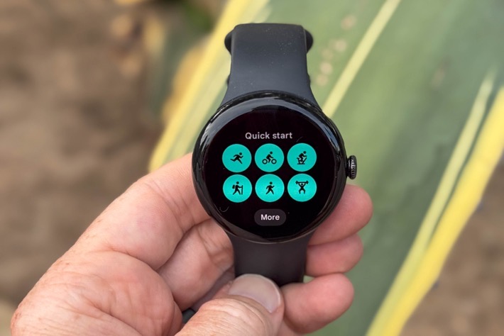
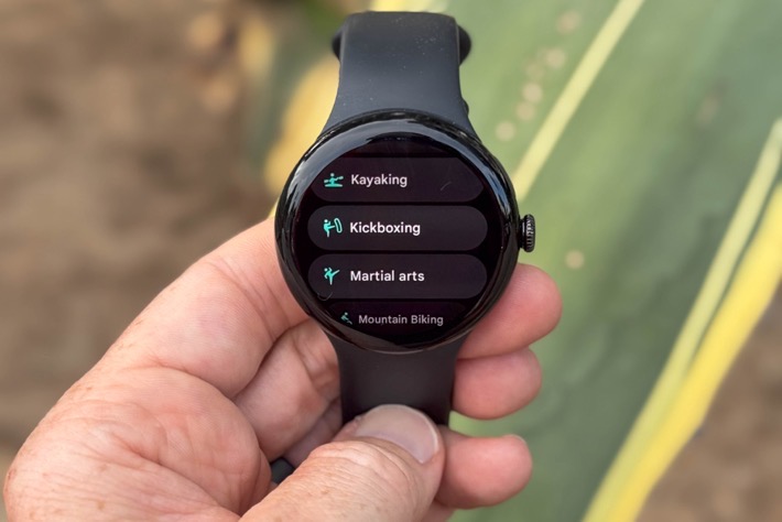
Here’s the full listing of sport types (as of Sept 16th, 2024):
– Aerobics
– Bike
– Bootcamp
– Canoeing
– Circuit Training
– Core Training
– Cross-Country Skiing
– CrossFit
– Dancing
– Elliptical
– Golf
– HIIT
– Hike
– Indoor Climbing
– Kayaking
– Kickboxing
– Martial Arts
– Mountain Biking
– Outdoor Workout
– Paddleboarding
– Piltes
– PowerLifting
– Rollerblading
– Rowing Machine
– Run
– Skating
– Skiing
– Snowboarding
– Spinning
– Sport
– Stair Climber
– Strength Training
– Surfing
– Swim (Pool)
– Tennis
– Treadmill
– Wall
– Weightlighting
– Weights
– Workout
– Yoga
This has just about all the sport types most athletes would want, however, notably missing from the list is any form of triathlon/multisport mode, as well as any sort of Openwater Swim mode (there is though pool swimming).
You can customize the default view page with various metrics, though, you won’t have anywhere near the customization you’d see on a Garmin/COROS/Suunto/Polar watch. But you can do things like change the automatic splits if you want, as well as setup/enable a specific structured workout.
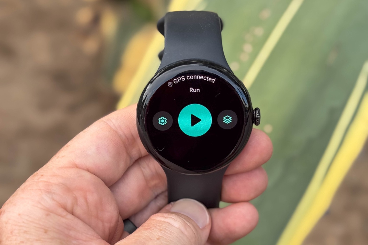
In fact, that’s one of the big ticket areas on the Pixel Watch 3, is the ability to create structured running workouts and push them to the watch. Here you can easily add sets of intervals with either heart rate or pace targets (or no targets), as well as a warm-up and cool-down. You can add multiple different intervals too (e.g. a main set, and a secondary set, s seen below):
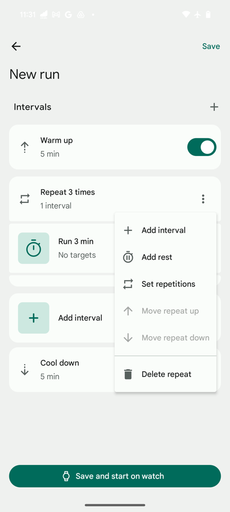
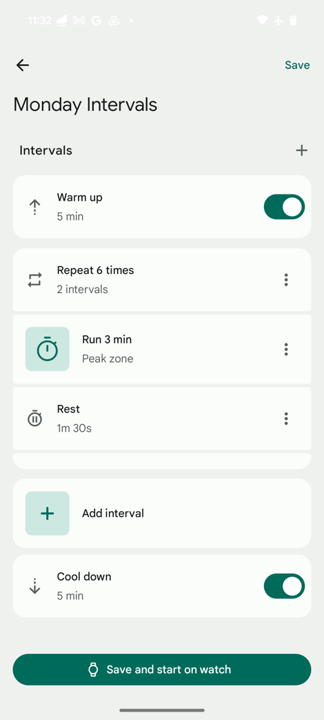
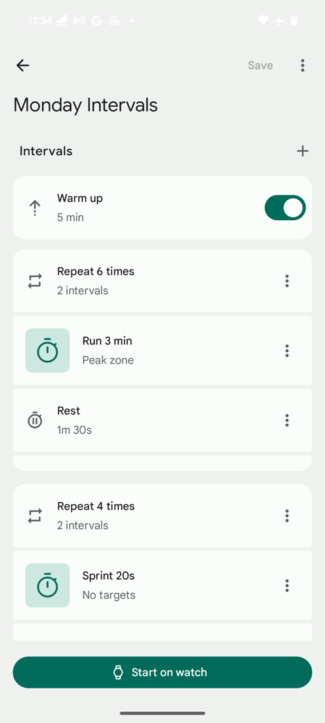
When you do this, you can choose to save these intervals to the watch for later use, or save and open them immediately on the watch. The entire sync process from the phone is instant (versus on most other Garmin/Polar/Suunto/etc… watches, it’s anywhere from a few seconds to a few minutes). Here it is on the watch, ready to roll:
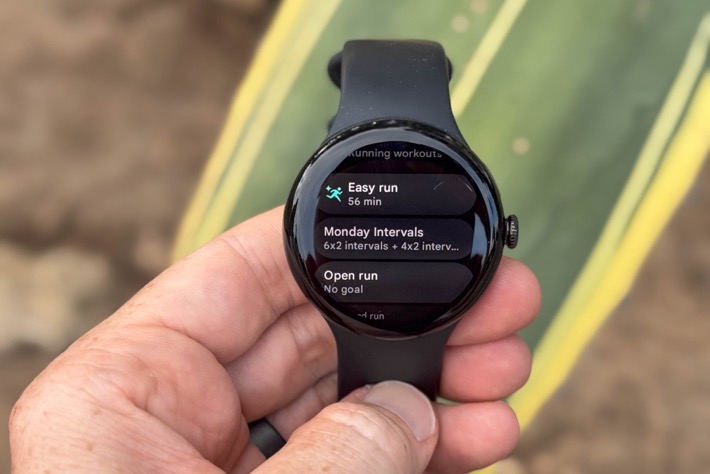
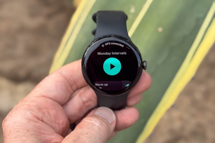
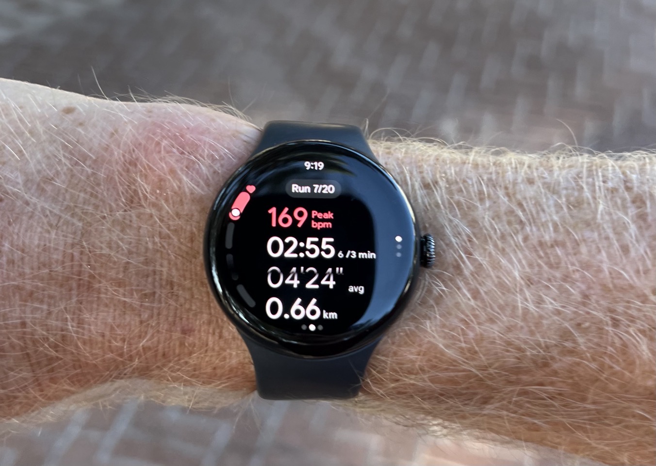
Next, as you start your workout (and this is basically the same across all sport types), you’ll see the data fields you’ve configured, as well as a general HR zone screen. In my case, since this workout I’m showing you was also structured, I’ve got a target page shown too, as seen here:
But most of my workouts have been without structured targets, and just riding/running/etc… Thus, I’d only have the one page. This is one area I think Google should expand on, if they want to be more competitive with other running-focused watches. Having different pages for lap splits vs run totals is kinda core stuff in the running world.
In any event, as you’re running along, you’ll get notified of the next interval section, as such (both audibly and via vibration/on-screen notices). All of this worked well for me without any issues.
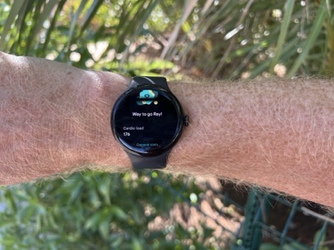
Now, once you’ve completed a workout (structured or otherwise), it’ll show you the summary stats. There’s actually quite a boatload of summary stats here as you scroll down further, eventually getting into running efficiency metrics and more (these are new). Here’s a couple of them, from this morning’s interval run:
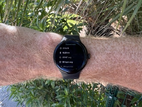
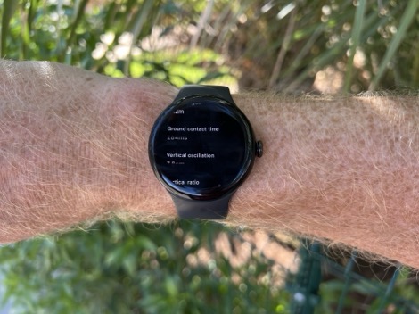
And then, all of these are also visible in the Fitbit app as well. Here’s some screenshots of that same interval run (which also included some solid election gain, as a one-way run).
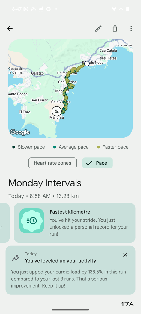
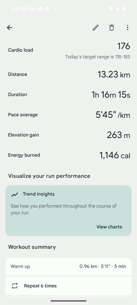
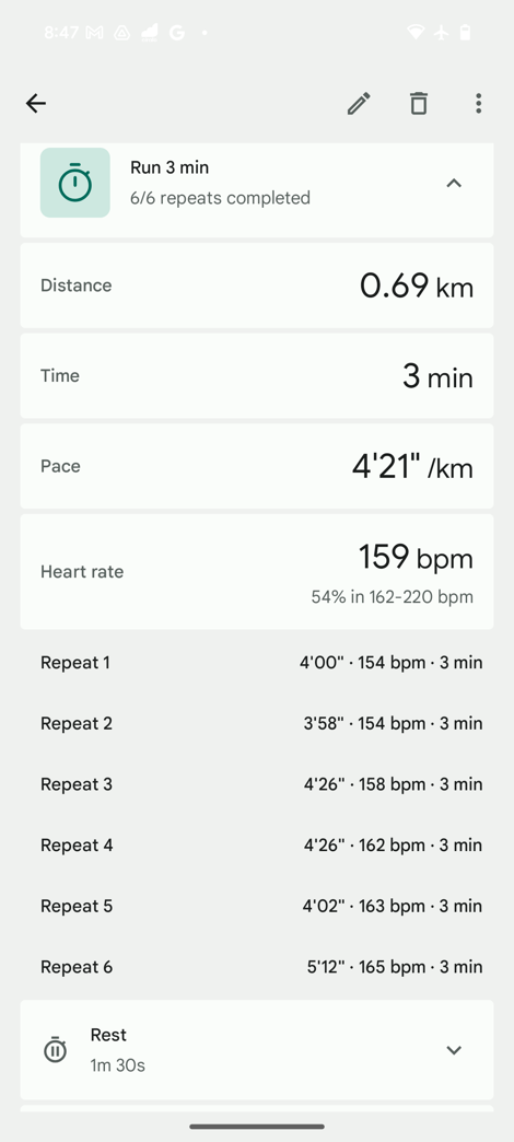
Now, let’s talk about those running efficiency stats, these include specifically: Ground contact time, vertical oscillation, form analysis, cadence, and stride length. All of these are measured from the wrist, like most other companies. Google has spent a ton of time in this realm testing and validating these metrics. In fact, I even visited a Google HQ lab they setup complete with a fancy force measurement running track section, high-speed body positioning cameras, and more. You can see this below:
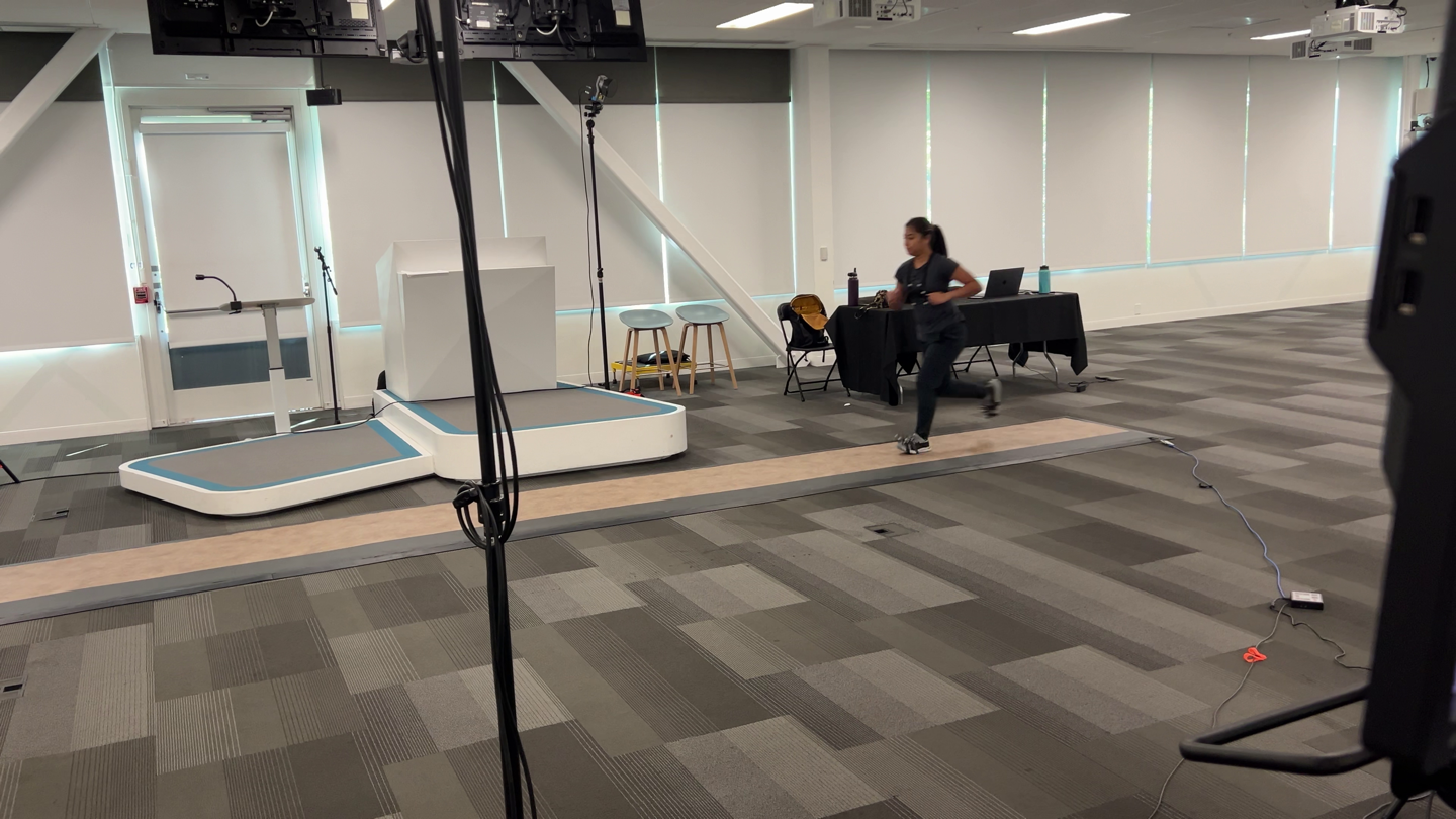
As well as the equipment one of the running testers (they had many) would wear, for the computers to use the imagery to capture all this data and validate it against the algorithms used in the watches.
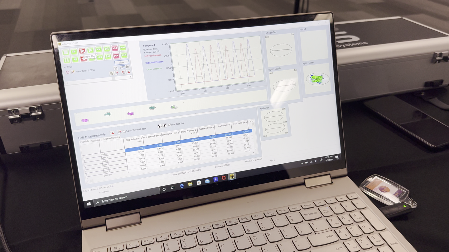
I even got a hands-on explainer in-person watching them do some test passes and showing the validation of their algorithms. However, as neat as all this is (and really, it is), what’s lacking here is Google doesn’t actually export out any of this data from the Fitbit app. The above gallery images (on the run completion screens) are the only places you can see it on a per-workout basis. Meaning, they don’t export it to a .FIT file like all of their competitors (or, export it to some other data type). Even Apple, keeper of the Walled Garden philosophy, at least exports it to Apple Health, where 3rd party companies can access it.
Thus ultimately, I can only compare total complete run averages, which is pretty much useless for any sort of comparison to see where things go right/wrong.
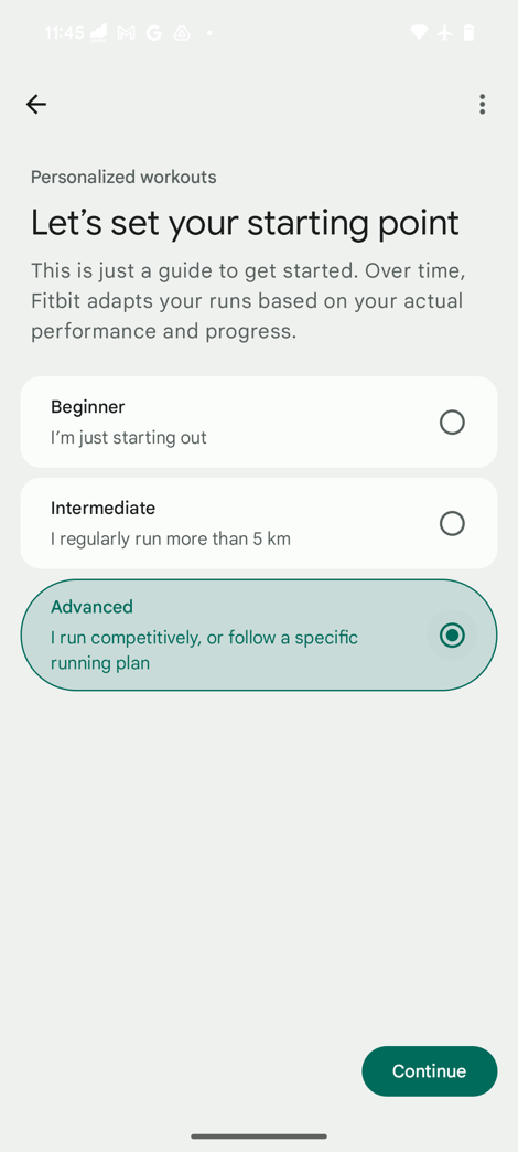
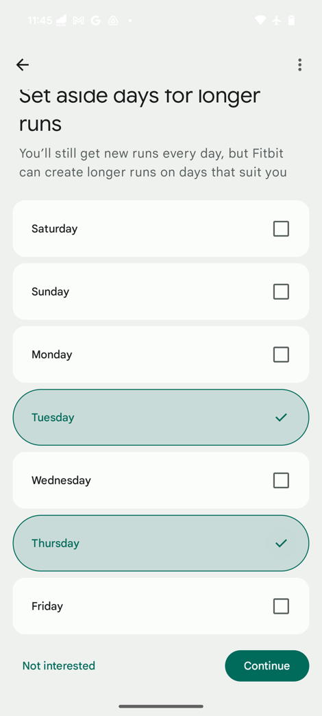
Ultimately, Fitbit does take this data though and leverage it within the Fitbit Coach features, when it builds workouts. And in fact, within Fitbit Coach (part of Fitbit Premium, one of the few places you’d need to pay if you want added features), it’ll ask you a slate of questions before building out automatic structured workouts (including which long-run days you want):
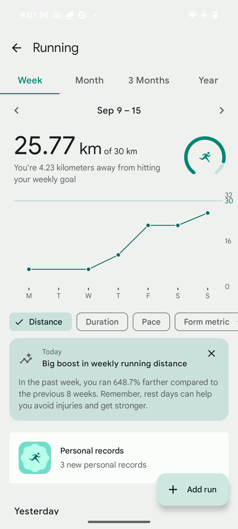
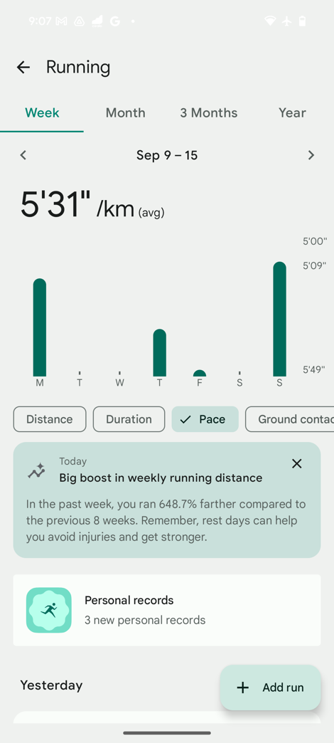
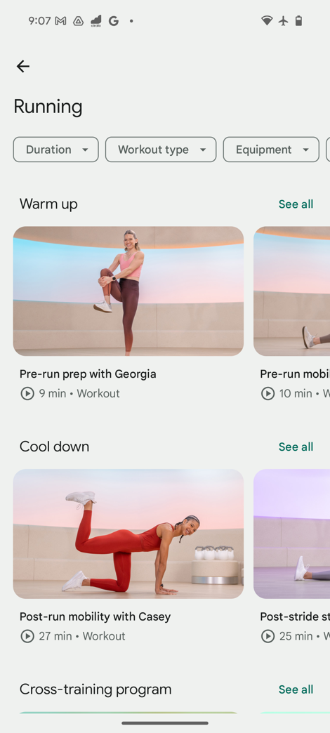
There’s also the new Run Dashboard, which consolidates all of your running data into one place. This includes weekly/monthly/etc summaries, notifications on new PR’s, as well as the ability to look at different metrics in terms of trending (even the running efficiency metrics.
Now, before we dive into Cardio Load, let’s quickly talk about two other bits. First, is the ability to broadcast your heart rate to other devices, via Bluetooth Smart. This means you can pair up a Pixel Watch to a Peloton Bike, Strava app, Garmin bike computer, etc… basically anything that accepts a heart rate strap will, probably, maybe, hopefully, accept the Pixel Watch data stream. I say that with all those caveats, because Google has made life far more difficult than it needs to be, and required access authorization each time you want to use the HR sensor with a 3rd party device:
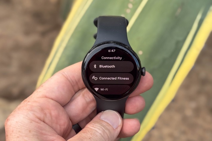
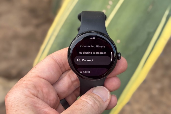
This means you have to do a silly little dance each time of confirming/reconfirming/etc, none of which is normally required for any regular heart rate strap. I wrote about this previously, and in short, Google is trying to be privacy conscious here. But ultimately, it’s overkill for a feature that literally not a *SINGLE PERSON* has every asked for on the site/YouTube here in 15+ years and hundreds of thousands of fitness-focused comments. Not even Tour de France WorldTour pro teams are asking for it. The end resultant is just a messy and cumbersome experience for end users.
And since we’re on the topic of heart rate sensors, Google does not pair to any 3rd party sensors, including heart rate sensors. Meaning, you can’t pair a chest strap to a Google Pixel Watch, nor any other sensor types like cycling sensors (such as speed/cadence/power/etc…). So, for cyclists that have those types of sensors, this will probably remain a non-starter. And while Samsung has added support for those sensor types to their WearOS watches, that’s only via the paired mobile app, and as I showed in my recent testing, the Samsung sensor connectivity is a dumpster fire of failures.
Setting all that aside, Google has done good work on the running portions here, and made some genuinely big strides forward. But the biggest jump forward is definitely the new training load pieces.
Cardio Load Features:
![]()
All of which finally gets us to the new Cardio Load & Cardio Target features. First is the load tracking piece. Every time you elevate your heart rate (be it working out, running to catch a bus, or practicing making a baby), Google will give you cardio load ‘credit’. This is notably different than every other watch out there today, which only gives you cardio load for workouts that you actually start/stop as a legit workout. And again, we’re specifically talking about training load type features here, not just general ‘exercise’ as Apple (or Garmin with ‘Intensity Minutes’) defines it.
The point being, Google’s approach is actually the most holistic one to date, as it does a much better job at tracking a busy day. For example, I spent a few hours one day loading up a truck with friends with a ton of heavy boxes. I didn’t start a workout, yet, I gained some 132 units of load that day. Roughly the same as a 10KM trail run I did. At left you can see the one day with that 132 units of non-workout load, versus last Friday with 129 units of workout cardio load (and then another 20 units of other misc load):
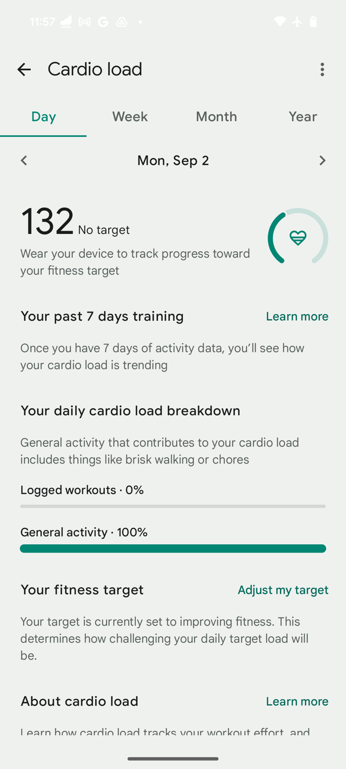
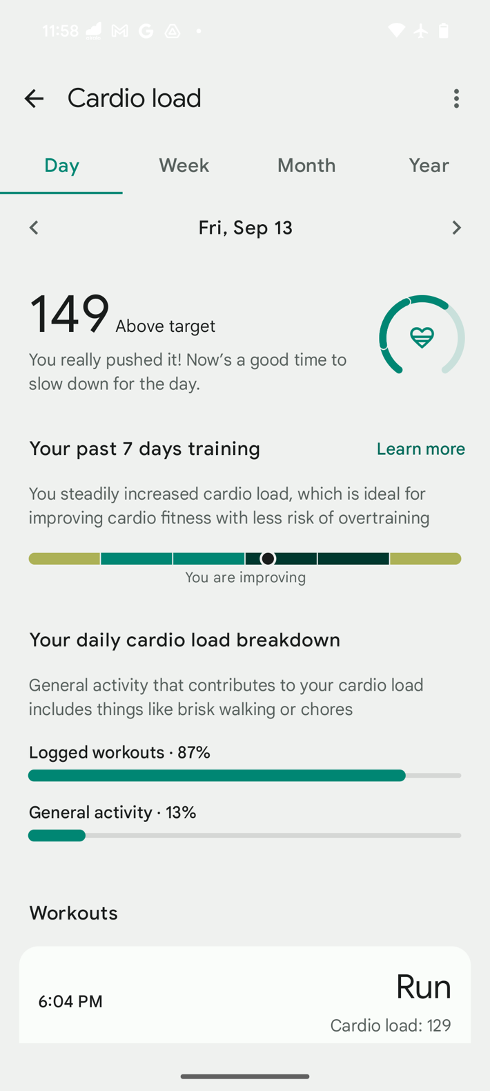
You can see your Cardio Load within the app, or, far more easily, right on your watch face (as I have done). It’s the one with the 23 units on it (left, yesterday), or 185 units on it (right, today).
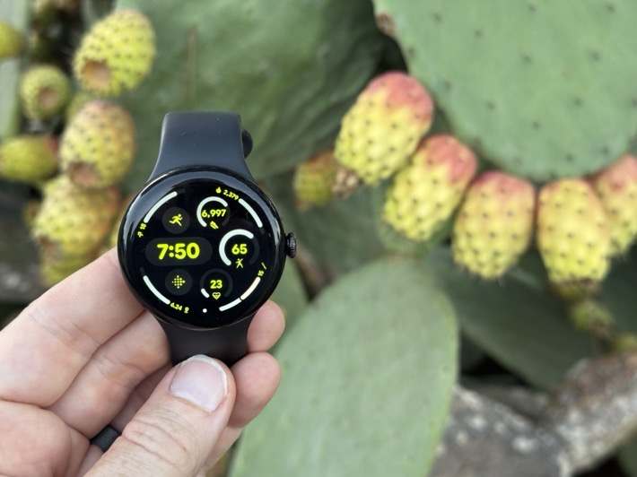
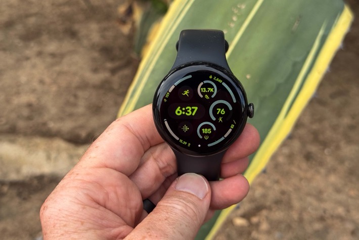
You can then tap that, to see more details on the current day on how that breaks out into various workouts (or non-workouts):
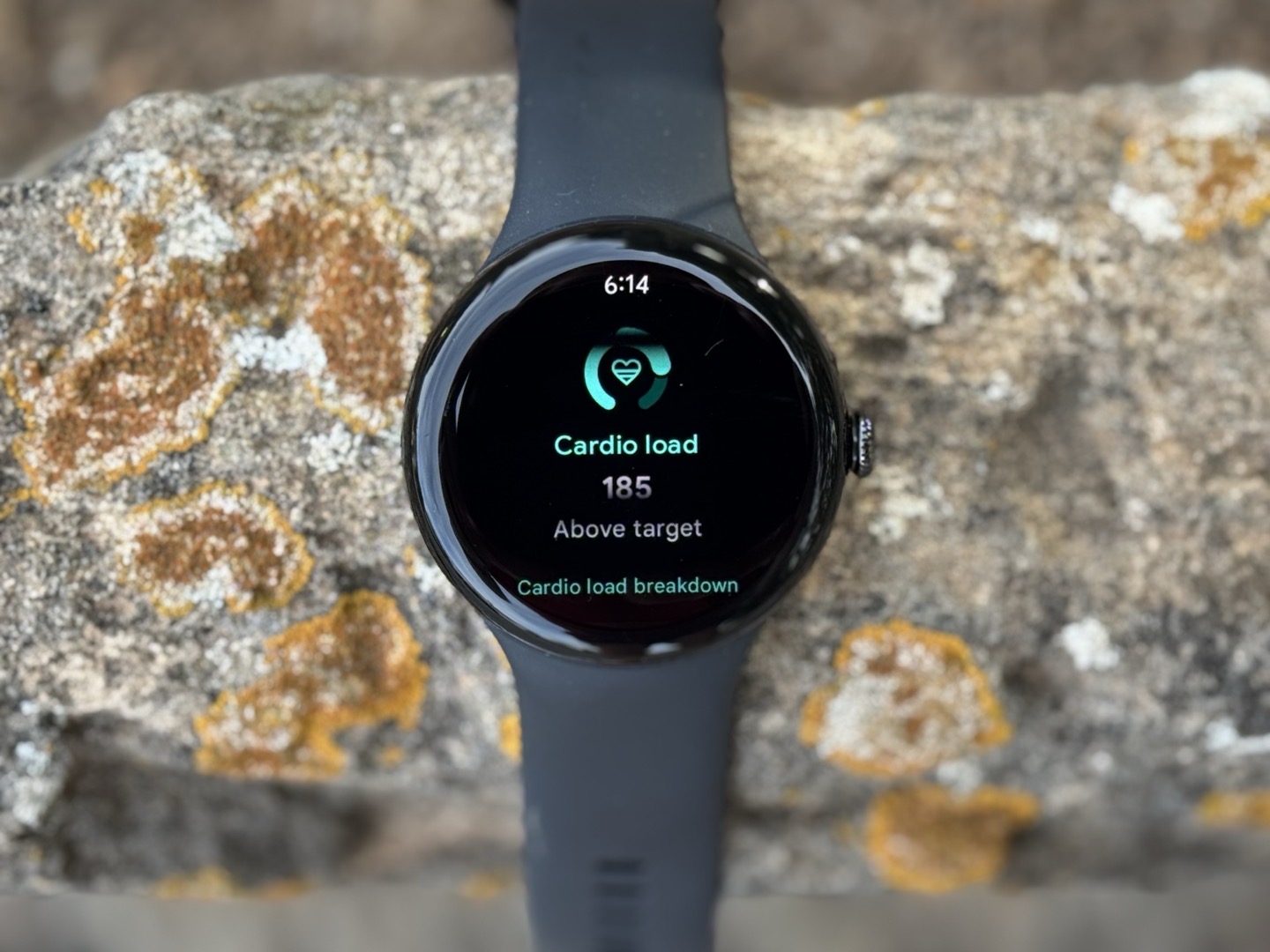
Once you start creating Cardio Load, then, you’ve gotta wait 14 days till you get a Cardia Load target. During this time it’s calibrating your baseline. This isn’t that much different from other companies, with the main difference that most other companies will start immediately (but effectively have incomplete data), whereas Google is holding back to give you bit more complete picture. Once that’s done, you’ll start to see a Cardio Load Target each day (as a range). That Cardio Load Target is based on not just your recent Cardio Load, but also your Daily Readiness score. Thus, if you have low/crappy sleep the night before, it’ll lower your target that morning.
![]()
In general, this mostly worked well for me. I did have a few outlier days though where the ranges were quite wide (especially on Day 14/15), spanning from 0 to 236. Basically Google saying: “Shrug, do nothing, do something, do all the things, I don’t care!”. But as that’s matured, it’s gotten more focused, and does seem to be providing some useful targets.
Note that additionally, Google is unique in the it’s actually letting you choose whether to “Maintain Fitness” or “Increase Fitness”, something no other watch does today in their training load pieces. Instead, all other watches just assume you forever want to increase fitness.
Thus, while Google doesn’t explicityl have a “Recovery” component of Training Load/Recovery, it sorta indirectly does, via the Daily Readiness pieces being incorporated into Cardio Load targets each morning. In effective, it’s doing the exact same thing that Garmin does with Training Readiness and Training Status, just in a bit more distilled manner.
Ultimately, if there’s anything I appreciate about all of this, is that Google is providing specific numbers in all of these metrics, which are based on TRIMP, and Google has very clearly documented in some detailed white papers on how all this works. You can find them here.
GPS & Heart Rate Accuracy:
![]()
In this section I’ll look at how well the GPS chipset and optical heart rate sensor performs. While neither hardware component has received an upgrade in the Pixel Watch 3, Google says that they spent significant time on improving optical heart rate accuracy on the Pixel Watch 3 via algorithmic updates. It also sounds like there may be some very slight hardware component tweaks on the optical HR sensor side, but not enough to call it a new sensor.
In any case, starting off on the heart rate side first, I feel like I could probably show just this single run graph from this morning’s beastly intervals (including on and off-road, steep trail sections, and more), and call it done. This is compared to a chest strap:
![]()
That mind-bogglingly scary perfect.
But still, we’ll look at more workouts. Next up, an even harder test – outdoor cycling. Specifically a blend of MTB, road, and gravel – all mixed into one glorious ride. Gravel and MTB terrain in particular tend to be very difficult for wrist-based optical HR sensors, given the vibrations that occur from that terrain, yet, here’s the results against a chest strap:
![]()
Outside of of a few minor delays at the start of an interval, this is one of the more (if not most) impressive displays of optical HR accuracy I’ve seen outdoors on a tricky-terrain ride such as this was.
In any case, here’s another run. This time just some more intervals. And again, very strong performance:
![]()
And yet another trail run, with all the fun that comes with plenty of short and steep hills. Also, perfection:
![]()
So, with the optical sensor looking absurdly accurate, let’s take a look at the GPS side of things. Starting with that that gravel/MTB/road mixed ride, you can see at a high level, things look very close:
![]()
Same goes for many tree sections, in fact, the vast majority of the ride looks just like this:
![]()
Yet, there were a few sections where it wobbled a bit, or slightly cut corners. Below is probably the single biggest example on the entire ride, but you can see it quite clearly.
![]()
So, let’s look at a suburban run in California. This should be pretty easy, as there’s not really anything blocking the signal, since there’s no tall buildings, nor really any major trees. At a high level, it mostly looks OK:
![]()
But notice above all those little notches? That’s not quite right. They look like small GPS blips. And you can see them more clearly when I zoom into a given section. Lots and lots of them.
![]()
While one might argue it’s nitpicking, it’s also not normal (or even close to normal). I’ve seen plenty of weird GPS things in my day, but this is definitely a strange set of minor quirks that I haven’t seen before.
The same goes for a road to path to trail run I did this morning (that interval run above). It looks good at a high level, but as you zoom in, you see lots of weird quirks. Very minor quirks, but quirks nonetheless. You can check out that data set here.
That said, it’s not as though giant buildings make it unusable. Meaning, it doesn’t get substantially worse as conditions get more challenging. I gave it a whirl through my usual downtown city test, with buildings in the 20-30 story range, and it did OK-ish. Not great, but not horrible. Just…normal-ish. You can see it struggled around some corners, but again, not horrific.
![]()
Ultimately, if I look t accuracy as a whole, the optical HR sensor has clearly joined the industry leading distinction among both Apple & Garmin. It’s really damn good. But, the GPS sensor is just so-so, and while normally I’d say they might want to look at multiband/dual-frequency, I don’t actually remember seeing the quirky offset errors for the Pixel Watch 2, thus this seems a bit more algorithmic than hardware. But, it’s hard to say for certain. Again, it’s not horrible, but it just doesn’t match the really high quality of the optical HR sensor.
Lastly, in terms of battery consumption, for daily usage, it’s been really really good. I’m getting a solid two days of battery life out of it (in a non-LTE usage/setup scenario), including roughly 1-2hrs of GPS time per day, on the 45mm. I’m happy with that.
However, for workout battery consumption, I’m seeing a bit higher battery burn than I’d like. Take for example this morning’s 75 minute run. I started off the run at 31%, but ended at 8%. That’s 23% in a bit over an hour, putting it on target for only about 5 hours of GPS time. Yet other workouts, like a 2hr 15min ride I did, went from 37% to 24%, putting it on pace for roughly 4-5%/hour (or about 20-25hrs GPS time). In the case of this morning’s run it was doing a structured workout, whereas the bike was not. Unfortunately, Google doesn’t show/record the battery percentages to the file, meaning the only way I know is by taking before/after photos of the battery indicator, which…is cumbersome to remember (especially after a hard run).
In any event, at least the daily battery life is very solid.
(Note: All of the charts in these accuracy portions were created using the DCR Analyzer tool. It allows you to compare power meters/trainers, heart rate, cadence, speed/pace, running power, GPS tracks, and plenty more. You can use it as well for your own gadget comparisons, more details here.)
Final Thoughts:
It’s interesting to see how different companies approach new versions of their watches, which ares they latch onto, which areas they avoid, and how they position the watch towards different audiences. In the case of the Pixel Watch 3, they delivered on finally having a bigger watch. And then they delivered further on arguably best in place optical heart rate, along with a very interesting take on training load via their Cardio Load/Targets feature. While structured running workouts is definitely useful, Google really does need to find a way to let 3rd party platforms like TrainingPeaks push to the watch. The reality is that most serious runners that are manually creating highly structured workouts, are doing so within other 3rd party platforms.
Still, even the workout builder they did create is quite good for a first iteration focused on running. It won’t solve issues for cyclists or other sports, but, the clearly wasn’t the focus area here. Speaking of focus, while optical heart rate is great, GPS leaves a bit to be desired. It’s unclear to me if this can be fixed via software update, or would require further hardware tweaks. As noted above, they are minor issues, but nonetheless quirky.
All of which leaves me looking towards the future. With Google now on its 3rd iteration, I feel like this might be a critical juncture for the product line. Is Google seeing the returns it wants on it? And what about WearOS more generally – are other companies (beyond Samsung) going to continue investing? And ultimately, I think that gets to the biggest question: When will we see something akin to a Pixel Watch Ultra/Pro/whatever that has a bigger battery/case design, with some more rugged features. That certainly seems to be the clear direction of the industry.
Until then though, Google seems to have delivered one of the best running/sports focused variants of WearOS (or at least, current editions of WearOS) at this point in time, in terms of battery life, accuracy, and sports features. None of which require a Google Pixel phone, but work with any Android phone.
With those things to ponder, thanks for reading!
FOUND THIS POST USEFUL? SUPPORT THE SITE!
Hopefully, you found this post useful. The website is really a labor of love, so please consider becoming a DC RAINMAKER Supporter. This gets you an ad-free experience, and access to our (mostly) bi-monthly behind-the-scenes video series of “Shed Talkin’”.
Support DCRainMaker – Shop on Amazon
Otherwise, perhaps consider using the below link if shopping on Amazon. As an Amazon Associate, I earn from qualifying purchases. It doesn’t cost you anything extra, but your purchases help support this website a lot. It could simply be buying toilet paper, or this pizza oven we use and love.
