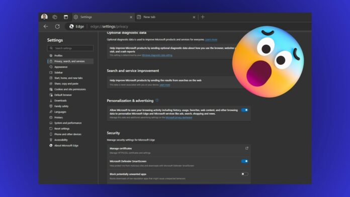
Microsoft Edge browser has numerous settings and customization options, but that’s becoming an issue. Even Microsoft realized that the Settings page was heavily populated, which is why it plans to change that. This move could help users understand Microsoft Edge better if they’re switching away from Google Chrome.
The company has three navigation improvements in mind that’ll make it easy to find any Edge setting.
Windows Latest spotted this change listed on the official Roadmap website. Firstly, you’ll get quick access to the most used settings in Edge. These suggestions will appear on the landing page and grant one-click access to your most used sections.
Similarly, a second implementation of quick access will appear on pages with overwhelming options like the System and Performance page. So, you can immediately jump to the most visited setting of the page.
Lastly, Microsoft will condense the long Settings pages into smaller, expandable sub-sections. So you won’t have to scroll the complete page to find something. You can simply click on a sub-section and then access the settings.
Microsoft has already bloated the browser with too much stuff, and it will offer some respite.
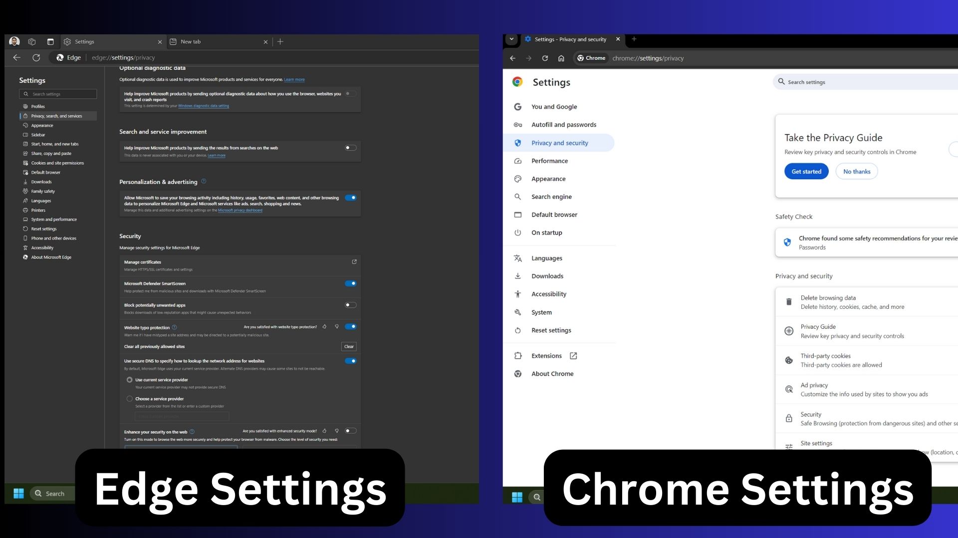
Windows Latest compared the Edge settings page with Chrome and found that the latter was better organized with sub-sections. The Chrome settings page doesn’t have quick access suggestions but is easy to navigate.

All three proposed changes are indeed useful and will improve Edge’s navigation. The rollout will begin in October 2024, which is next month. Still, it could be a while before it arrives in the stable version of Edge.
Another laudable attempt at improving Edge’s navigation is “decluttering the sidebar” which we covered last month.
Sidebar cleanup
Edge’s sidebar is also a mangled mess with too many apps. You can remove the icon manually with some extra effort. Soon, Edge will suggest auto-remove the apps from the sidebar. It will determine the apps that haven’t been used in a long time and make suggestions based on that.


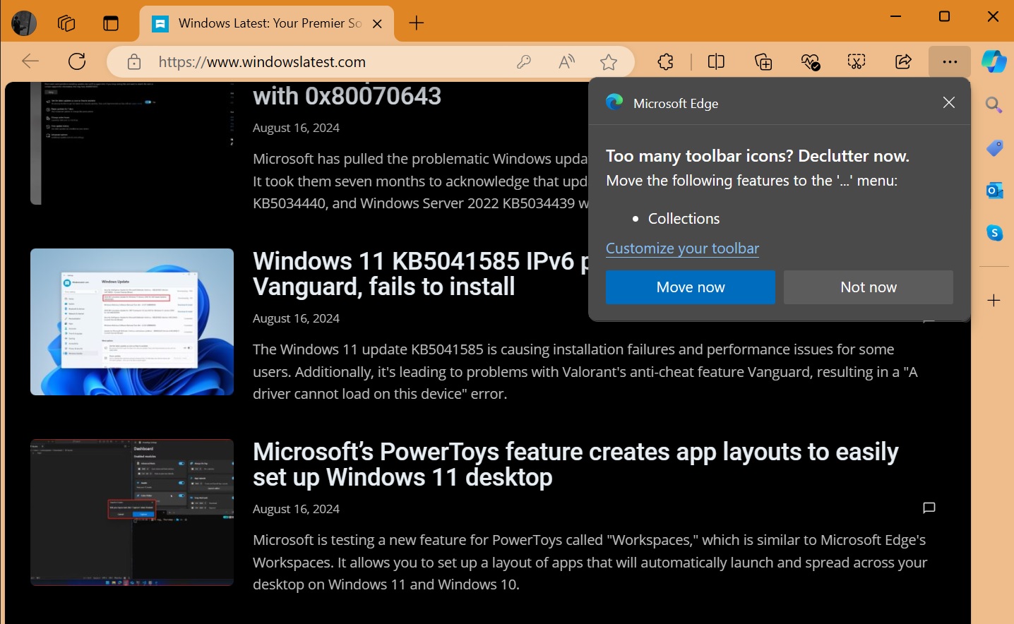
As shown in the above screenshot, a pop-up “too many toolbar icons? declutter now” could appear after Edge update with the option to “move” the icons to the “…” menu.
In addition, Edge could also sync with Windows 11’s Energy Saver to conserve battery life. Until now, both have separate settings but soon they could work together. Multiple AI features like Copilot in the screenshot tool, AI site suggestions, and more are in the works.


