Joe Hindy / Android Authority
TL;DR
- Google is redesigning the account switcher for its apps.
- The new design looks similar to the web version.
- We were able to activate the new UI.
Back in August, we shared that strings of code in several apps suggested Google was working on redesigning the UI for the account switcher. At the time, we only had information from the strings to understand how the UI would look. Now, we have managed to activate the new account switcher UI.
An APK teardown helps predict features that may arrive on a service in the future based on work-in-progress code. However, it is possible that such predicted features may not make it to a public release.
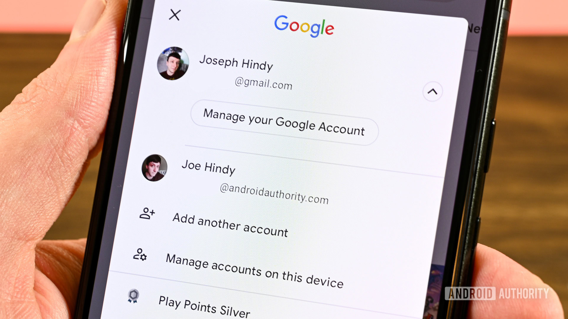
Currently, when you tap on your profile in a Google app on mobile, a pop-up is displayed that contains your primary account, a “Manage your Google Account” button, other connected accounts, an “Add another account” button, and a “Manage accounts on this device” button. Based on our teardown from last month, we expected that the UI would be altered to resemble the web version, offering a cleaner look overall.
We have now activated the new account switcher UI in Gmail version 2024.09.01.670000360.Release, which can be seen above. As we expected, the redesign is very similar to the UI you’ll find in the web version. Instead of a dialog, the UI now appears as a full page.
With this new full-page UI, you won’t be able to just tap outside of the dialog box to close it. You’ll now have to tap on the close button on top right or use the back gesture/button to exit. We also noticed that swiping up/down to switch between accounts is staying.
We believe this new UI should come to other Google apps in the near future. When exactly Google will roll out the changes is unknown.

