Summary
- Google News gets a minimalist makeover, slimming down its bottom bar and layout for a cleaner, less cluttered feel.
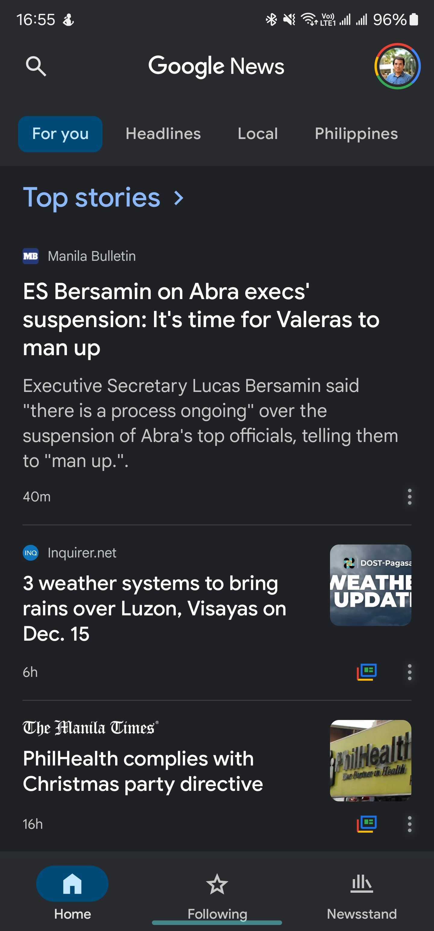
- The “For You” and “Headlines” tabs merge into a single “Home” tab, while “Following” and “Newsstand” stay the same.
- A new categories carousel at the top gives quick access to key sections like Local, U.S., World, Business, and more.
Google has been busy fine-tuning its Android apps, and the latest to get a refresh is Google News. Taking a page from the recent Google Maps redesign, which slimmed down the bottom bar, Google News now sports a cleaner, more minimalist look. The updated app tweaks its bottom bar layout for a less cluttered user experience.
The latest Google News update trims down its bottom navigation bar. Previously, it featured “For You,” “Headlines,” “Following,” and “Newsstand.” Now, “For You” and “Headlines” have merged into a single “Home” tab, blending personalized content with top stories, as spotted by 9to5Google. The “Following” and “Newsstand” tabs stay as they are.
You’ll also now find a handy categories carousel at the top, giving you quick access to key sections like Headlines, Local, U.S., World, Business, Tech, Entertainment, Sports, Science, and Health. Previously tucked away in the “Headlines” section, these categories are now front and center, cutting out extra steps and making it easier to find the news you care about.
The revamped Google News app also uses bold chips to highlight your current feed in the carousel. While it might make one-handed navigation a bit trickier for some, it boosts navigation overall with a clearer, more visually engaging way to track where you are.

Google News is the go-to app for pulling together the world’s top stories in one place. While you can catch the latest updates through the Google app, News gives Android users a more focused, dedicated space to stay in the loop.
Google’s apps are all going minimalist, and News is no exception
Google News shrinking its bottom bar from four tabs to three reflects a wider trend in Google’s app design. This streamlined approach reduces mental clutter, improves usability, and adds a touch of elegance. Fewer tabs mean a cleaner, simpler look that fits right in with the sleek, minimalist style of Material You. The redesign is rolling out with version 5.120.x on Android, thanks to a server-side update.

