While Google Chrome is the undisputed king of the browser world, the company seems to have slowed down in terms of innovation. Chrome sure is a reliable workhorse, but it feels dated in terms of features, customization, and overall user experience. Enter Arc, a modern browser that has captured the attention of users with its fresh approach to browsing. Its innovative features and user-focused design make it a strong alternative that Chrome could learn from.
In this post, I will go over the specific Arc features that I believe Chrome could steal to win back users like myself who are craving a more efficient, customizable, and engaging browsing experience.
Related
Arc browser hands-on: Reinventing the wheel, even when it worked perfectly fine
Arc wants to shake up the Windows browser market — but did it really need to change?
5 An infinite whiteboard
Surprisingly, Easel (an infinite board in Arc) turned out to be one of my most used features. While there is no shortage of third-party whiteboard tools out there, nothing beats a seamless integration right into your desktop browser.
It acts as an infinite canvas where I can jot down ideas, sketch diagrams, and organize my thoughts visually. Whether I’m researching for a complex subject, creating a Christmas wishlist for friends, brainstorming ideas for my next blog post, or planning a summer trip, Easel proves to be an invaluable tool. It is feature-rich, with useful tools like text, shapes, arrows, images, and more.
And since Arc supports split tabs, I can easily glance over both the Easel and opened web tabs. Now that Google has shut down Jamboard (its digital whiteboard solution), the company can look into offering something similar right into Chrome to fill in the gap.
4 Vertical tabs and folders
Arc’s approach to tab management is a breath of fresh air and a key reason why many users find it superior to Chrome. Instead of the traditional horizontal tab bar crammed at the top, Arc utilizes a vertical sidebar for tabs. This seemingly simple change has positive effects on my browsing experience.
Whenever I work on my 32-inch monitor, vertical tabs free up valuable horizontal screen real estate, giving me a wider view of web pages and reducing the need for excessive scrolling. I no longer need to deal with tiny tabs squished together. I also find it quite intuitive to navigate through a vertical list of tabs compared to a horizontal row.
Arc takes it a step further by allowing it to create folders within the sidebar. This means I can group related tabs and even Easels together, keeping my workspace tidy and focused. In contrast, Chrome’s horizontal tabs can become crowded and cluttered as I open more tabs.
Related
Arc vs. Edge: Should you switch from Microsoft’s web browser?
Arc brings a fresh approach to web-browsing. But is it good enough to leave your tried-and-tested Edge setup?
3 Customization options
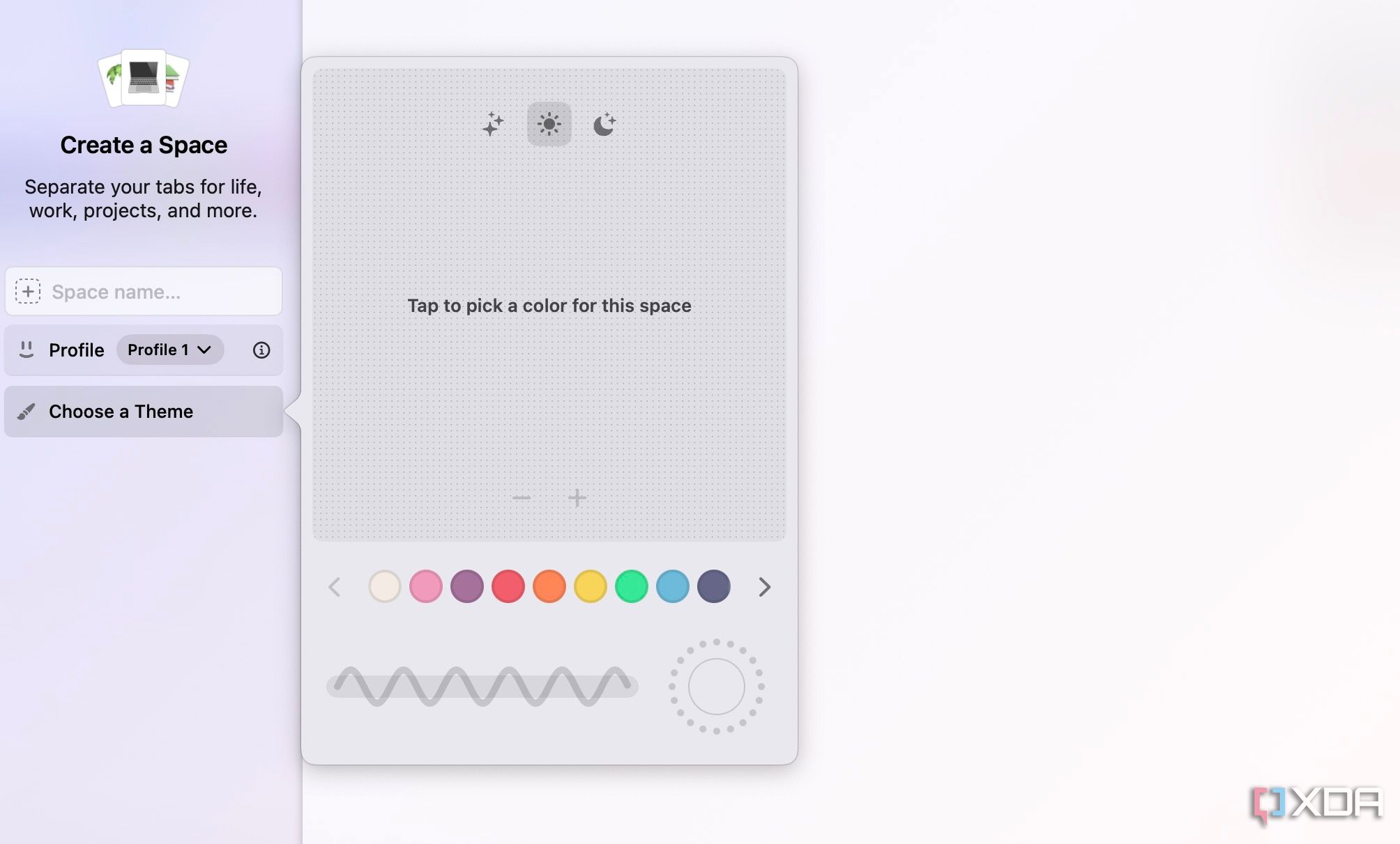
Here is where Arc truly shines. Arc’s Boost is a fantastic feature that unlocks a range of customization features for boring web pages. It lets you tweak the appearance, including colors, fonts, and even the layout, with a few clicks. This means you can make websites more visually appealing, improve readability, or even create a better aesthetic across all your favorite sites.
You can also visit a dedicated Boost Gallery to get inspiration from existing users. Overall, I feel Arc has set a benchmark in terms of customization. This level of customization is also great for accessibility. Even the default browser theme editor is more feature-rich than Chrome’s Material You gallery.
Now imagine Chrome offering the same. It would empower users to personalize their browsing experience like never before. Chrome could offer pre-made themes for Gmail, Twitter, Facebook, and other popular websites to get started.
2 Arc Spaces
While Google Chrome supports profiles, Arc takes the entire experience further with Spaces. You can think of them as separate, dedicated workspaces where each space has its own set of tabs, folders, and visual themes.
You can create different Spaces such as Personal, Work, Shopping, Travel, and more and switch between them from the bottom bar. This separation helps you stay focused and avoid distractions. You no longer need to go through endless scrolling to find what you need. Chrome does support Tab Groups, but Arc’s implementation is way better.

Related
4 browsers that are great Google Chrome alternatives
For those looking to de-Chrome, there’s a heap of great options, each with their own strengths.
1 AI integration similar to Arc Max
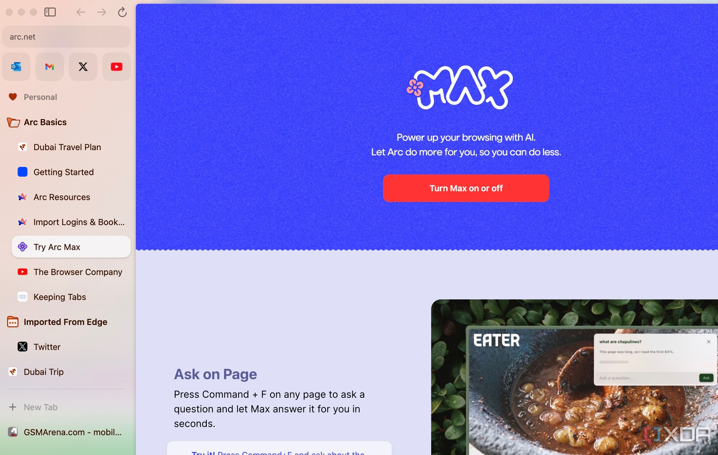
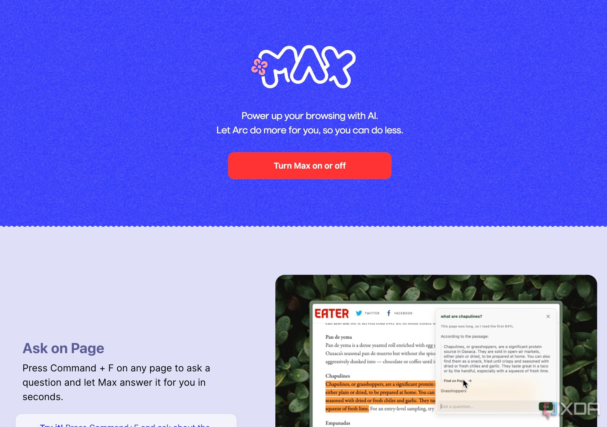
Although Google has been quite quick at integrating Gemini to its products such as Docs, Gmail, Sheets, Slides, Keep, and more, the company hasn’t explored the same for Chrome yet. In contrast, Arc Max is a shining example of how AI can be seamlessly integrated into a browser to enhance the user experience.
Arc Max enables ChatGPT integration, Ask AI to summarize a webpage, smart tab renaming, automatic download naming, and more. These are some of the neat, productive Arc features, and Chrome can surely take inspiration by leveraging Gemini.
Chrome, it’s time for an upgrade
Chrome can also learn some of the design tweaks from Arc. Although Chrome has recently received a neat Material You makeover, Arc still looks and feels a lot better and, dare I say, is lightweight. Overall, the browser space thrives on competition and innovation. Arc’s entry as a compelling alternative to Chrome should serve as a wake-up call to Google.
Refer to our comparison guide to learn more about the differences between Arc and Chrome.


