Key Takeaways
- Google Play Services’ Google Settings panel might soon start displaying the user’s account name.
- This is similar to iOS’ Settings panel, which shows the user’s name up top as a marker for Apple Account settings.
- The change adds a touch of personalization to the Google Settings menu, which might roll out with broader Settings panel changes later this year.
Google’s Android 15, which is far from a groundbreaking update, focuses more on refining existing functionality paired with a focus on enhanced security and privacy.
New features like Theft Detection and Private Space make up the bulk of its security enhancements, while predictive back gestures, the option to open two apps simultaneously, detailed widget previews, and more make the overall Android experience feel more polished.
Related
9 essential Android 15 features you’ll want to try immediately
The most useful features of Android 15
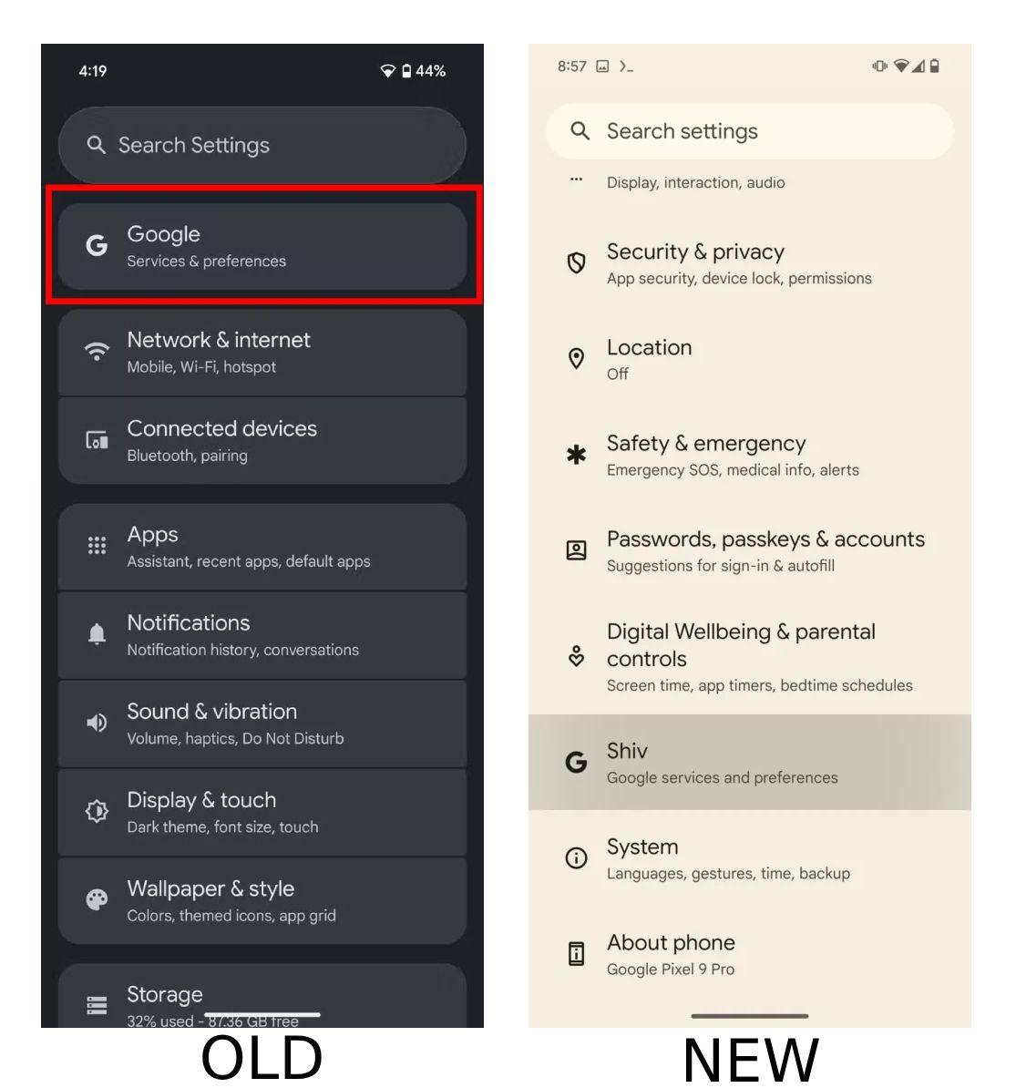
The OS will receive its first major update as a Pixel Feature Drop in December, and we know that it will flip the switch on a redesigned Settings menu. As seen in Android 15 QPR1 Beta 2, the redesigned menu will bring separation between different Settings panels, alongside moving the Play Services-powered settings menu right at the top of the Settings screen.
Now, new development indicates that in addition to moving the panel’s position, Google might also be looking at renaming it. As spotted by AssembleDebug in a report for Android Authority, Google Play Services version 24.42.31 (beta) surfaces the Google Services settings panel in a more personalized way.
The change could be here in December
Source: Android Authority
Similar to iOS’ Settings panel, which shows the user’s name up top as a marker for Apple Account settings, Google’s settings for services and preferences, too, will soon display your account name instead of simply “Google.”
While not a huge change, the UI tweak does make it easier to spot which profile you’re currently on, something that will primarily benefit those with multiple accounts on their device. It’s worth noting that the tweak only appeared within the Play Services version 24.42.31 (beta) on an Android 15 device. The panel’s updated name did not surface on the same beta running on an Android 14 device, suggesting that the change might make its way alongside the overall Settings panel overhaul later this year.
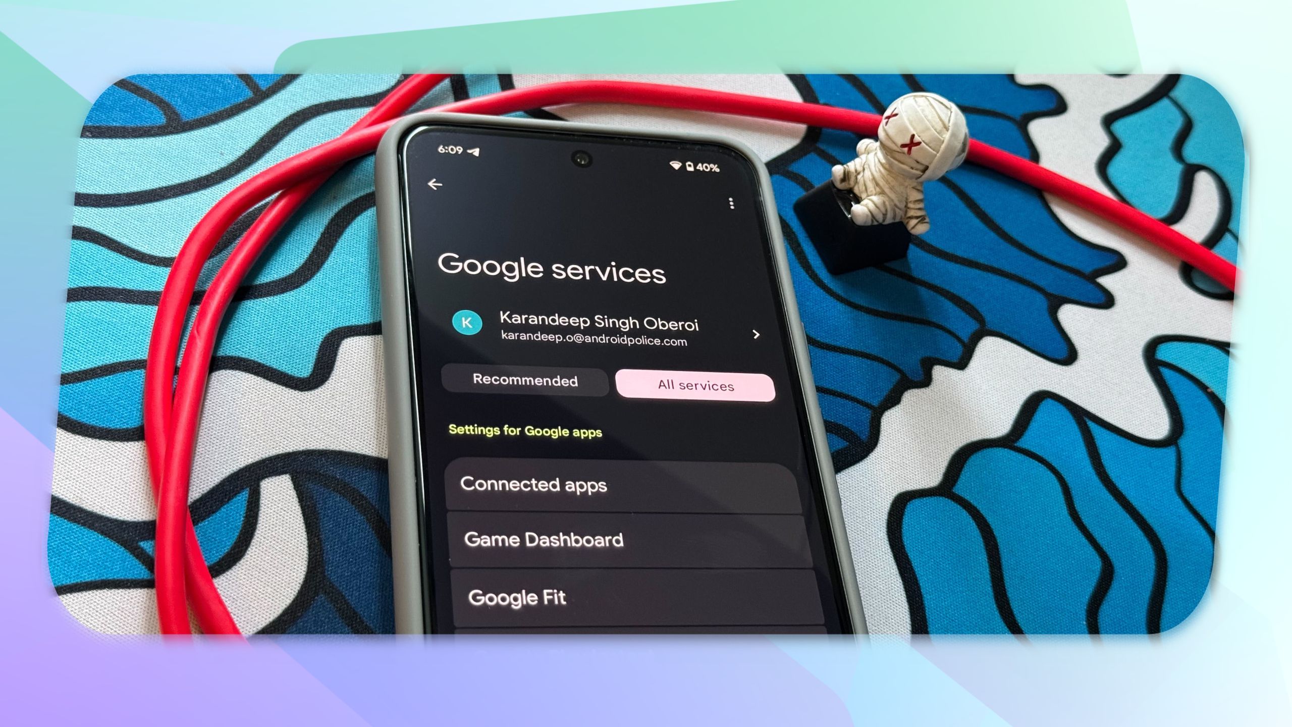
When the broader change does go live, the Google services and preferences settings menu will also widely undergo a Material You redesign. Within the settings, users will find that the Recommended and All Services tabs, which were previously unified, have been separated into individual bubbles. Additionally, the latter section, which previously housed all service settings in one large alphabetical list, will soon categorize them into 10 different sections. The change was first spotted on Google Play Services version 24.37.34.

Related
The ‘Google Services’ Settings panel is getting a fresh coat of Material You paint
And an easier-to-navigate menu

